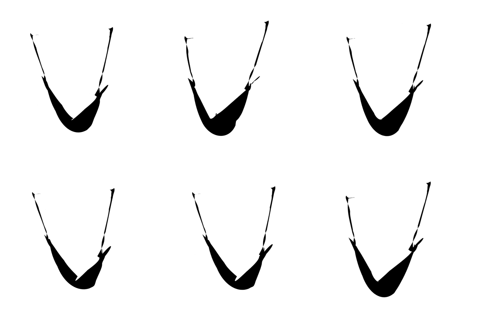
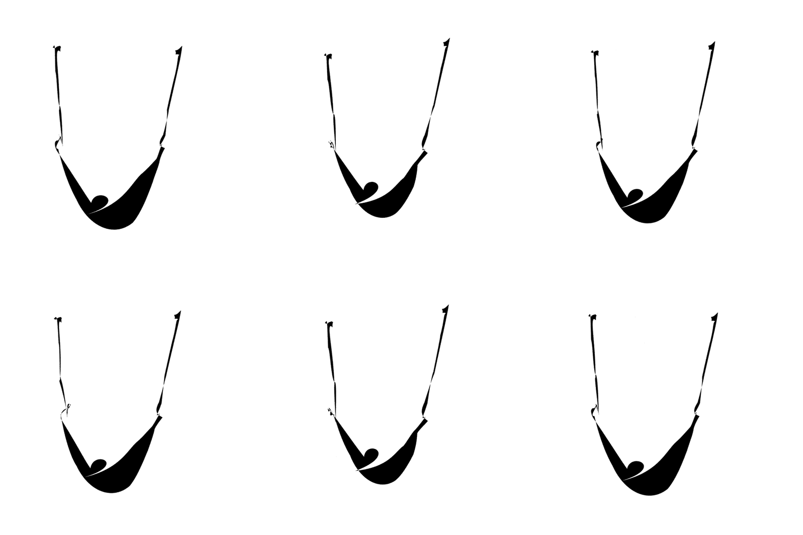
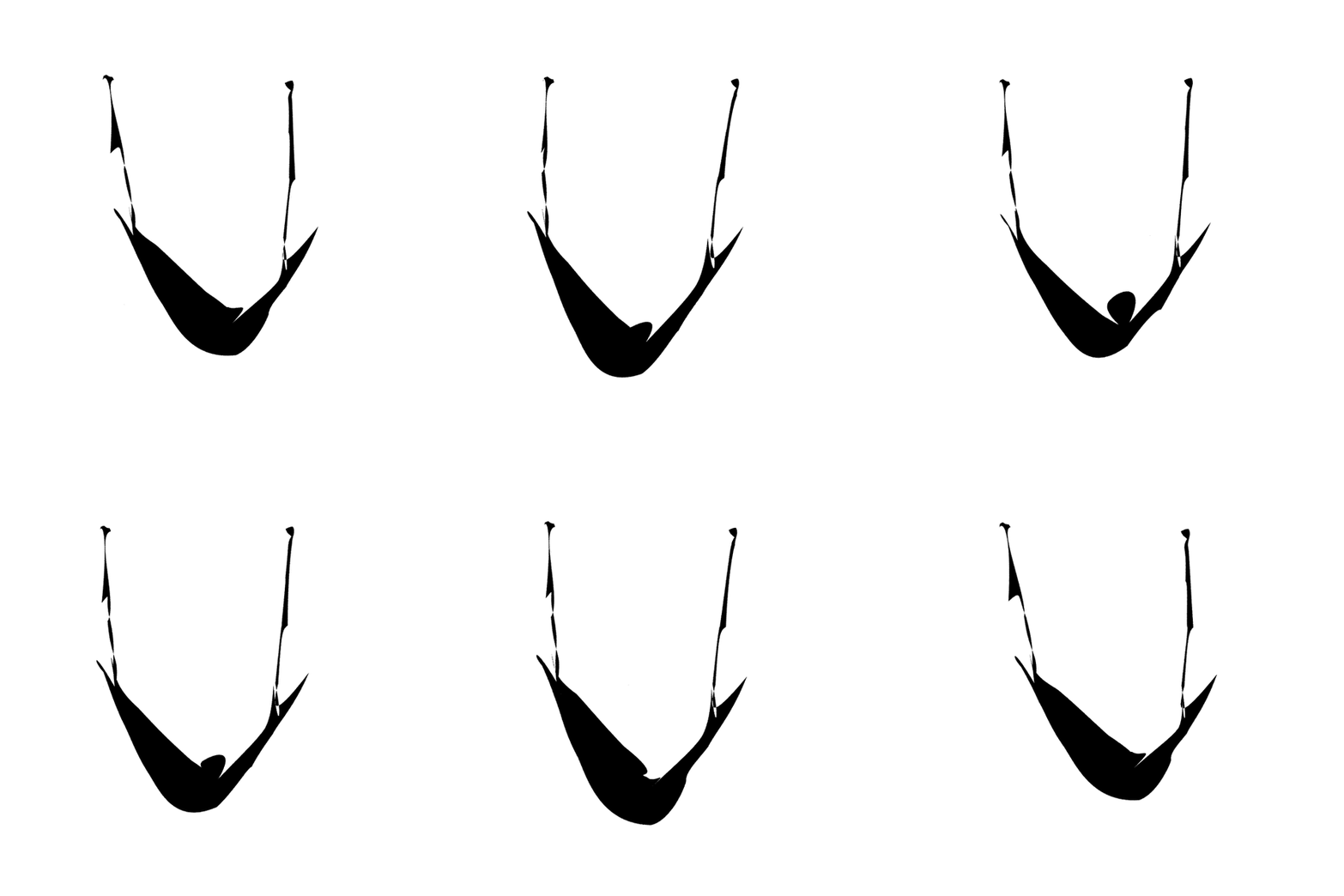
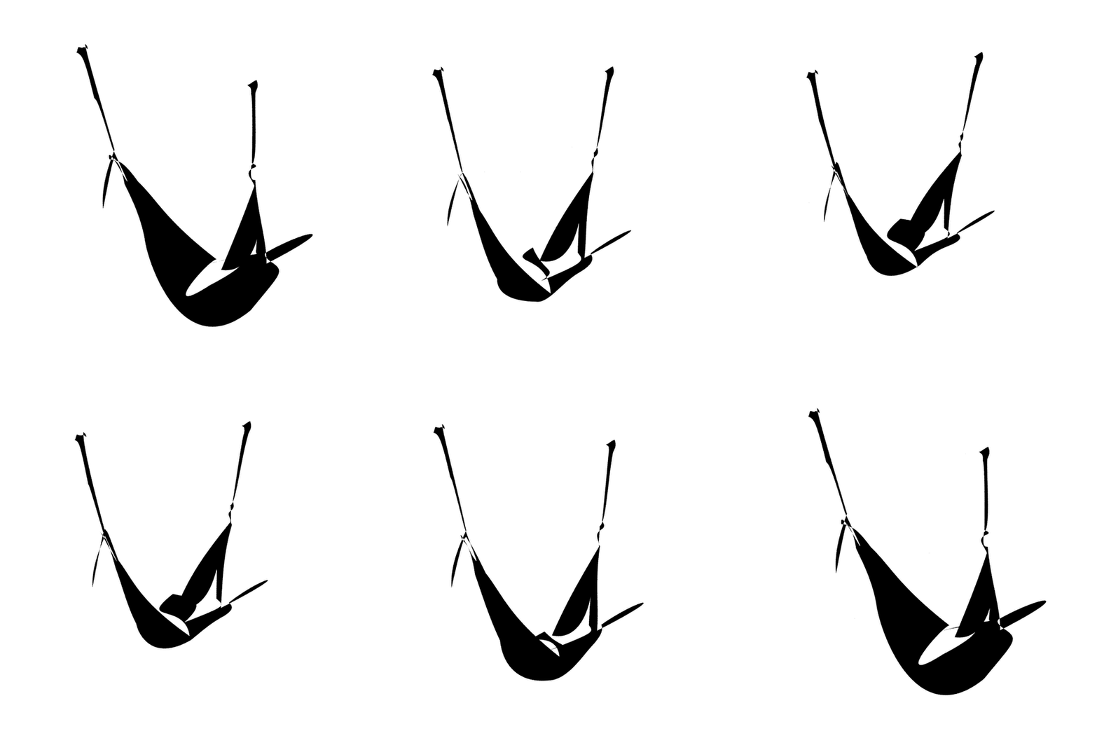
Visual Results: Shape + Motion
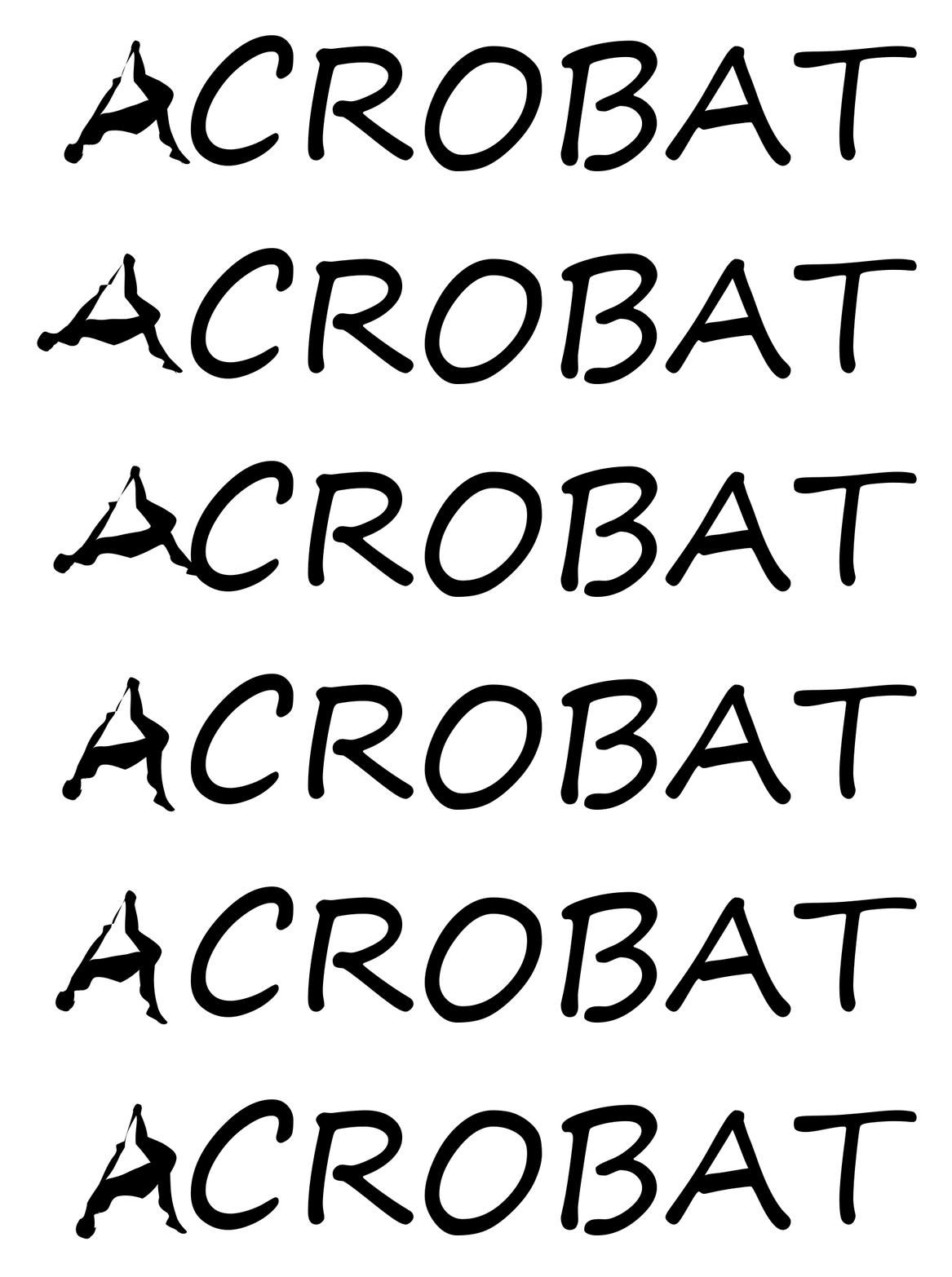
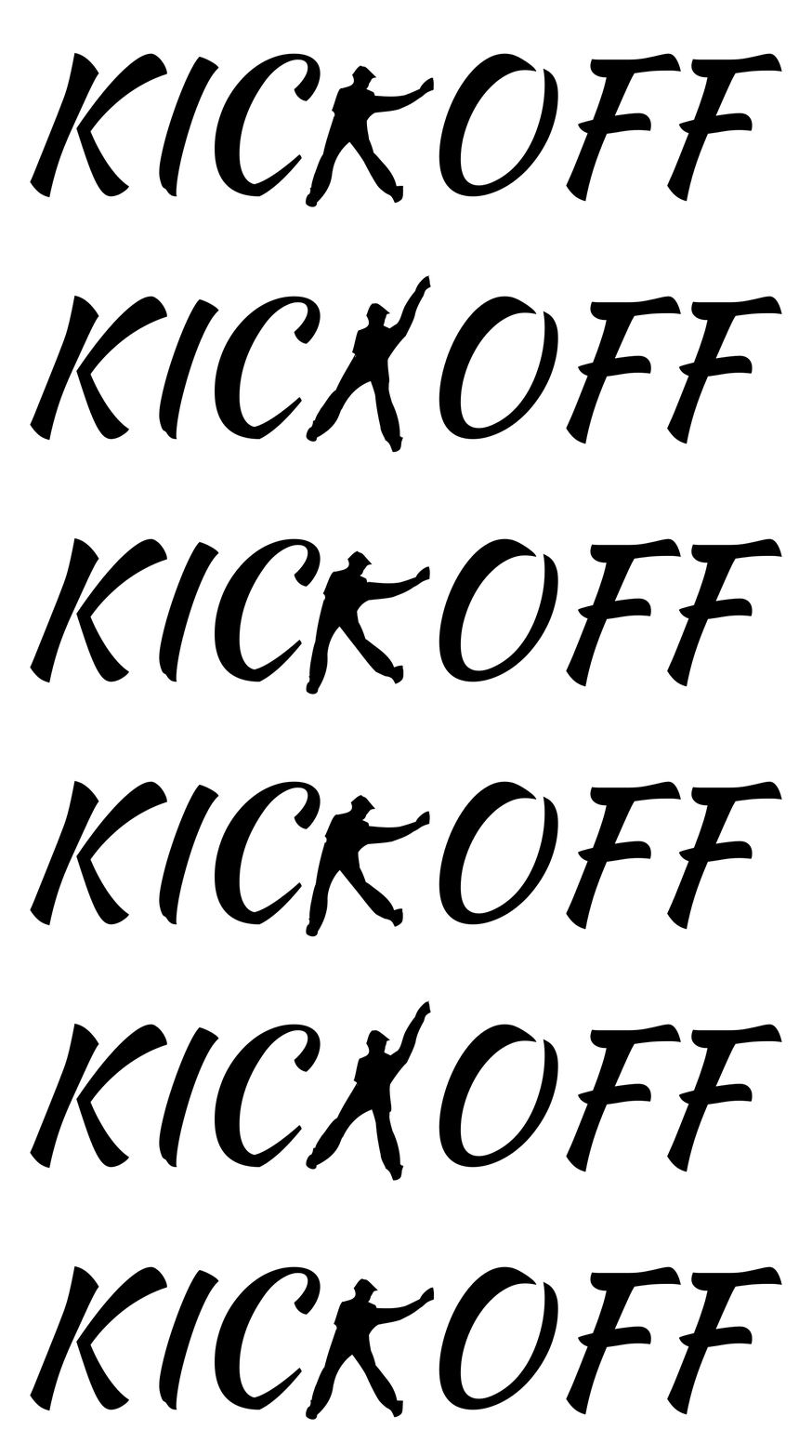
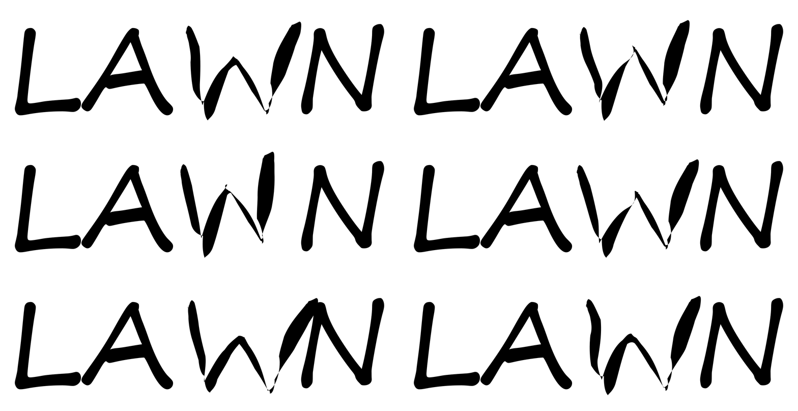
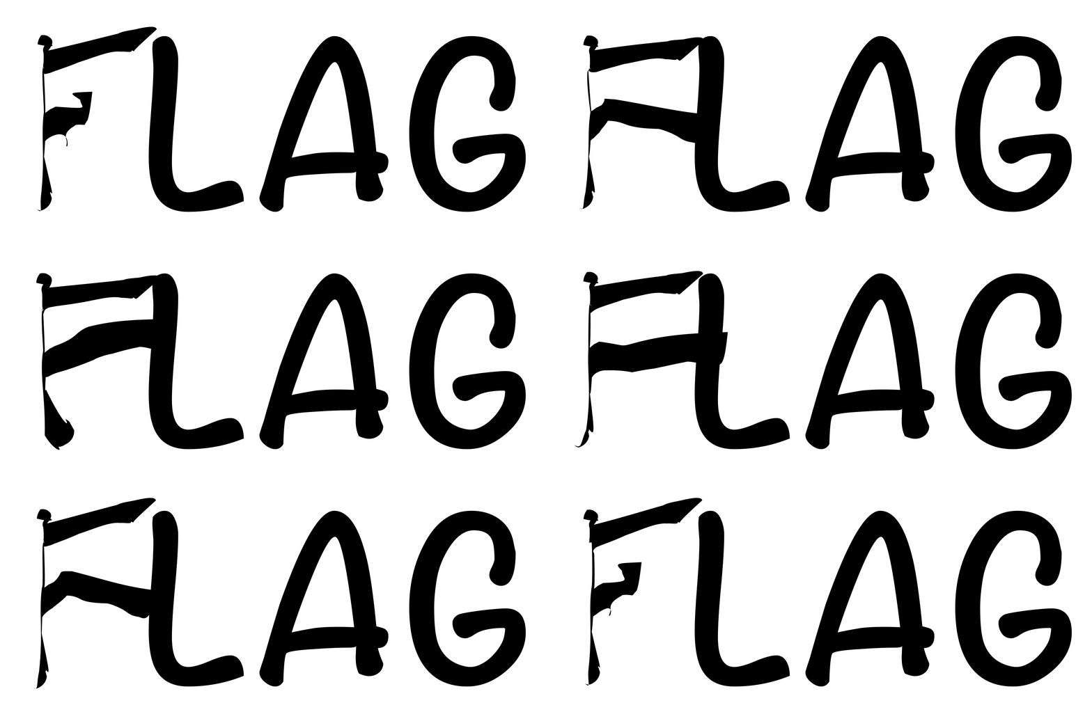
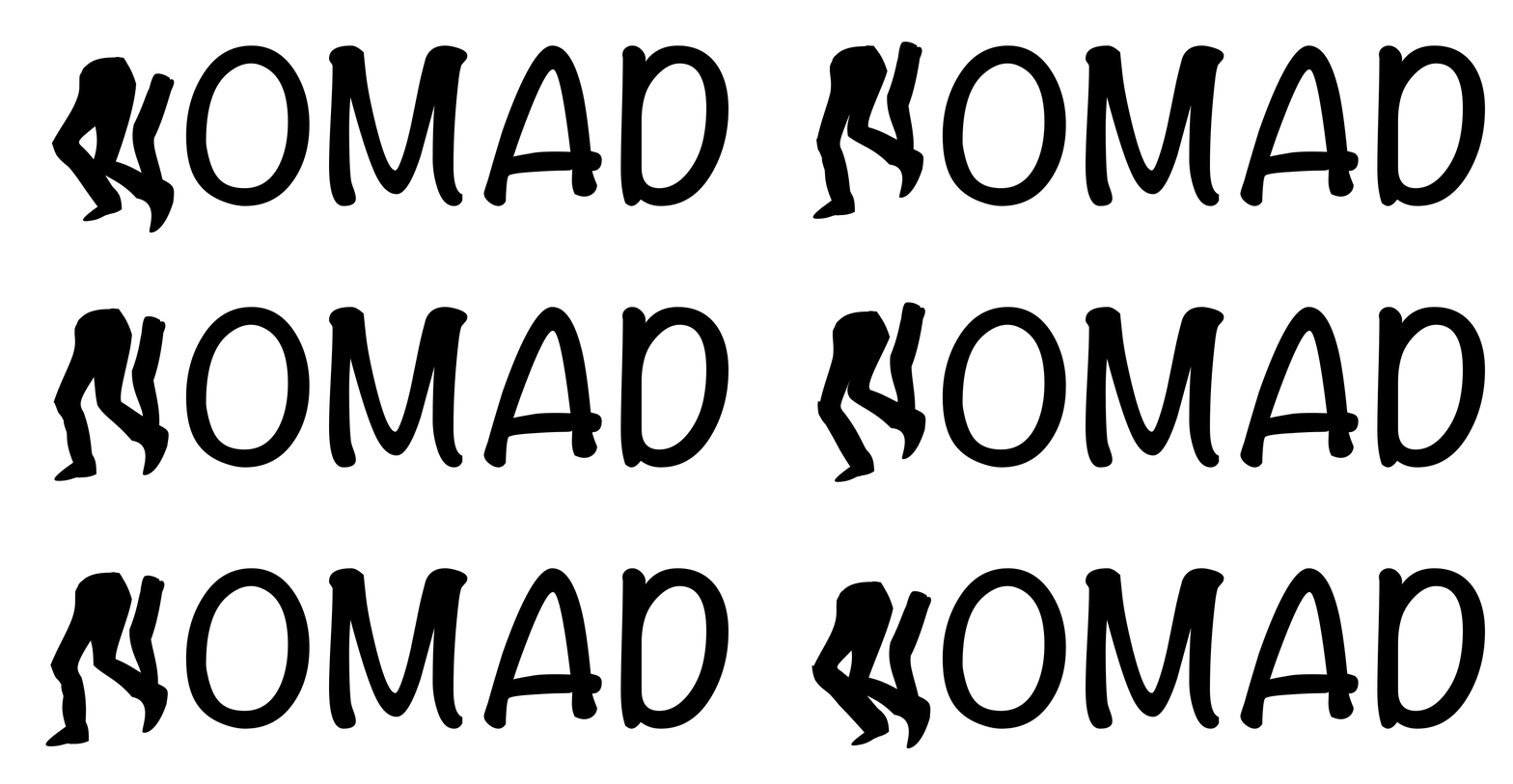
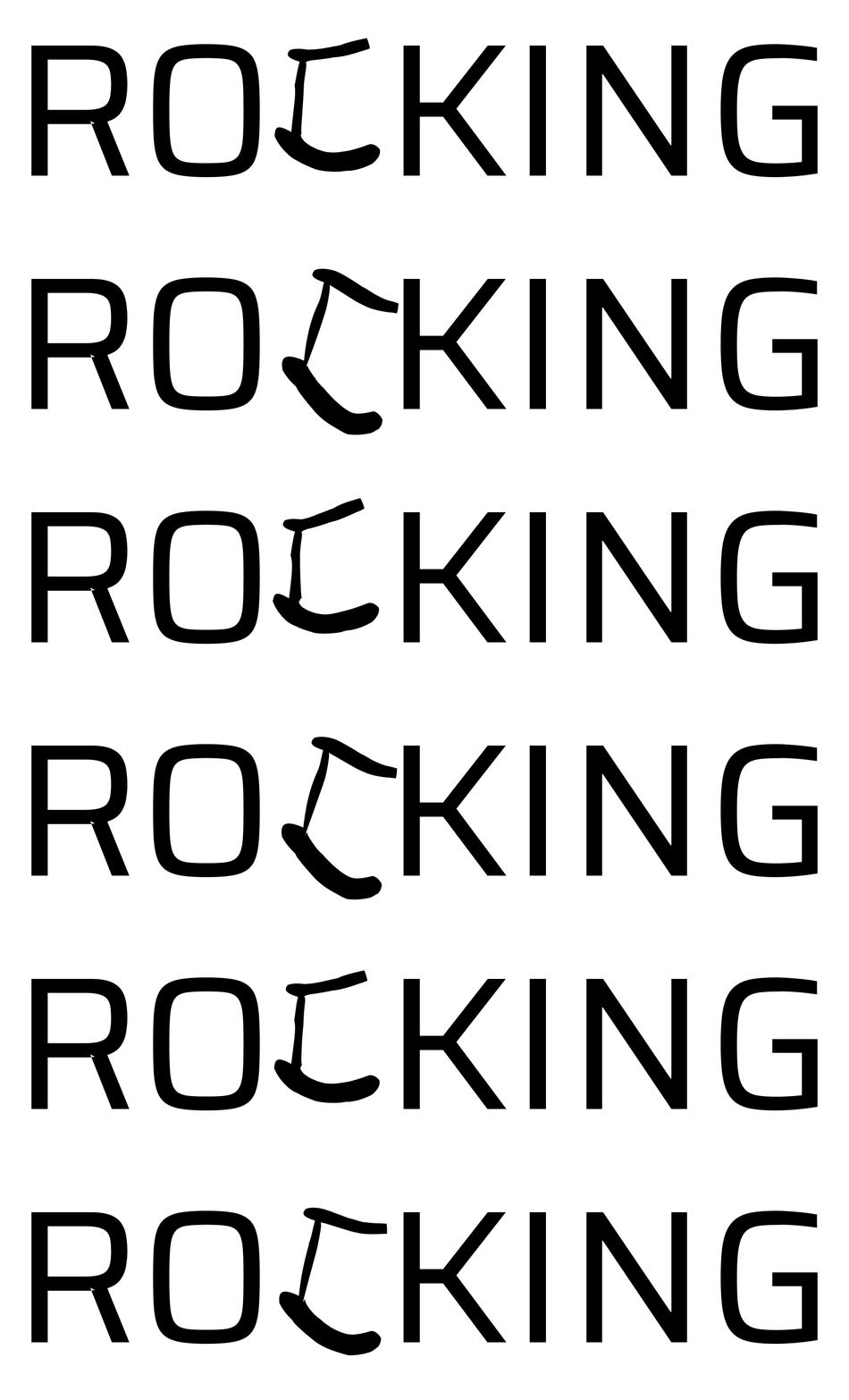
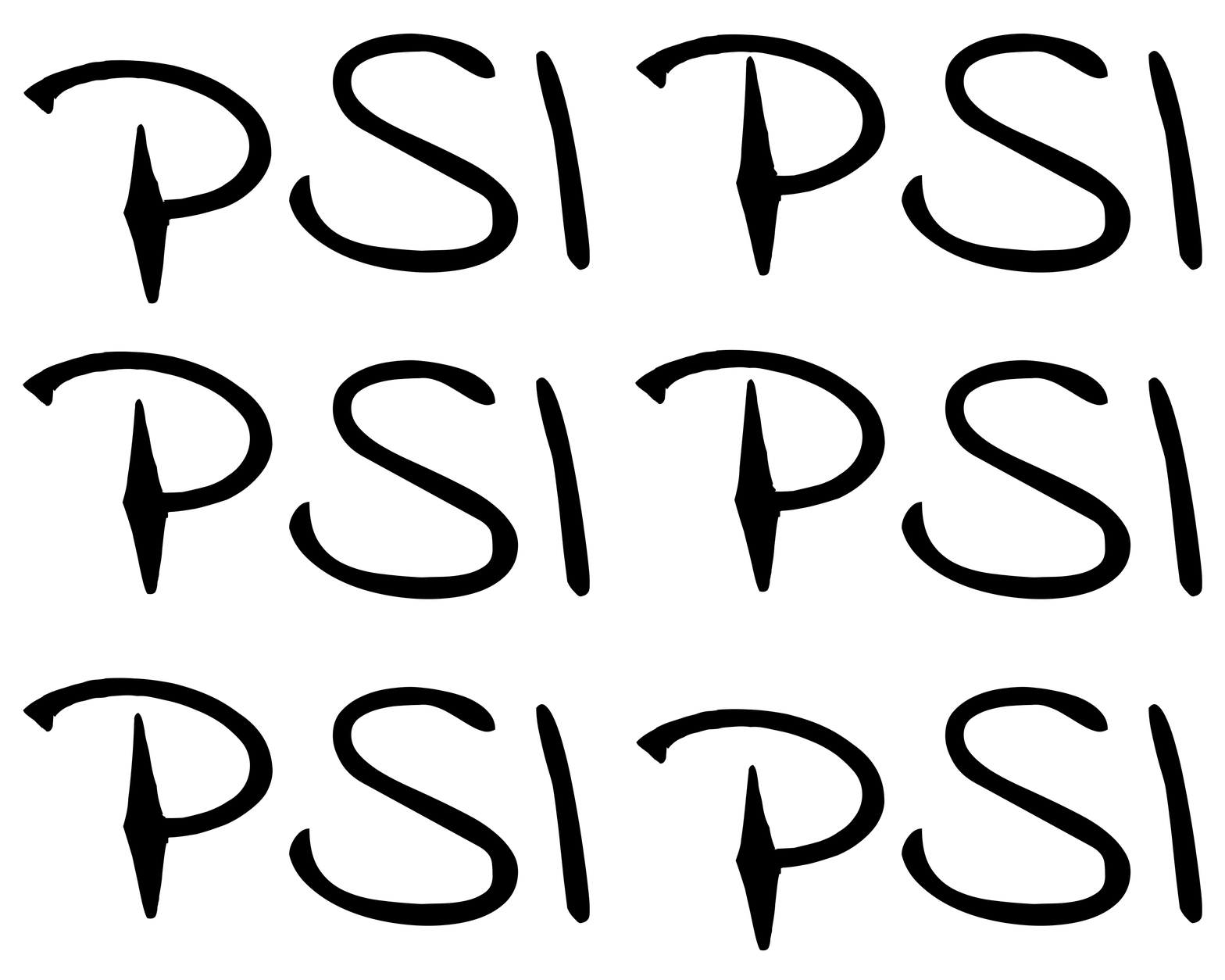
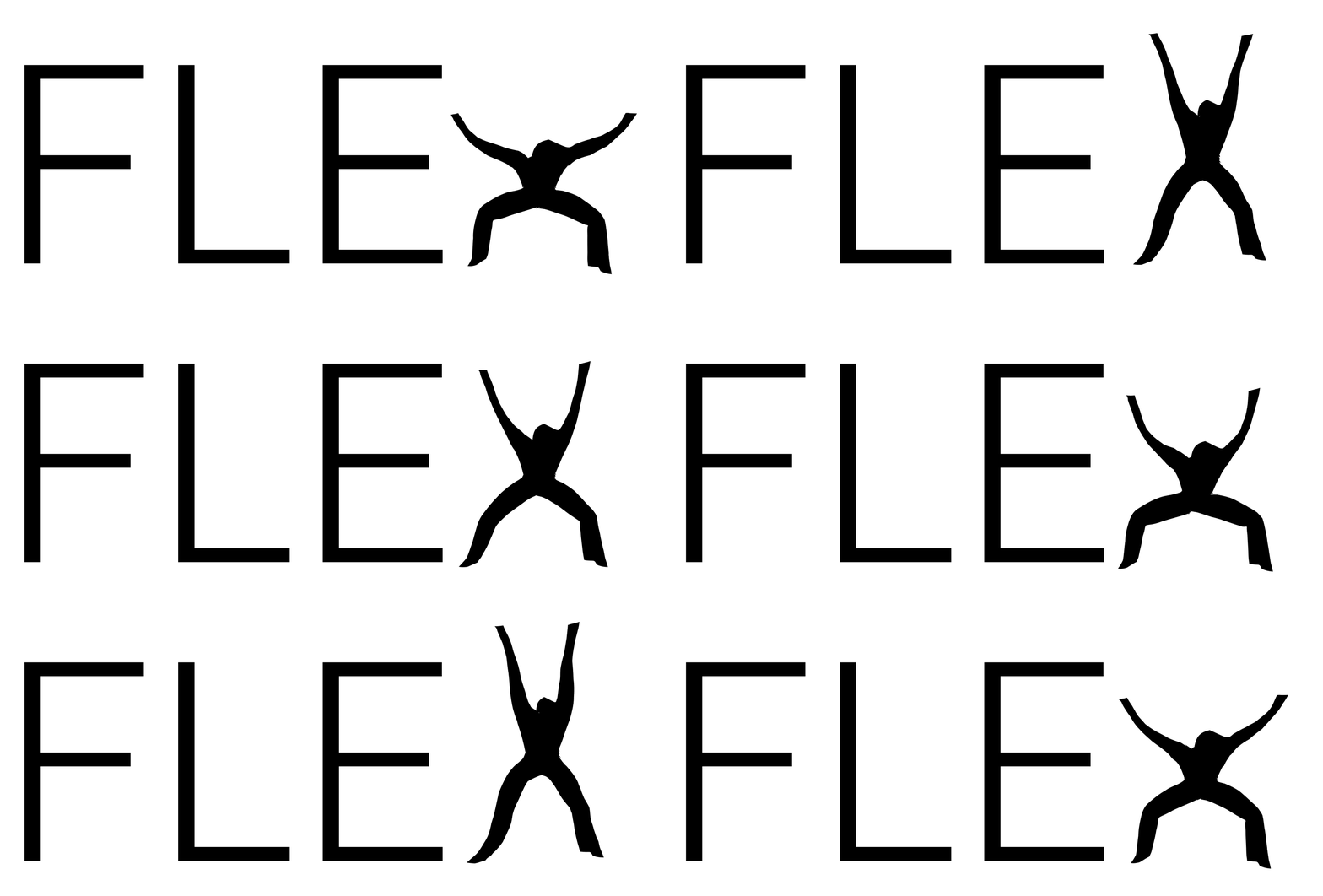
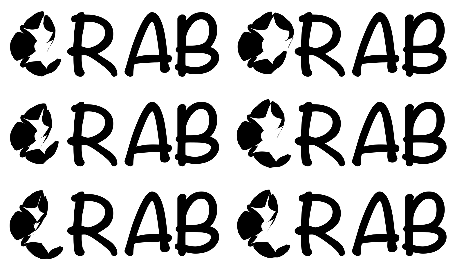
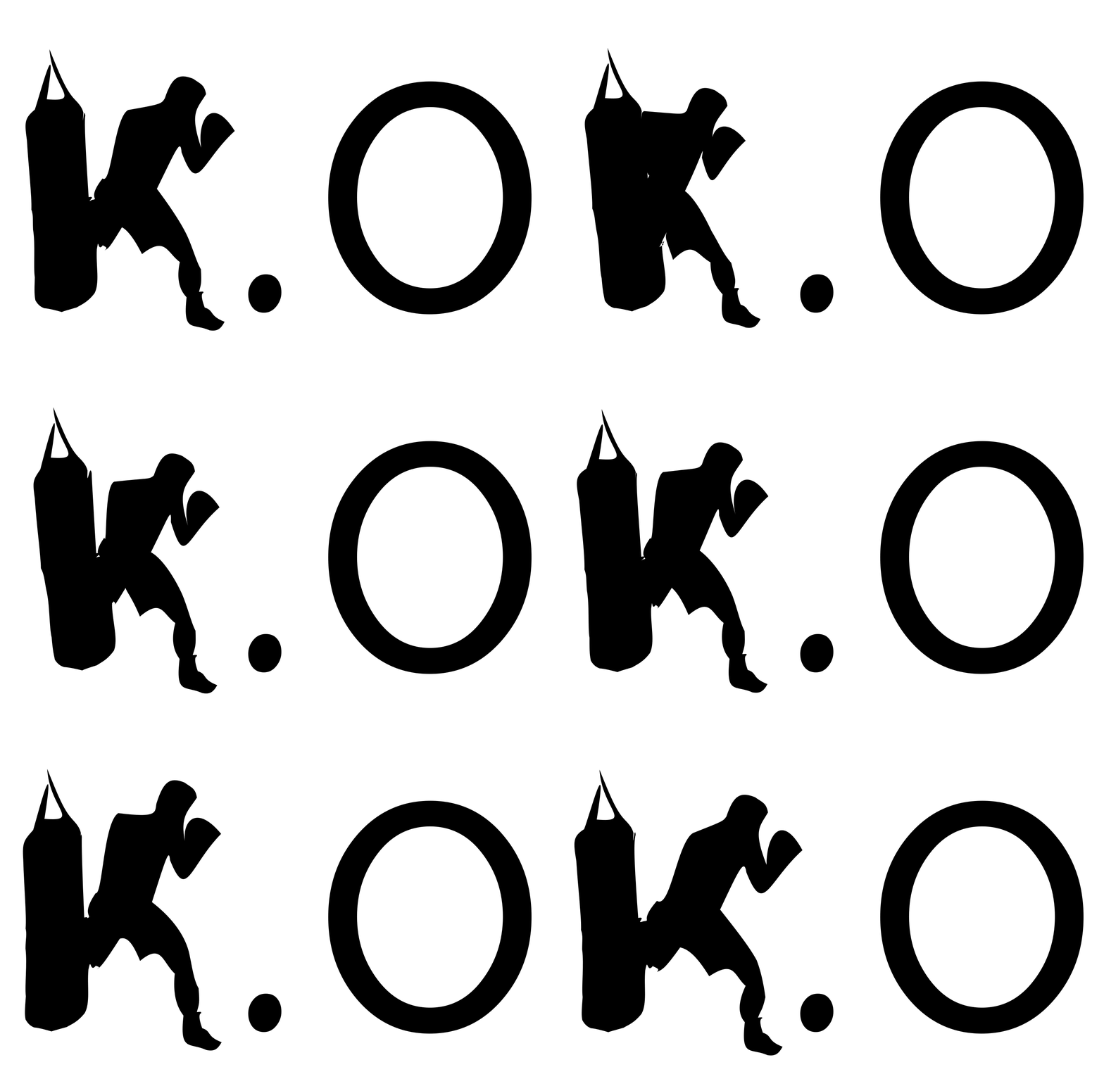
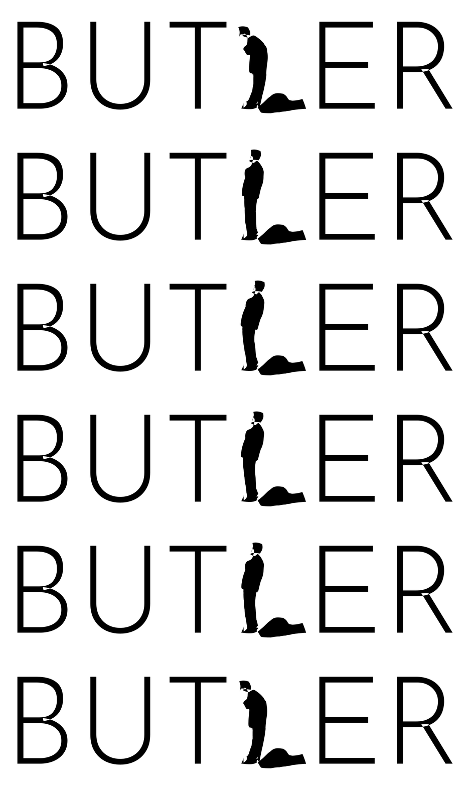
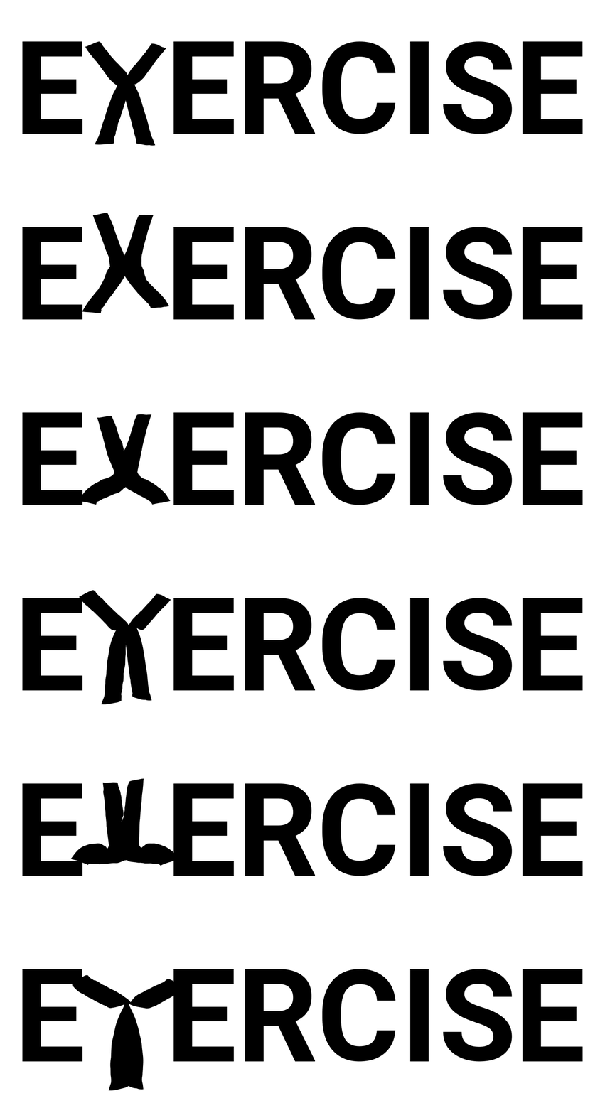
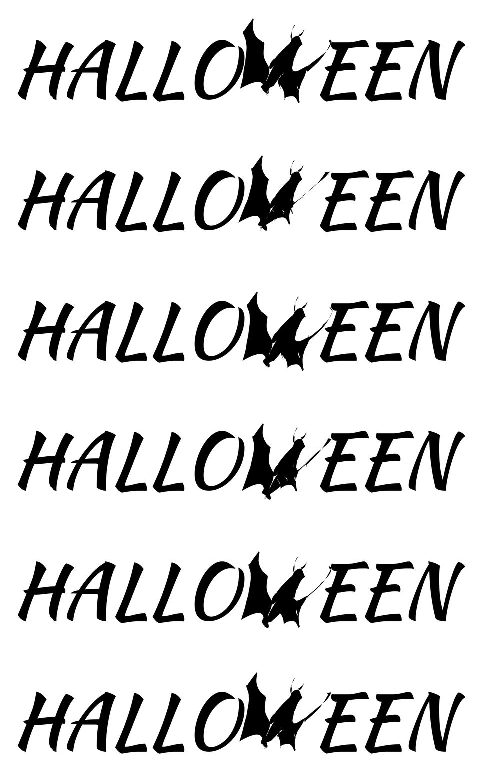
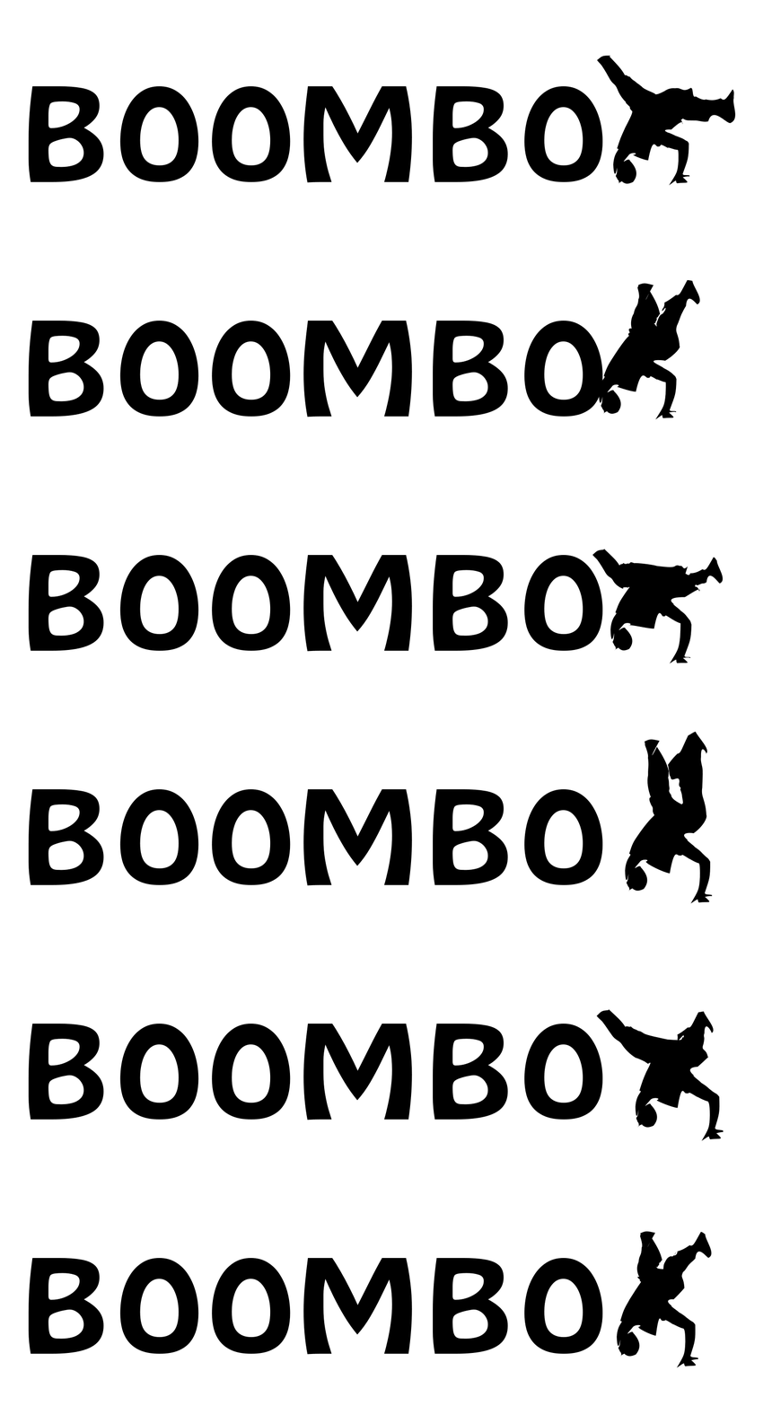
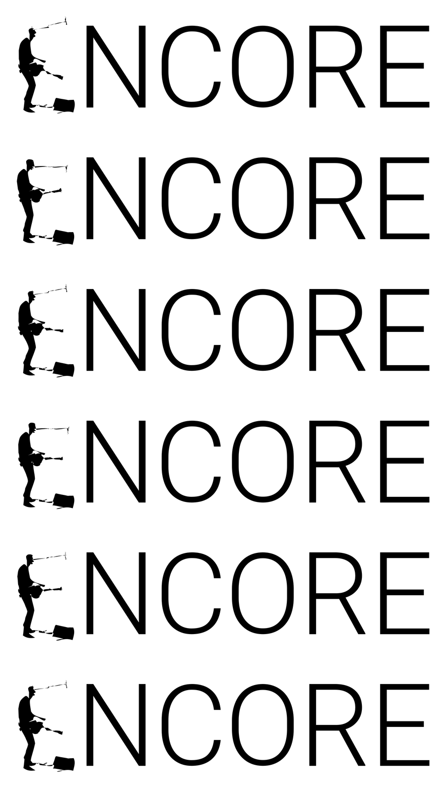
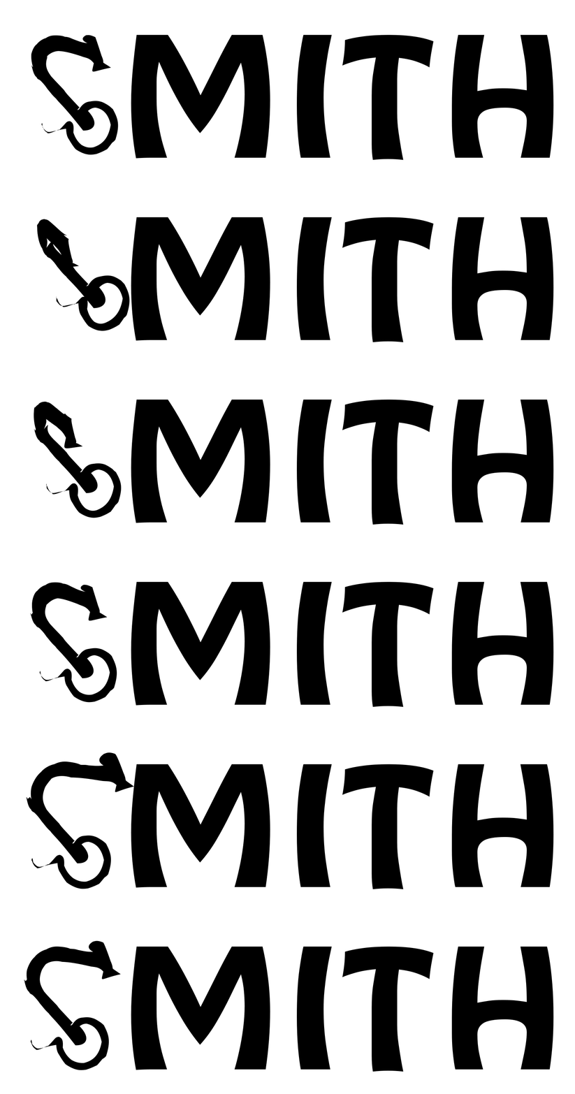
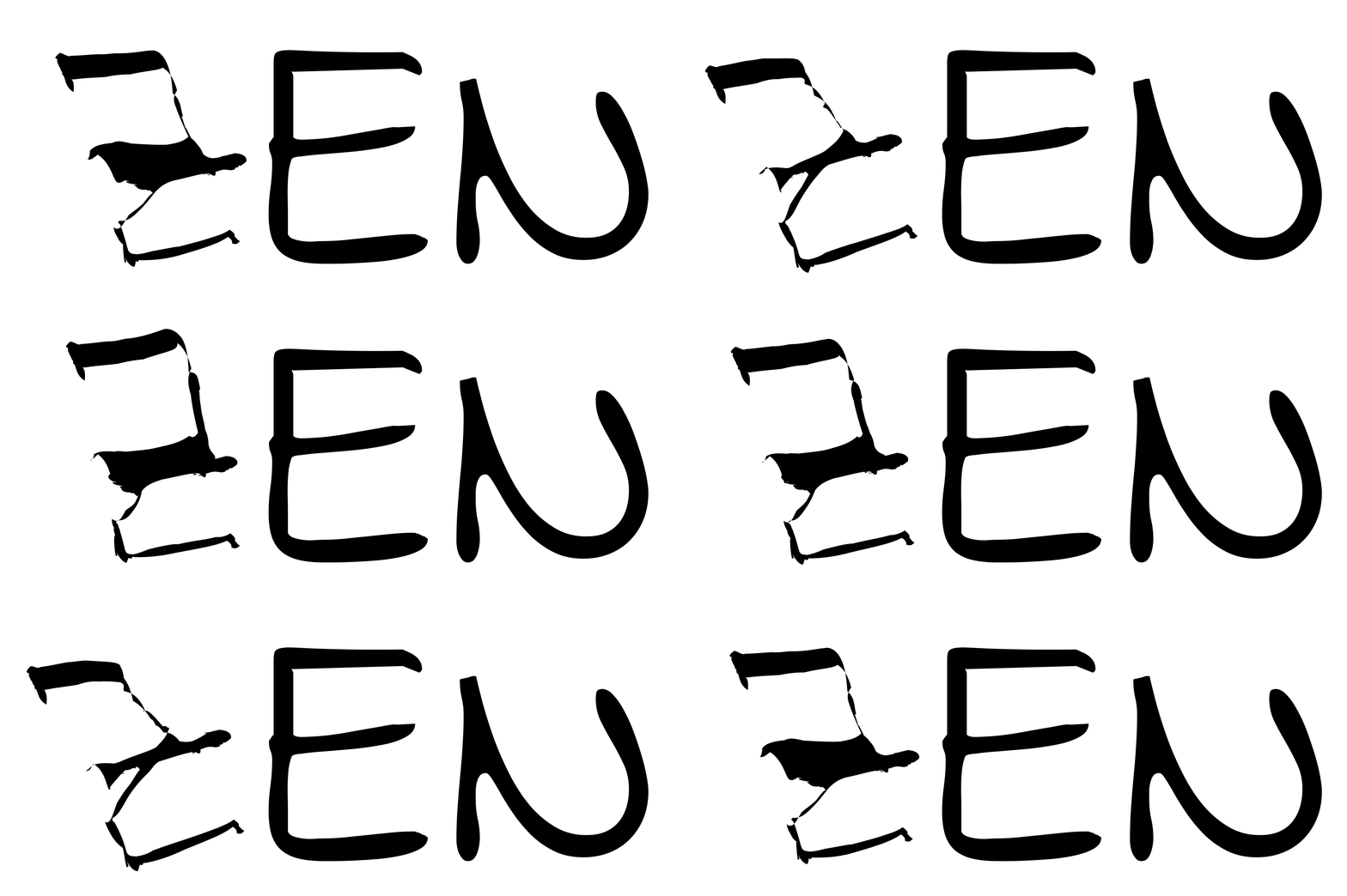
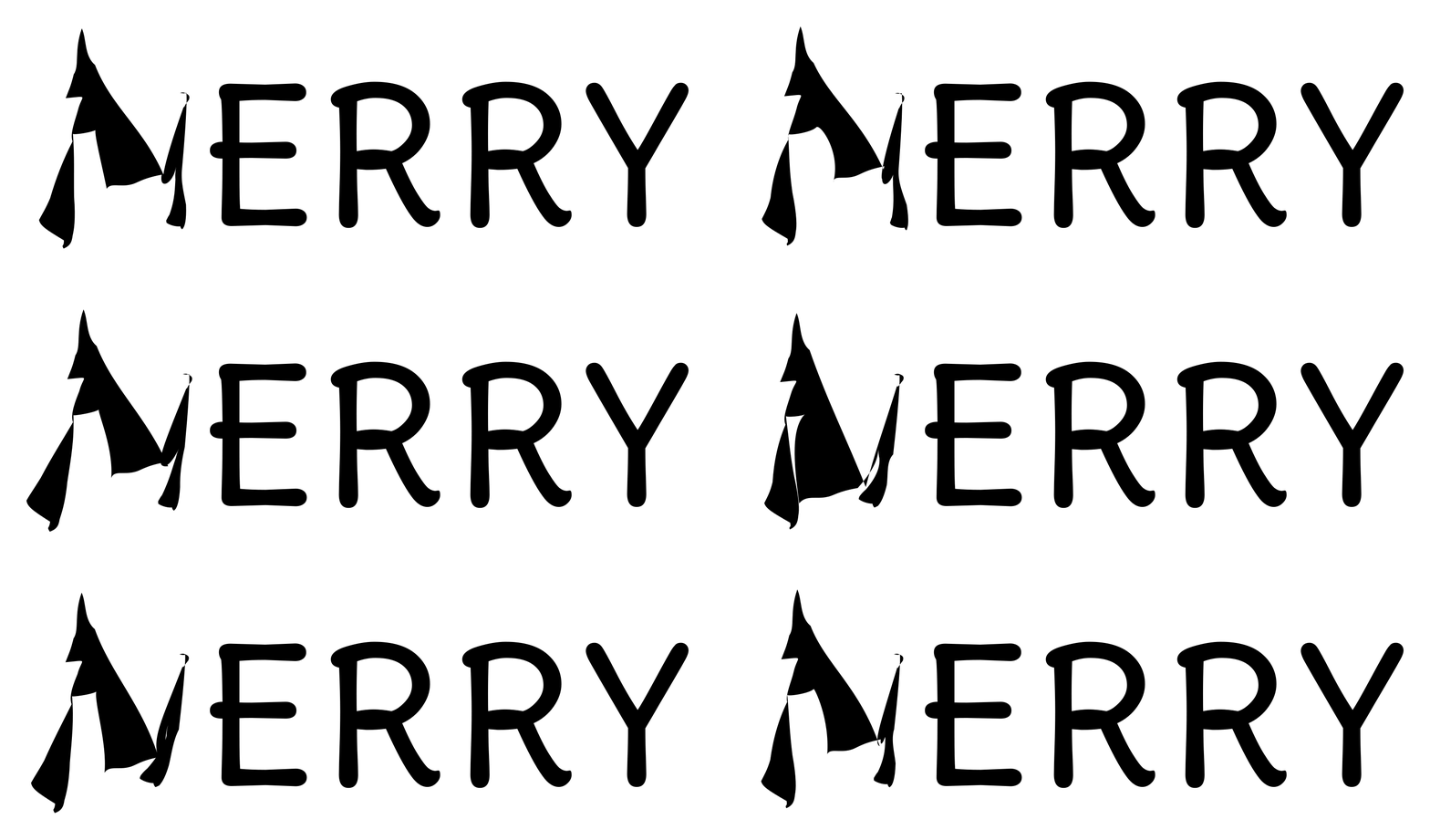
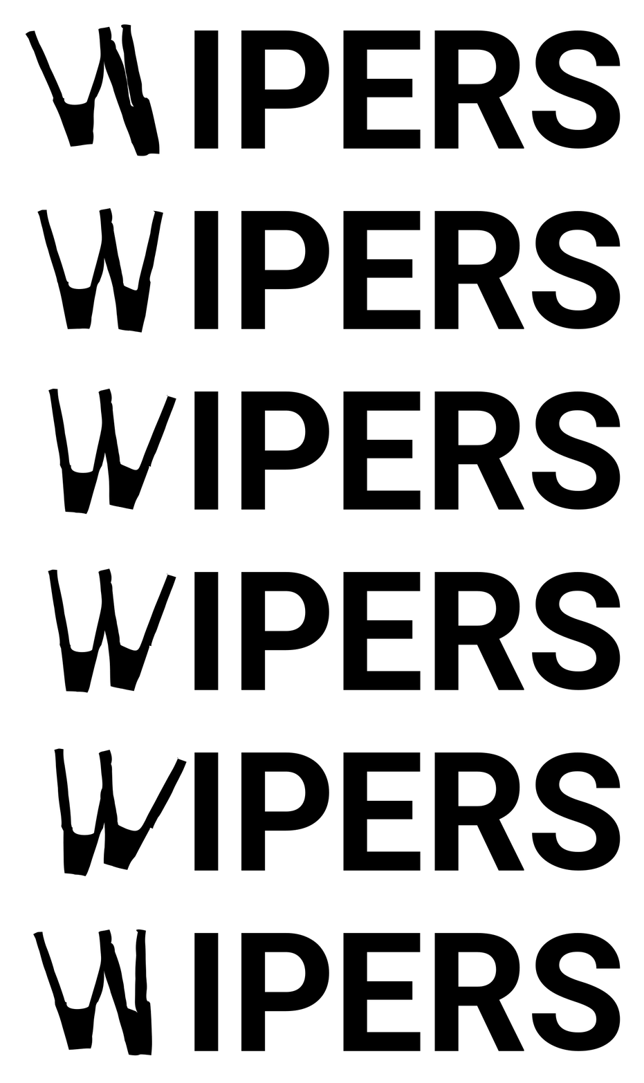
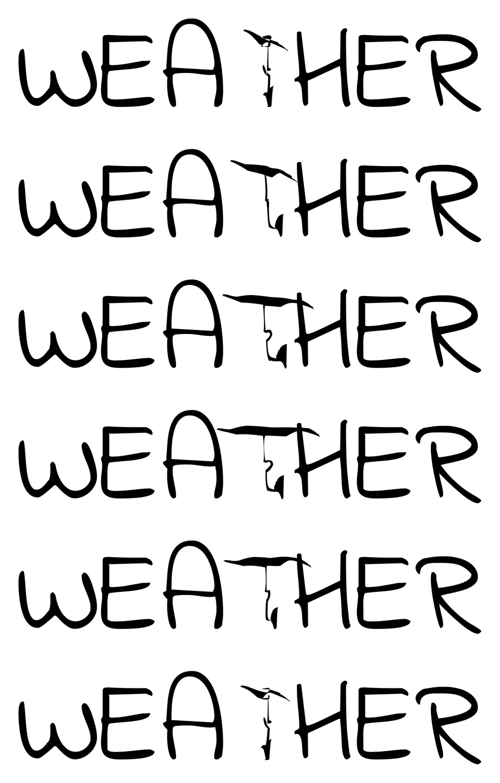
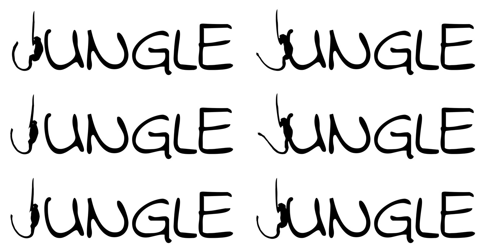
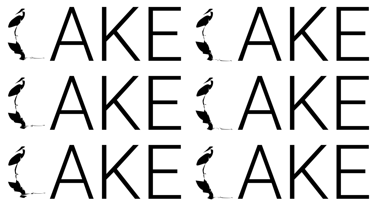
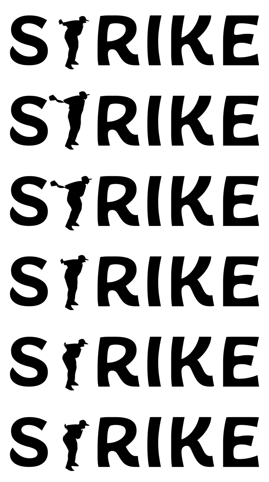
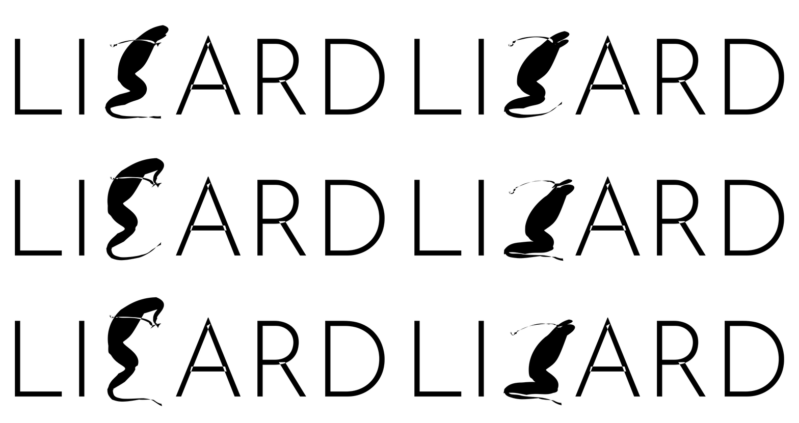
Modal Kinetic Typography
Abstract
We introduce modal kinetic typography, which animates a vector glyph to express a semantic concept while keeping it legible. Our key idea is to build motion from the glyph’s natural vibration modes. Specifically, a finite-element eigenproblem assembled from the vector outline yields the glyph’s softest modes, for the whole letter and for each of its parts, allowing it to bend. The problem’s zero-energy solutions, i.e., rigid translations and rotations, are applied in closed form to each part, allowing parts to also move as blocks. To animate the glyph, a frozen video diffusion model supervises only the modes’ amplitudes and phases. Our modal approach addresses two weaknesses of prior work. Free-form point optimization under video score distillation (SDS) moves each point and frame independently along noisy gradients, tearing the outline and causing jitter. In contrast, our modes are smooth along the outline and driven by a few whole-cycle harmonics, which restricts these gradients to smooth, seamlessly looping motion. On the other hand, structured alternatives rely on skeletons or keypoints from category-specific priors, whereas our modes come from the glyph itself; the only prior is a list naming each letter’s moving parts, generated once for the whole alphabet by a language model. In modal kinetic typography, shape and motion are disentangled by construction: a single base outline is sculpted toward the concept, and the modal drive cannot alter it, so a letter can also be animated without being reshaped. Across letters and typefaces, our method produces more articulated and smoother motion than Dynamic Typography and AniClipart at comparable or better concept alignment, with less glyph tearing than Dynamic Typography, and is preferred by human raters, including in a frozen-shape setting where motion alone must carry the concept. For reference, raters also prefer our method over Astra (GPT-6).
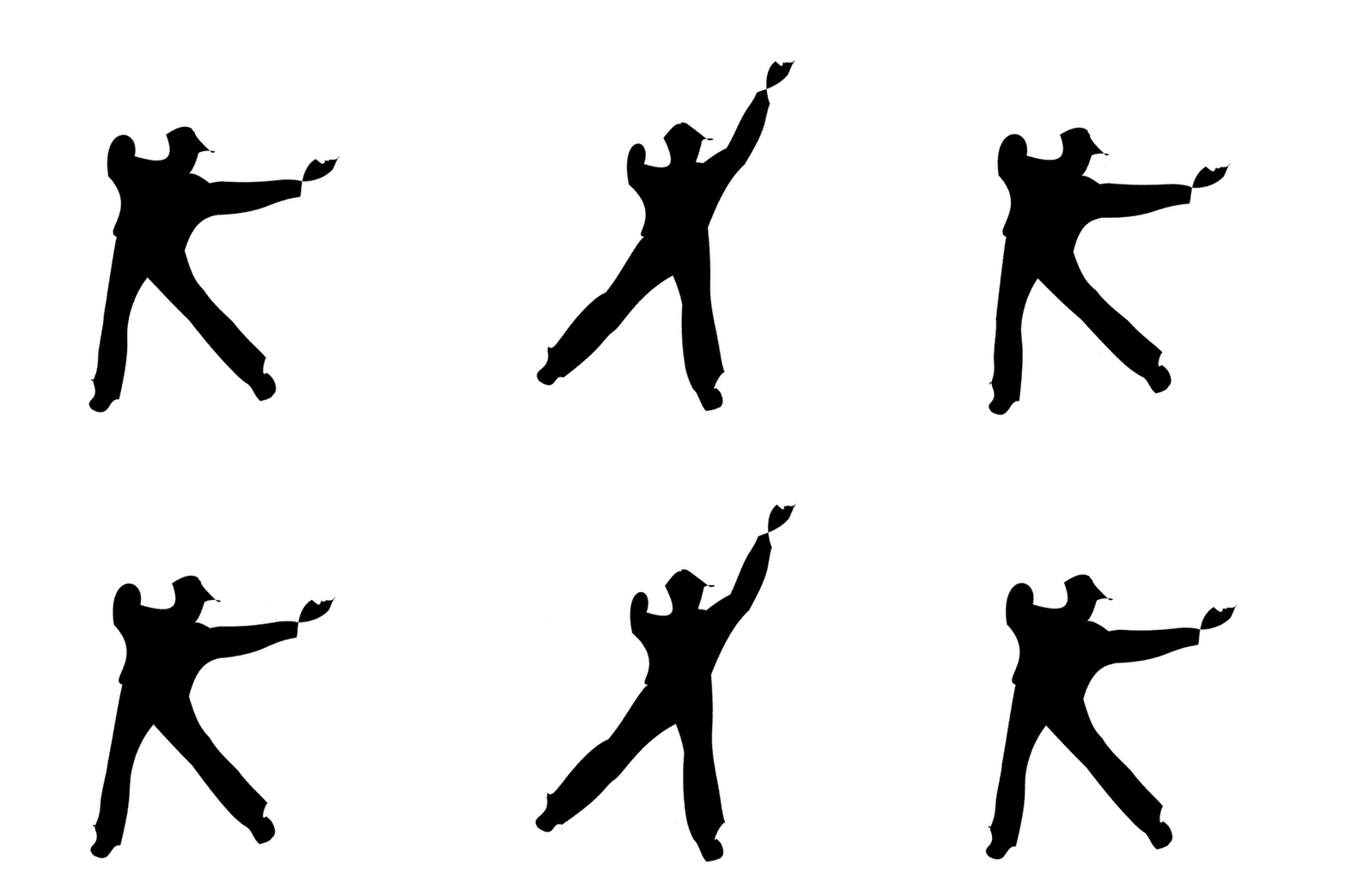
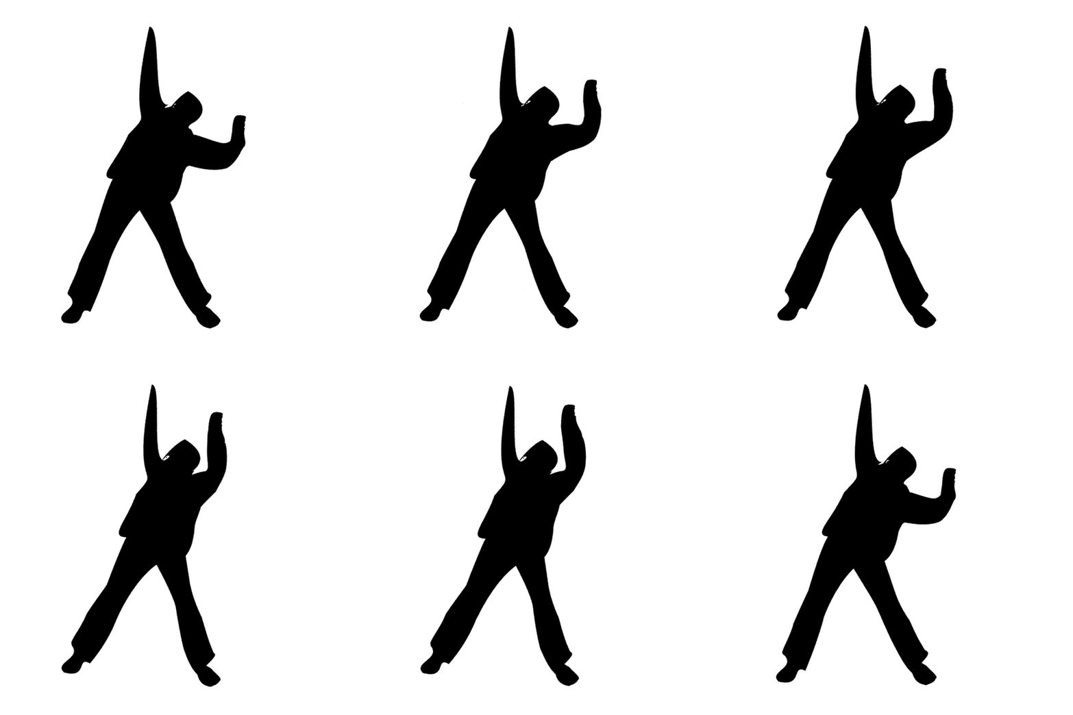
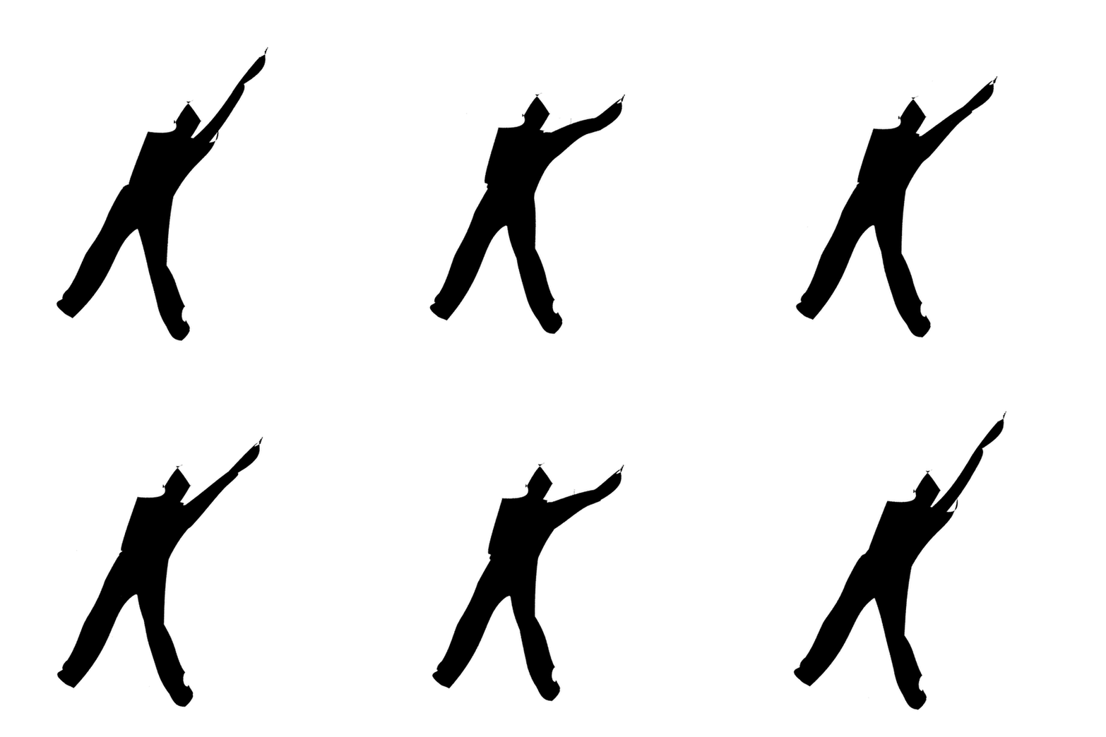
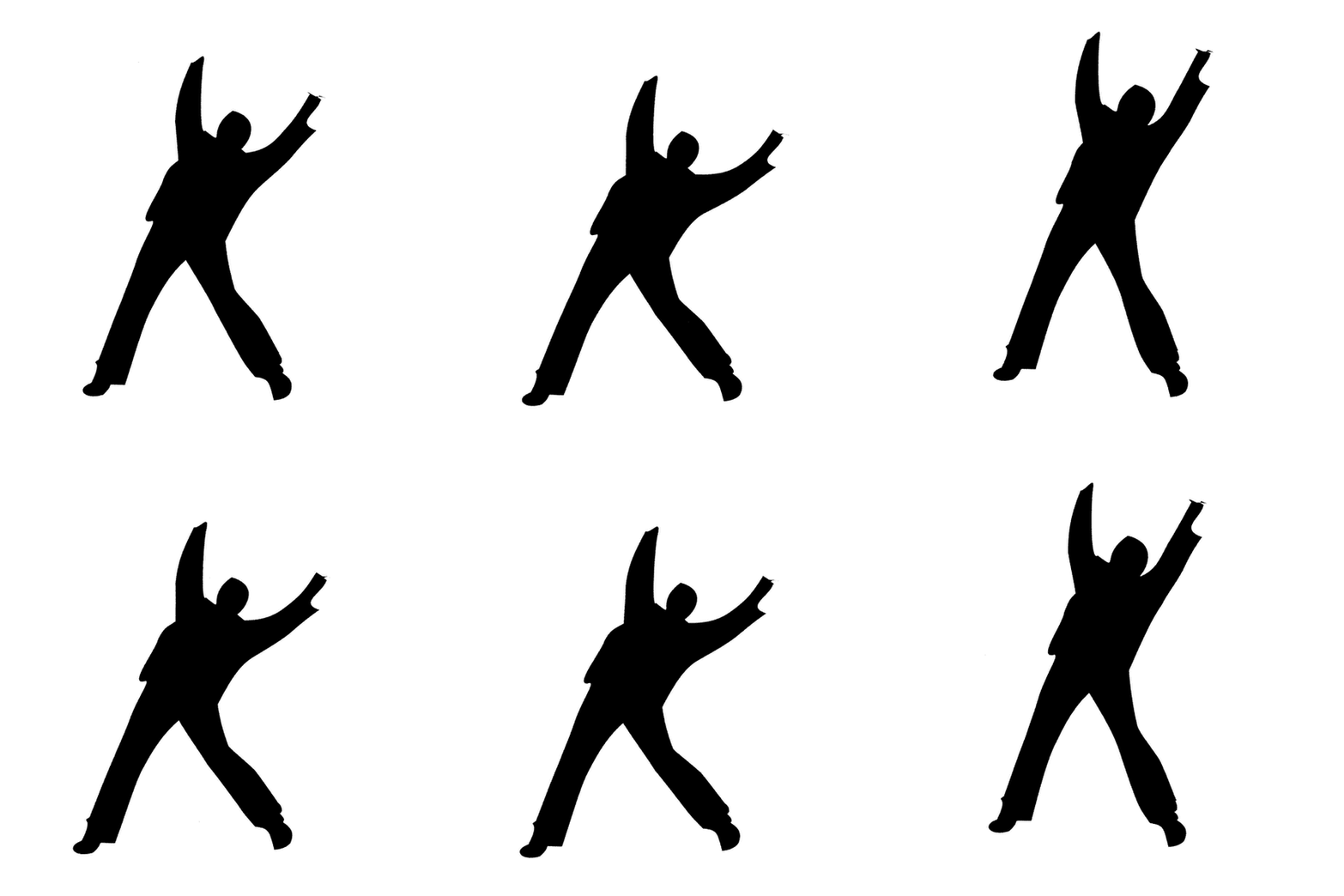
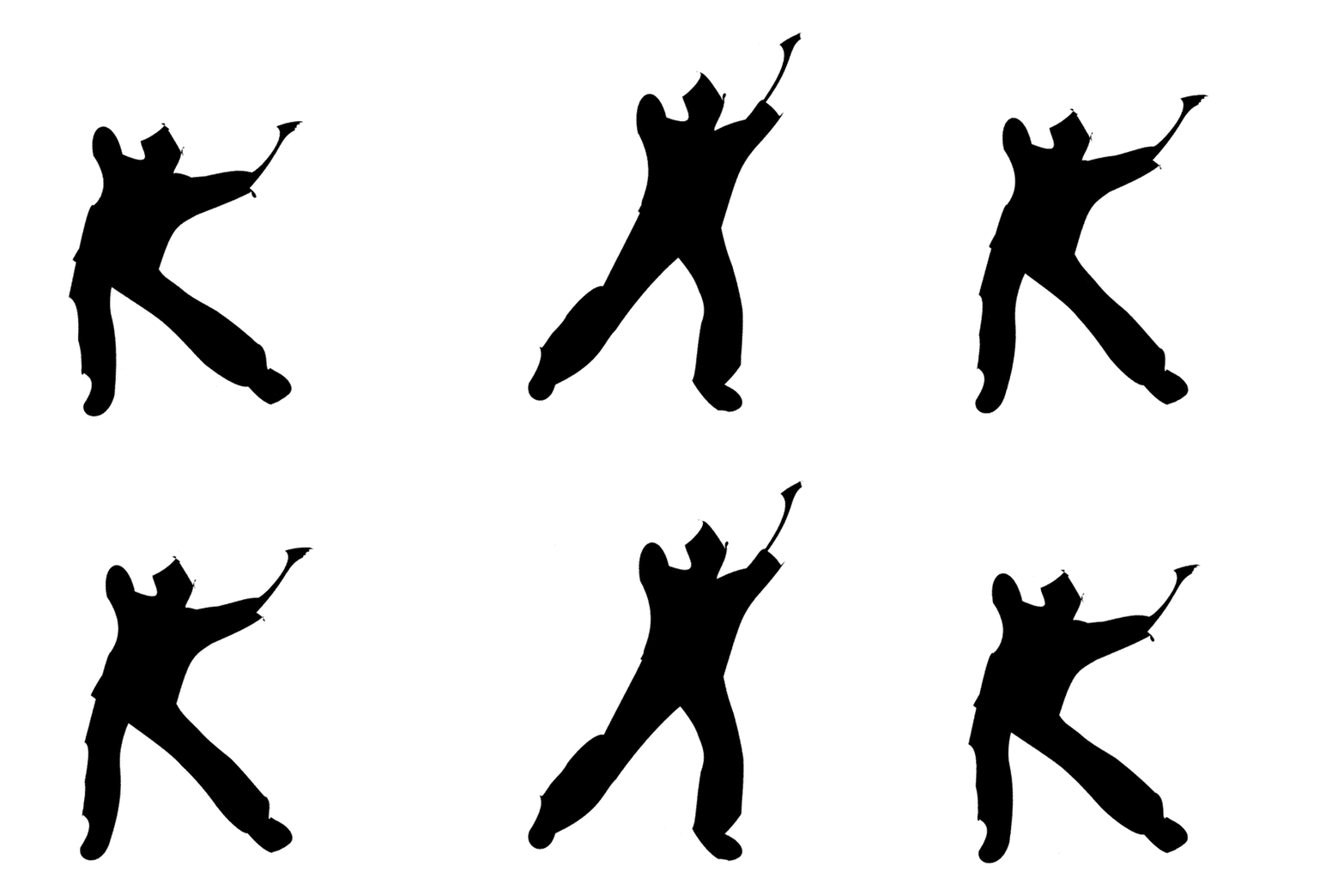
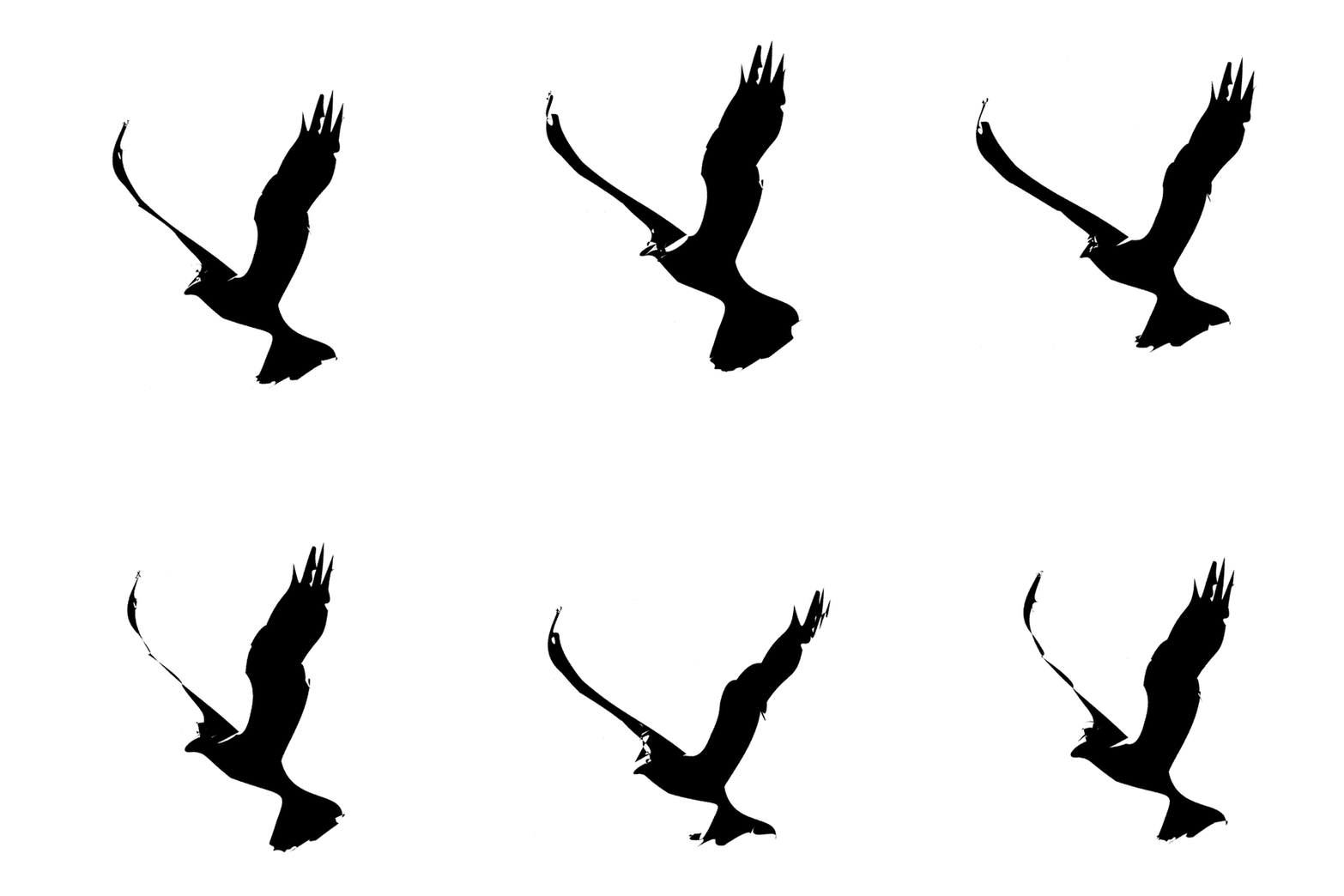
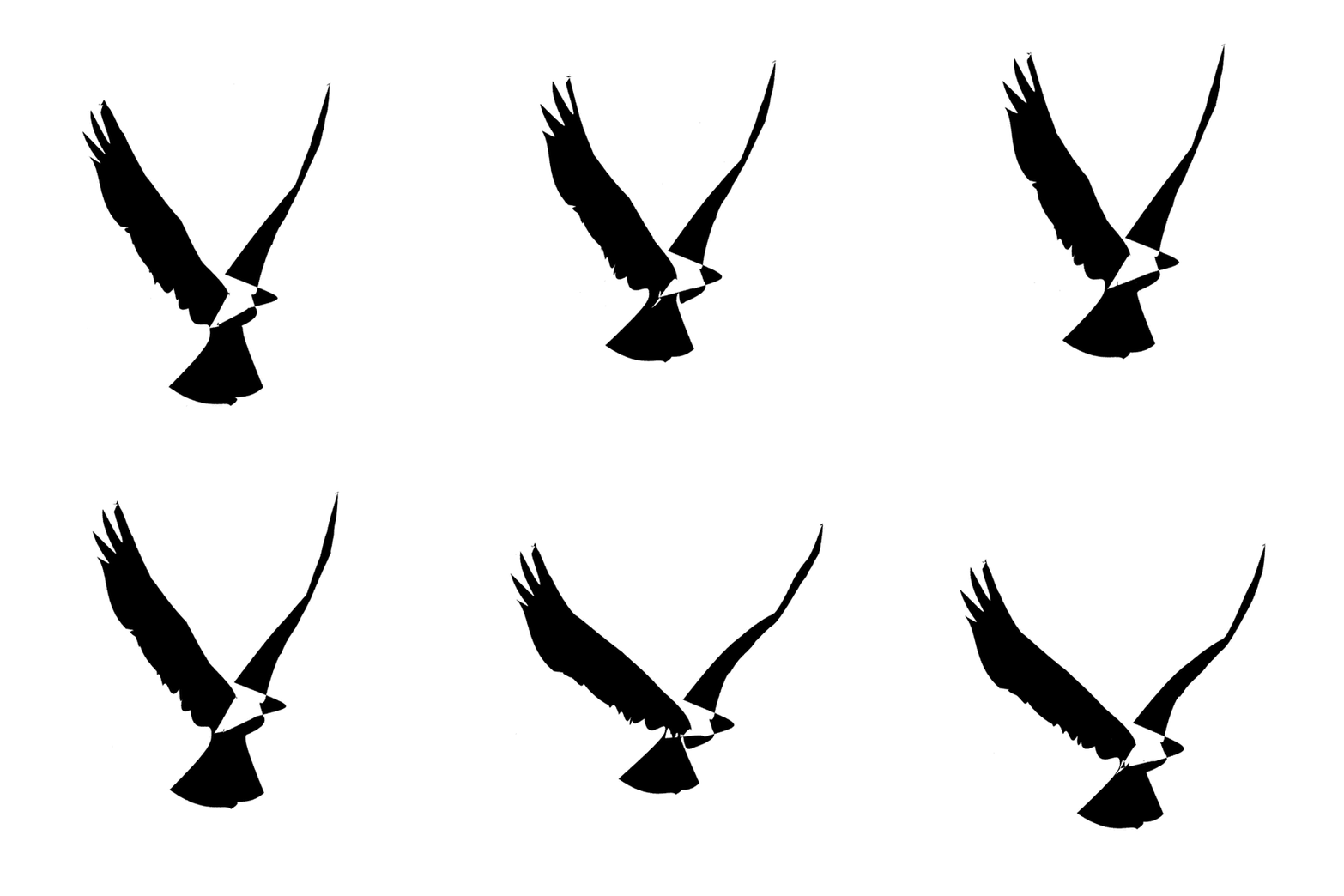
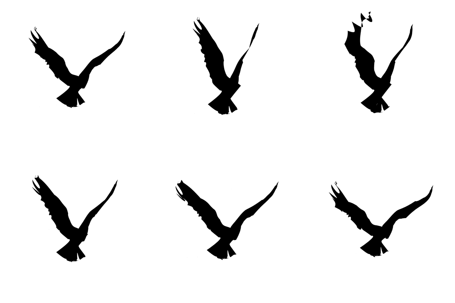
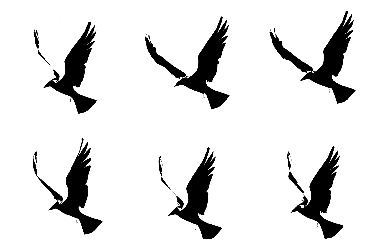
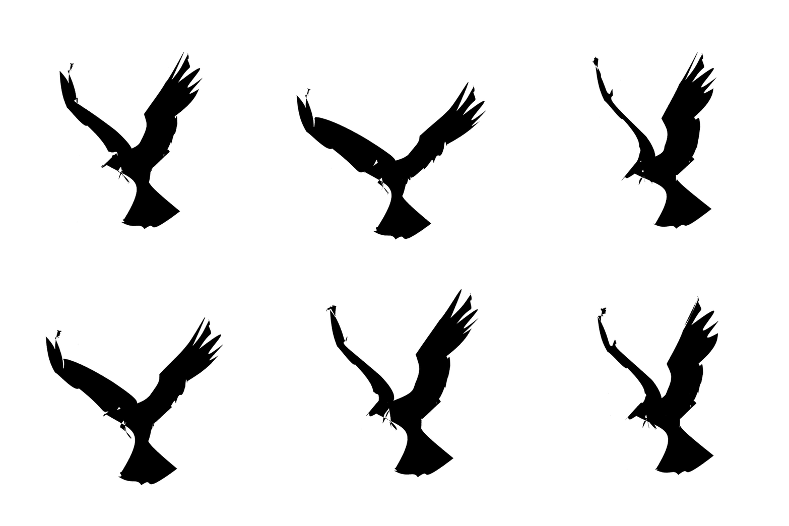
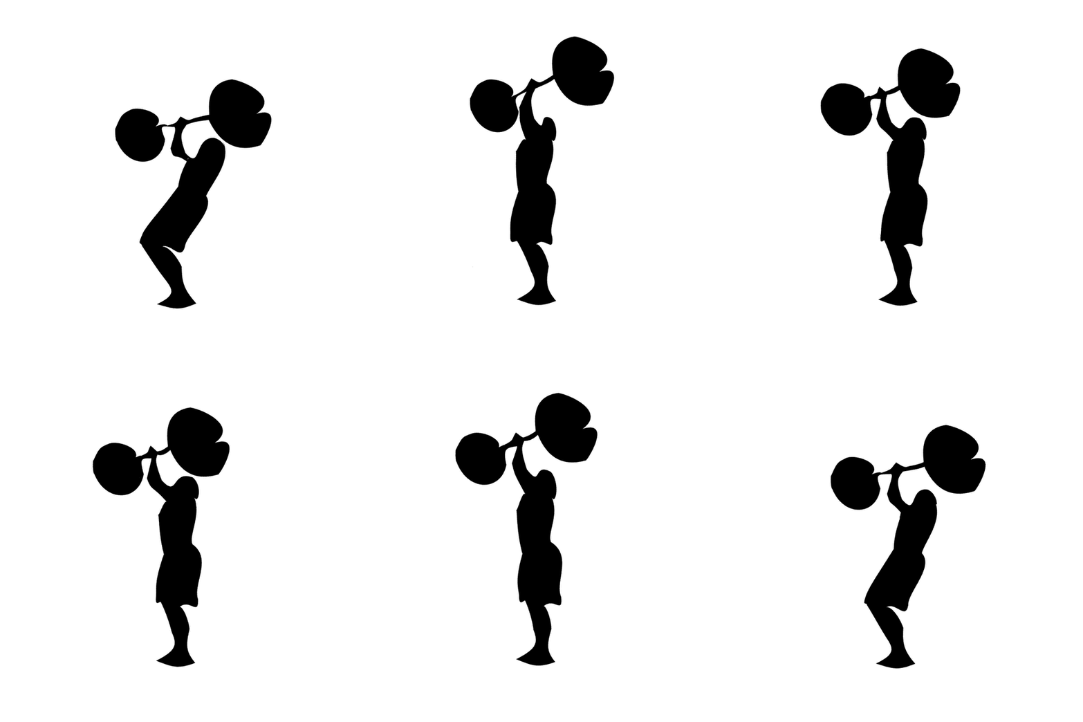
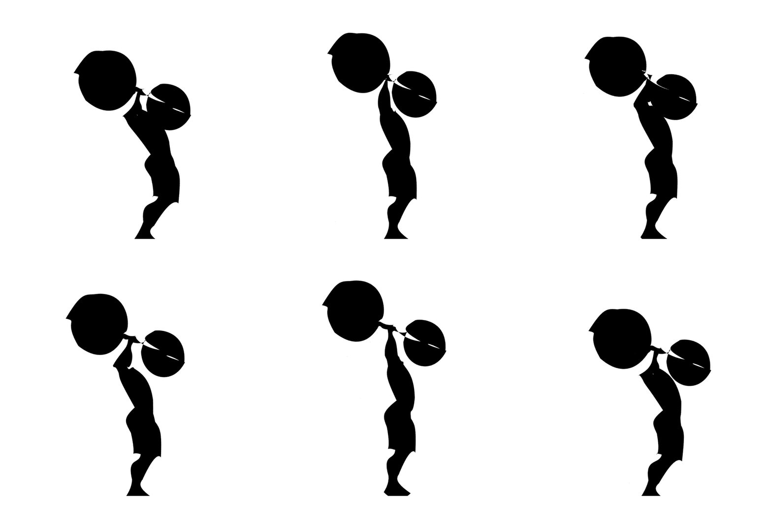
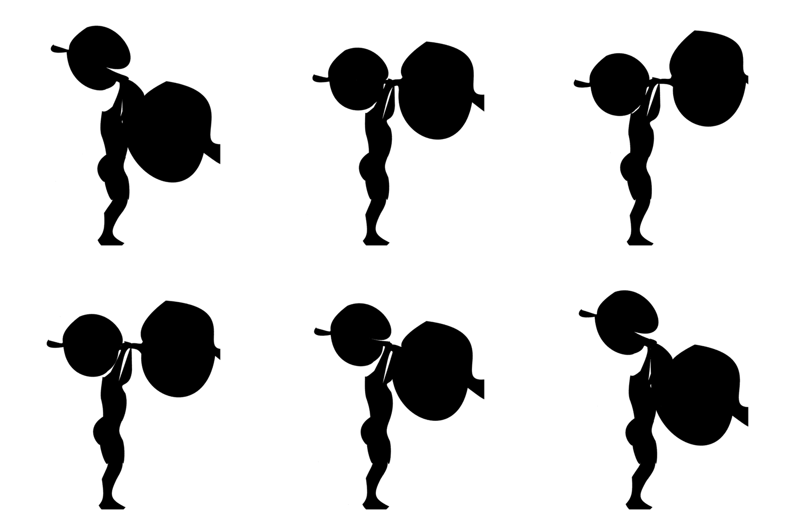
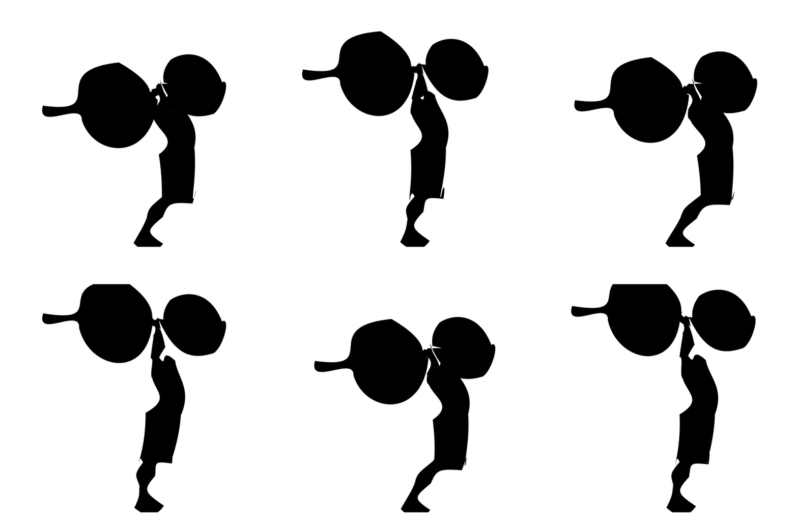
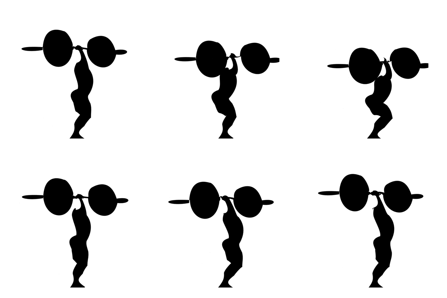
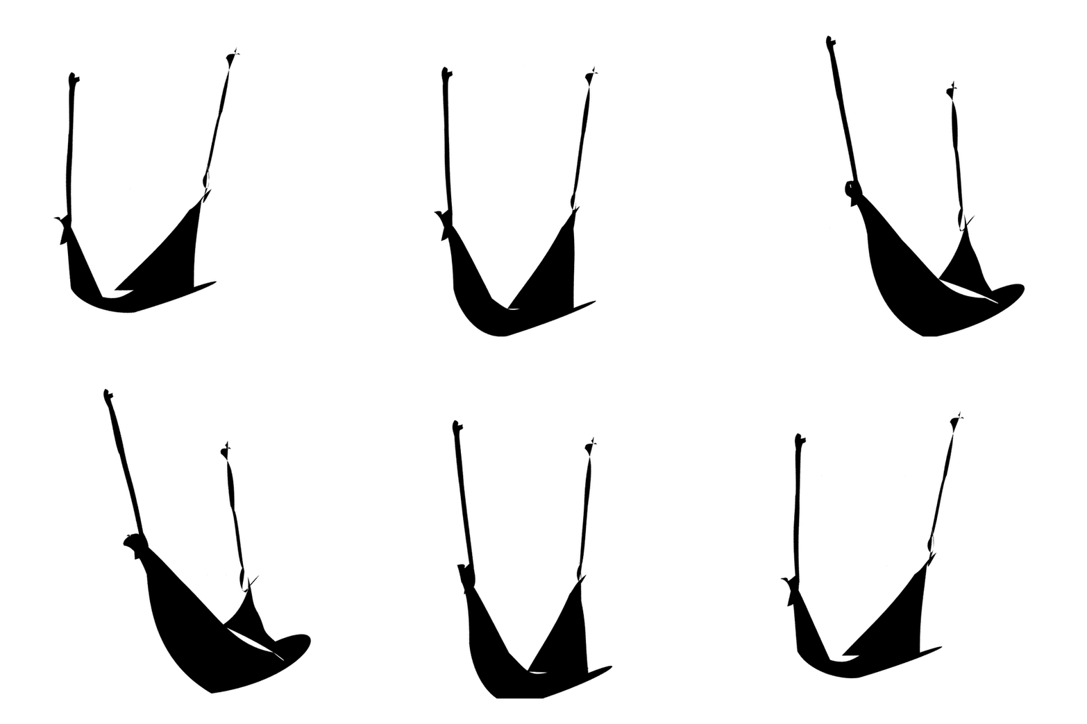
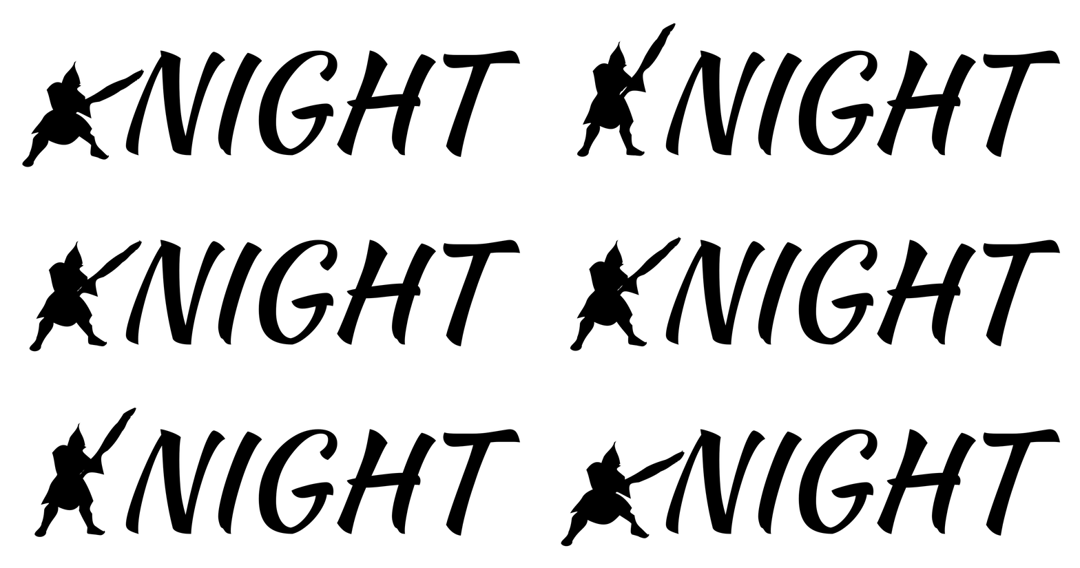
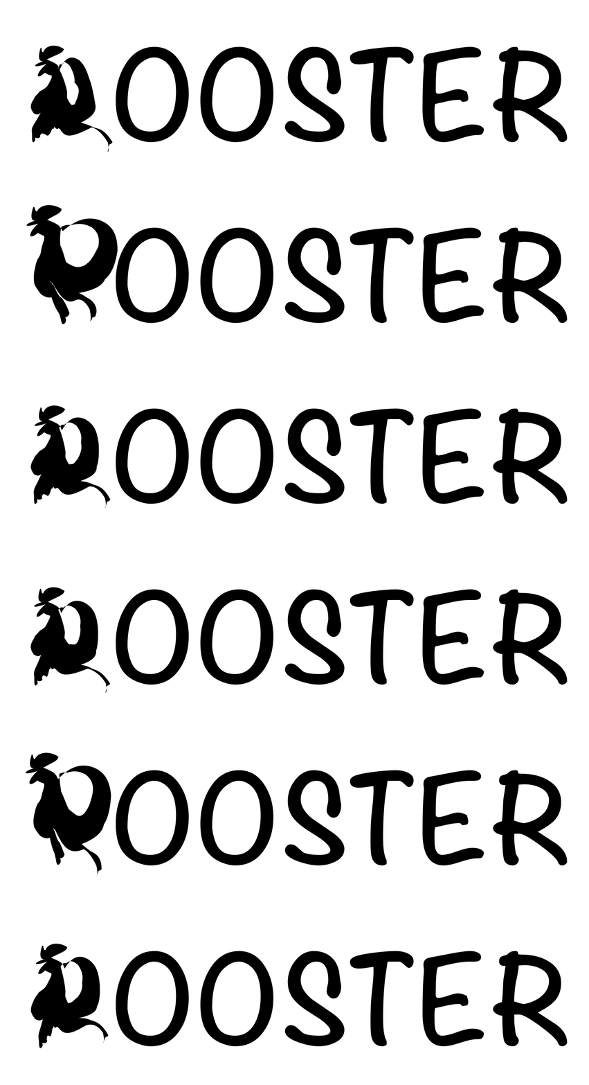
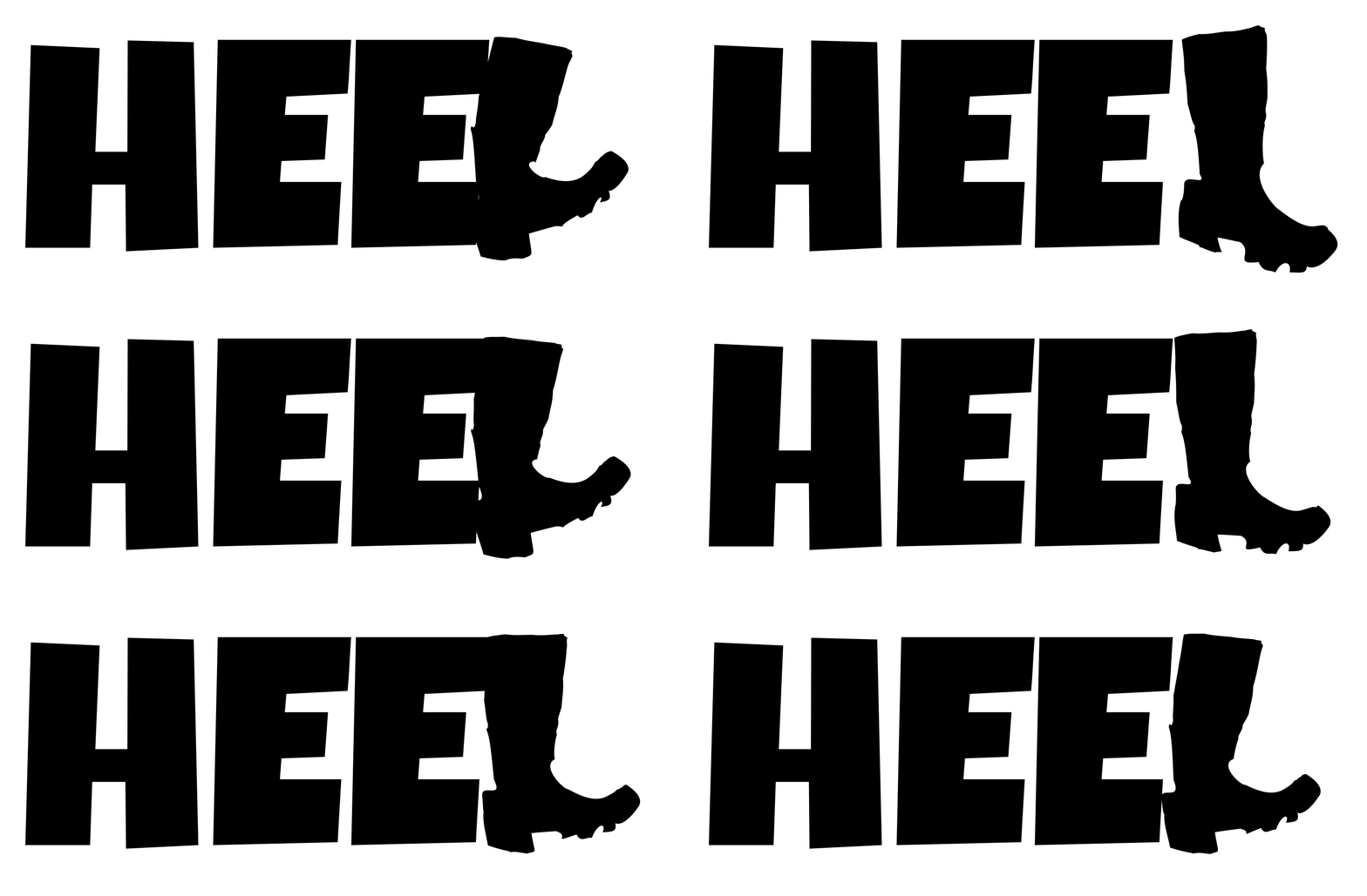
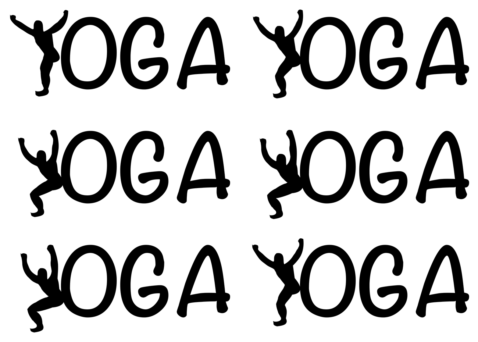
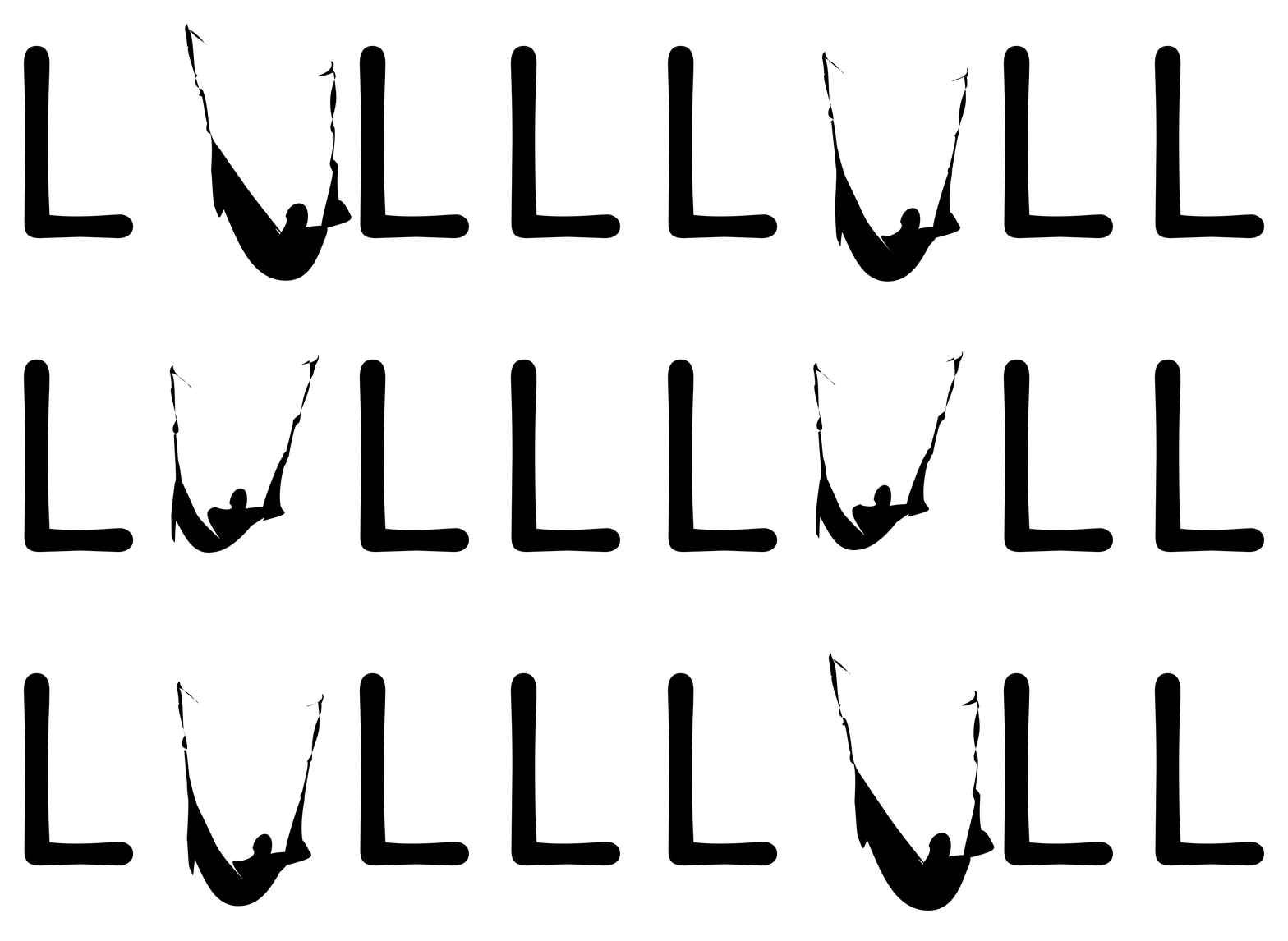
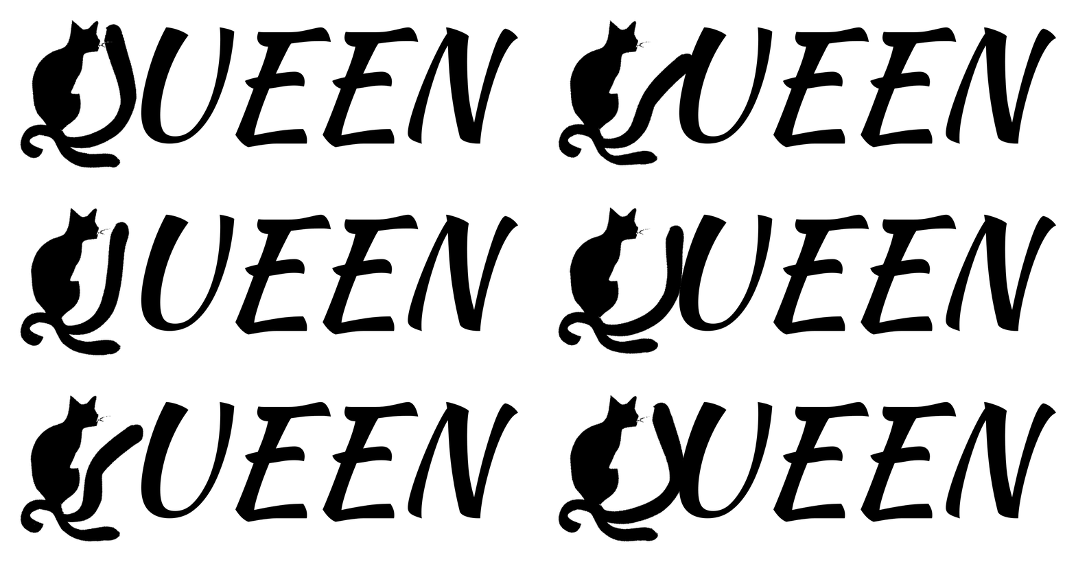
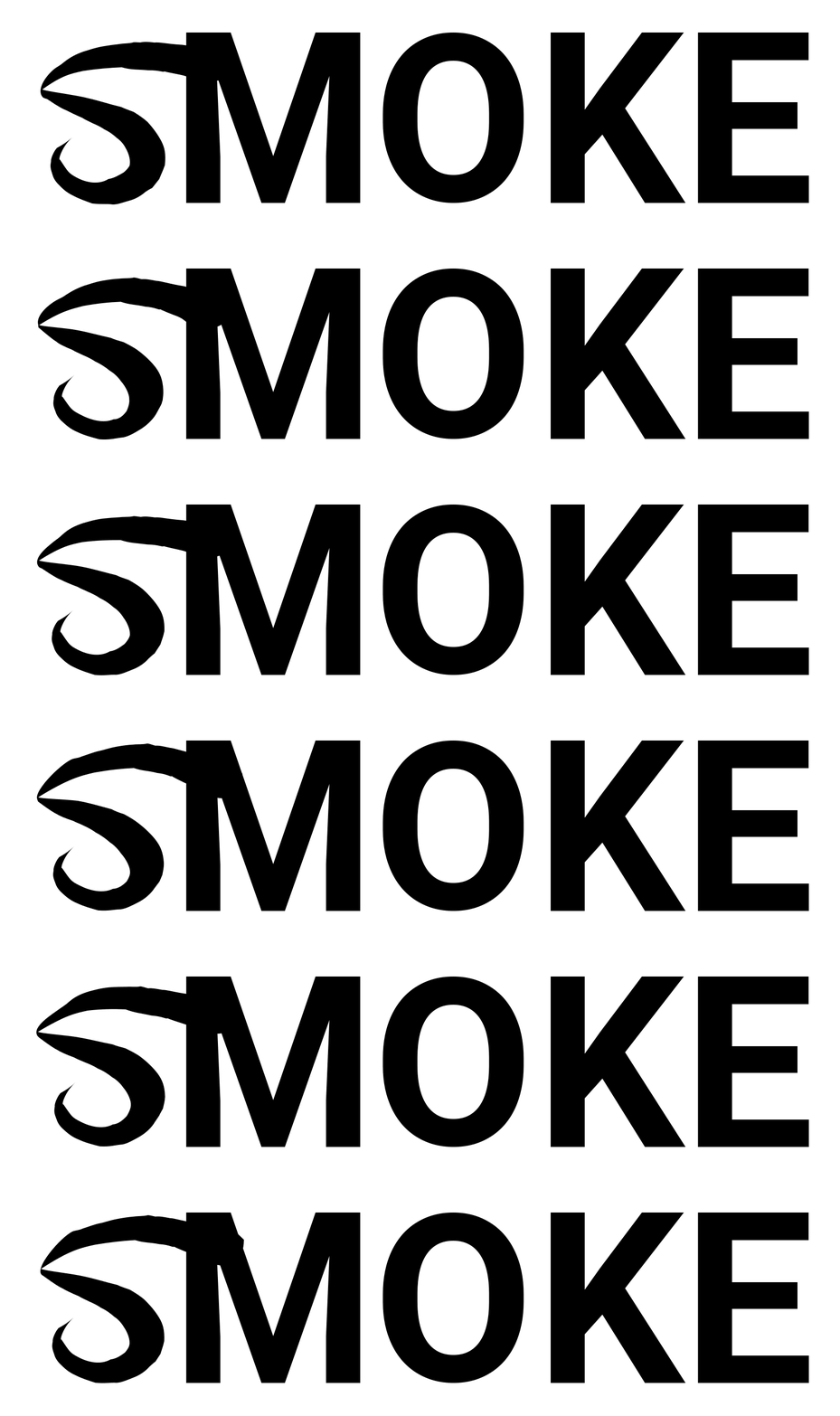
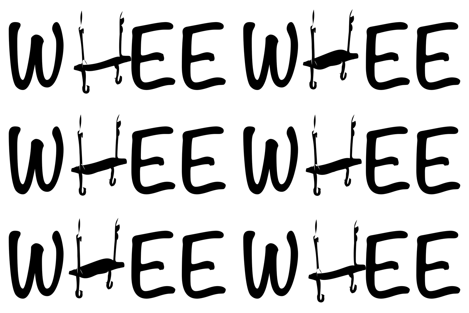
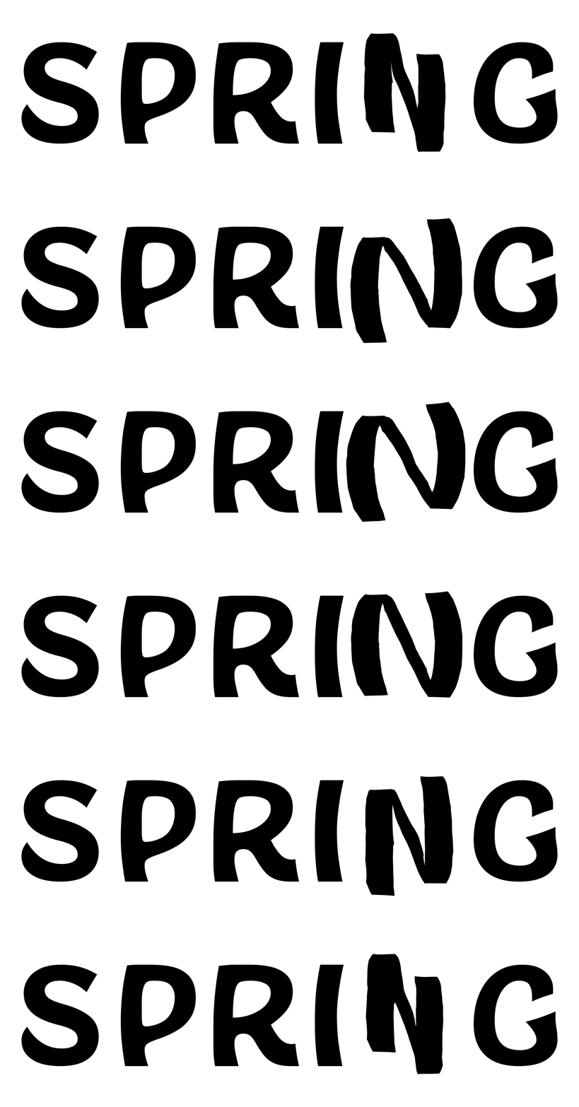
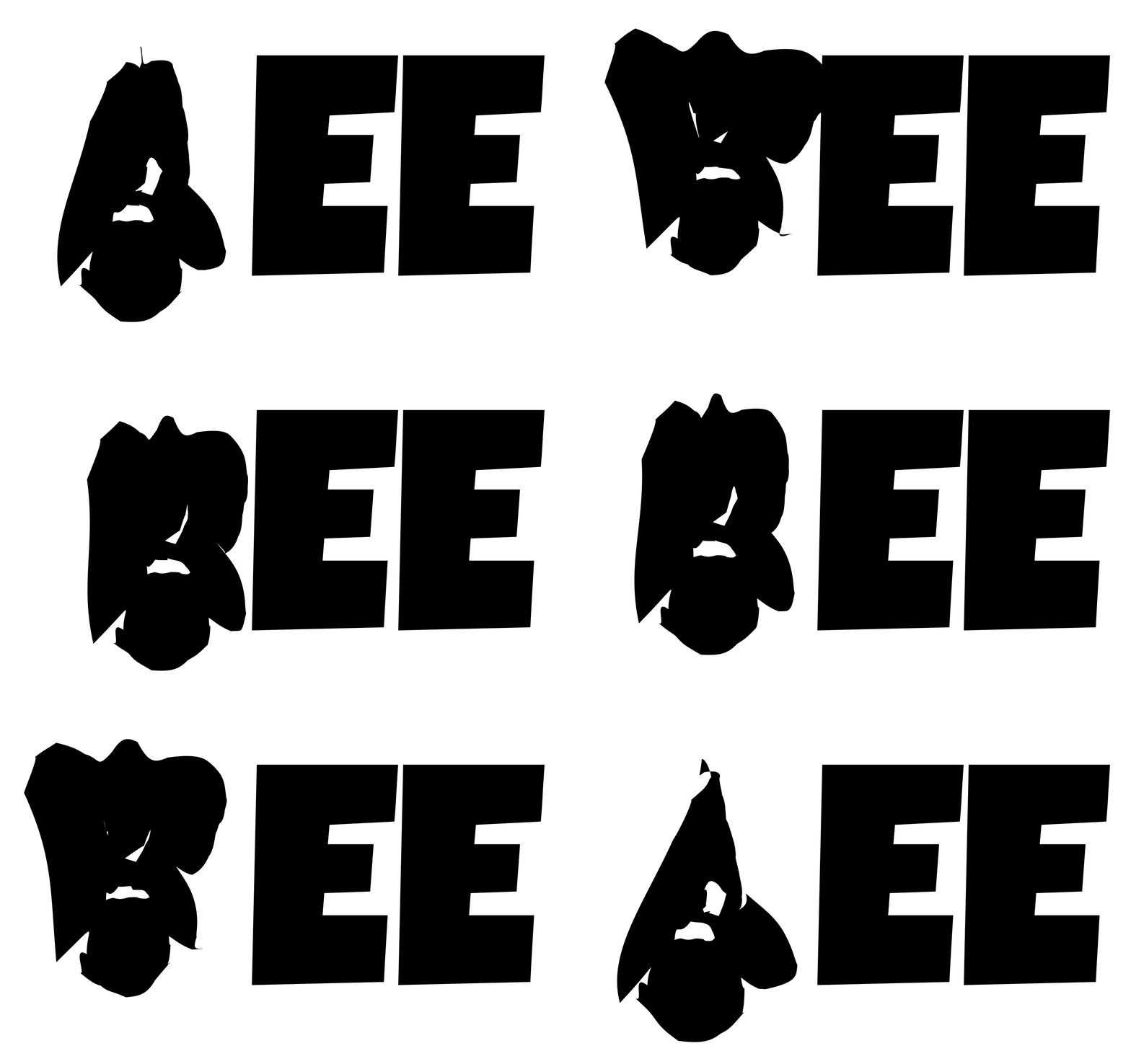
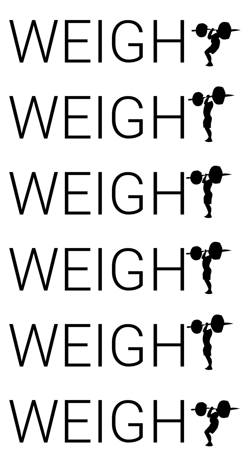
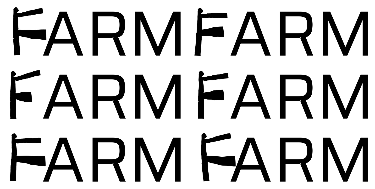
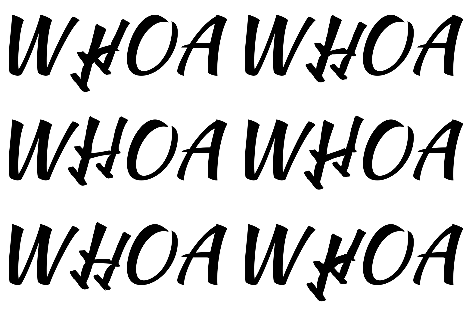
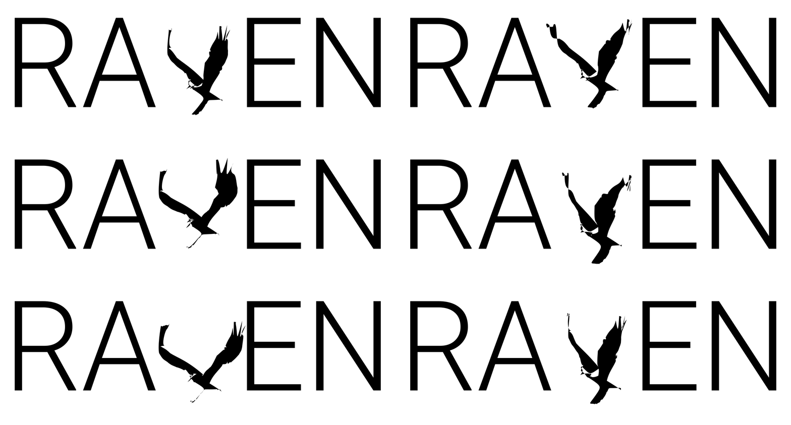
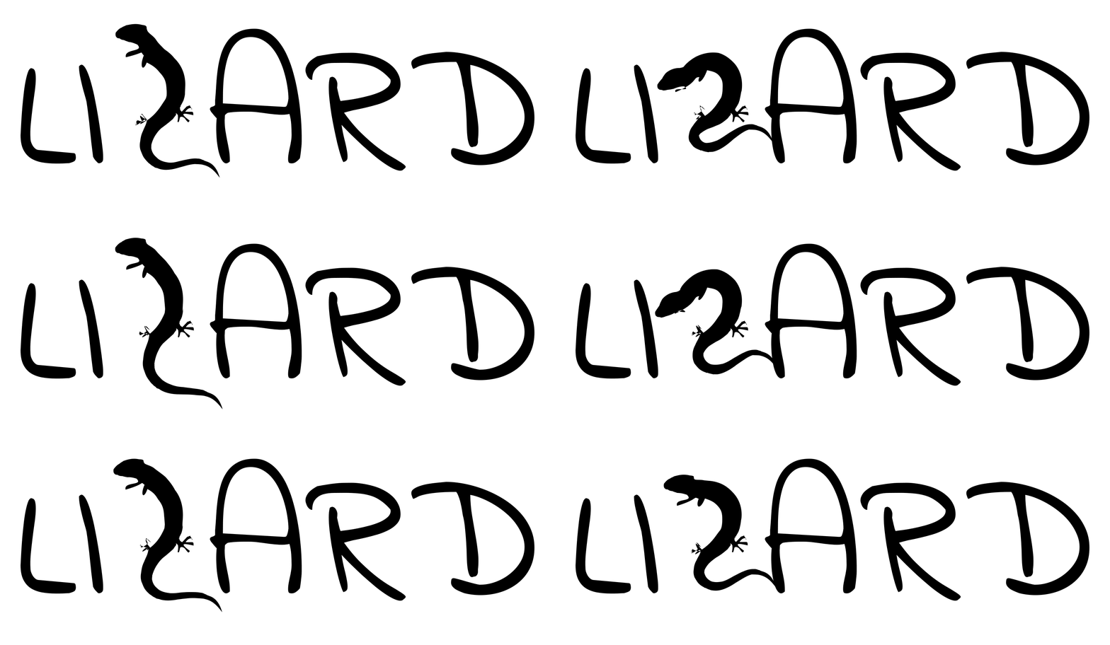
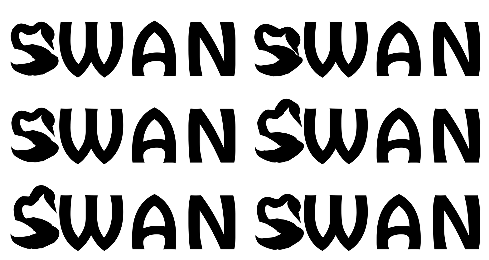
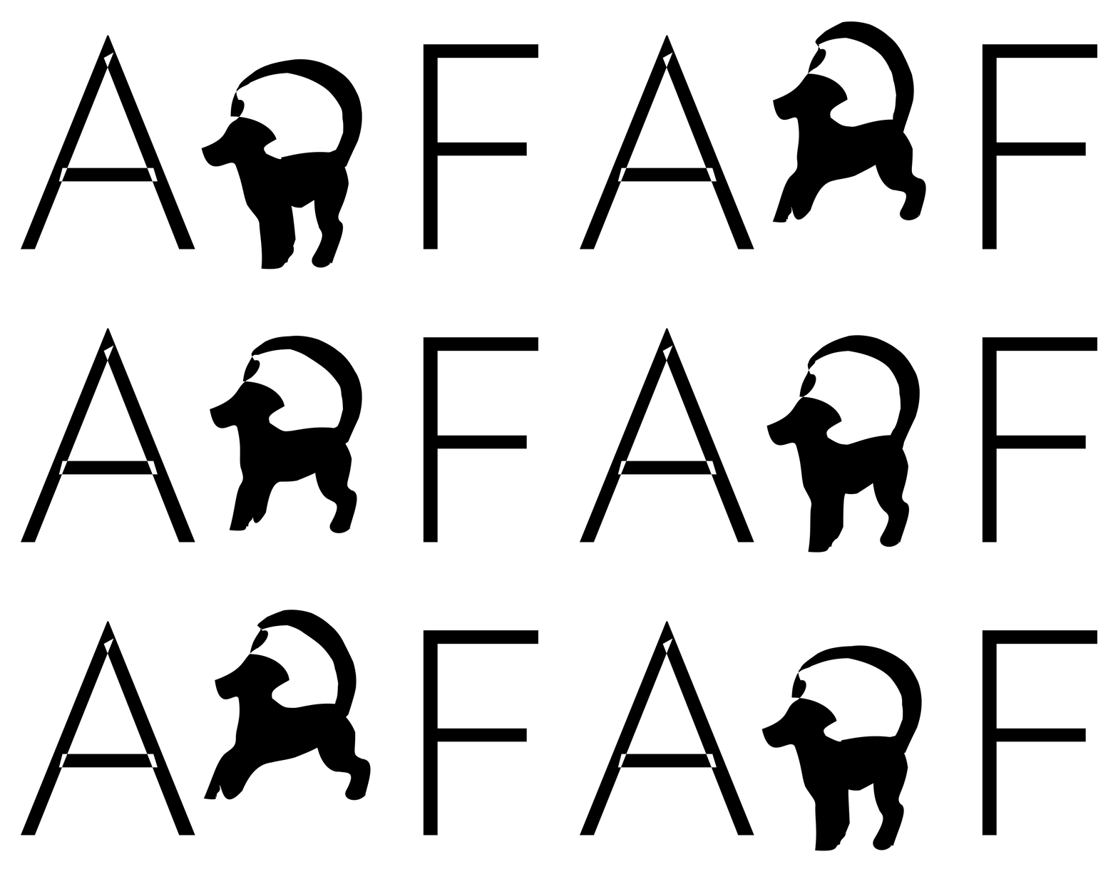
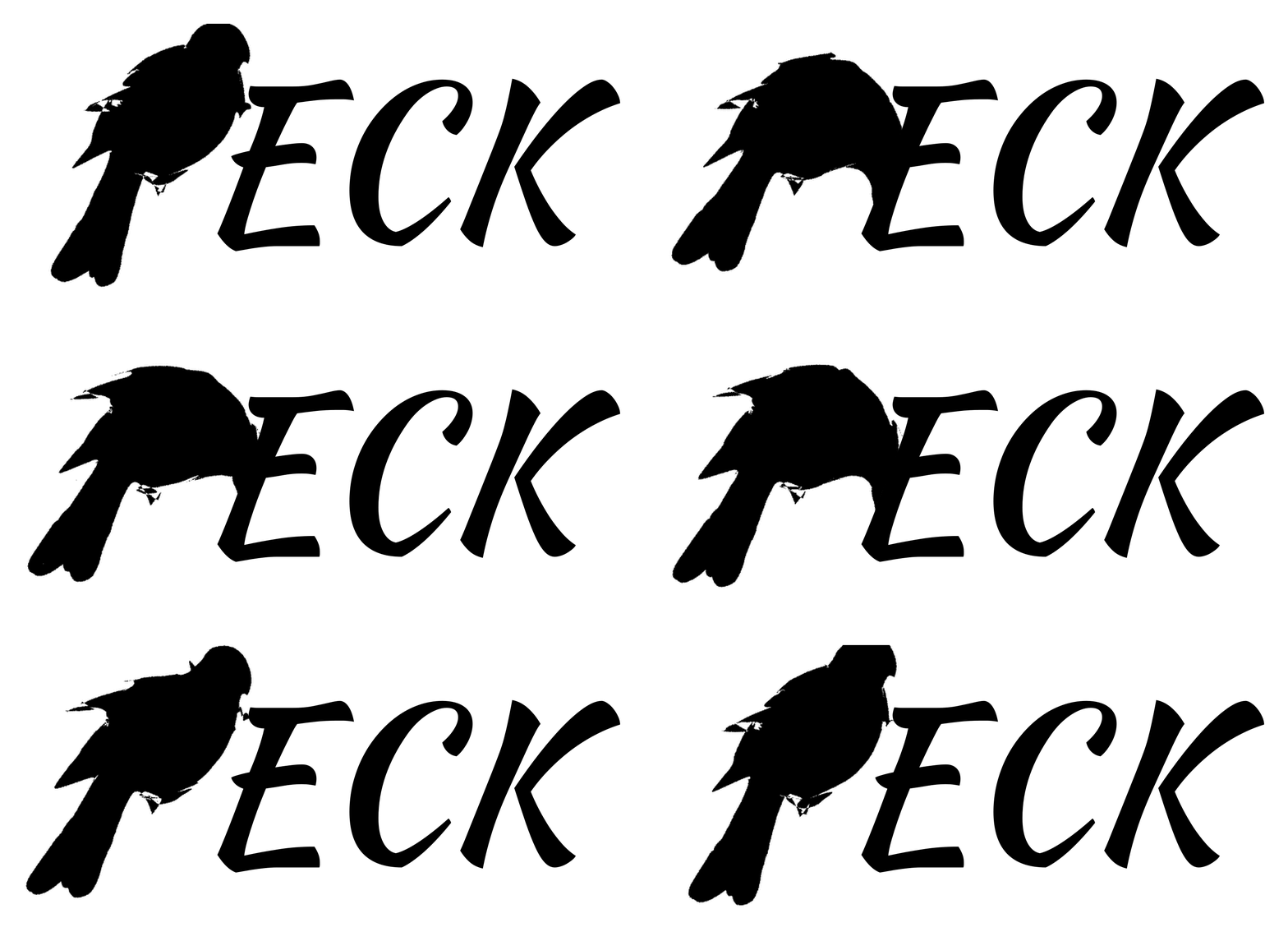
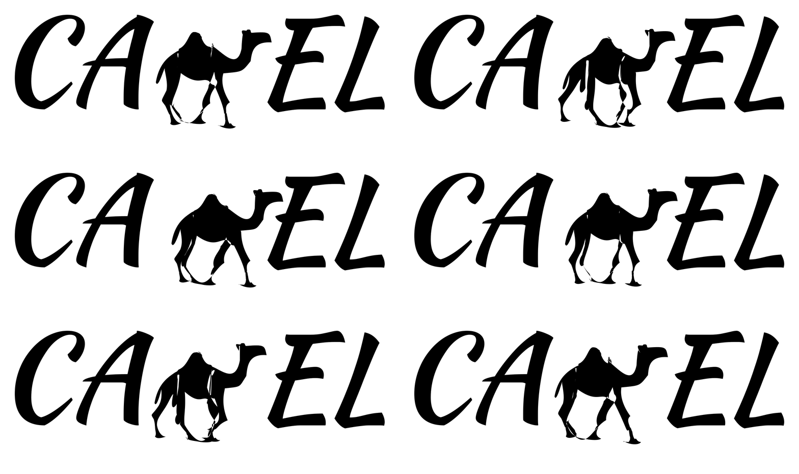
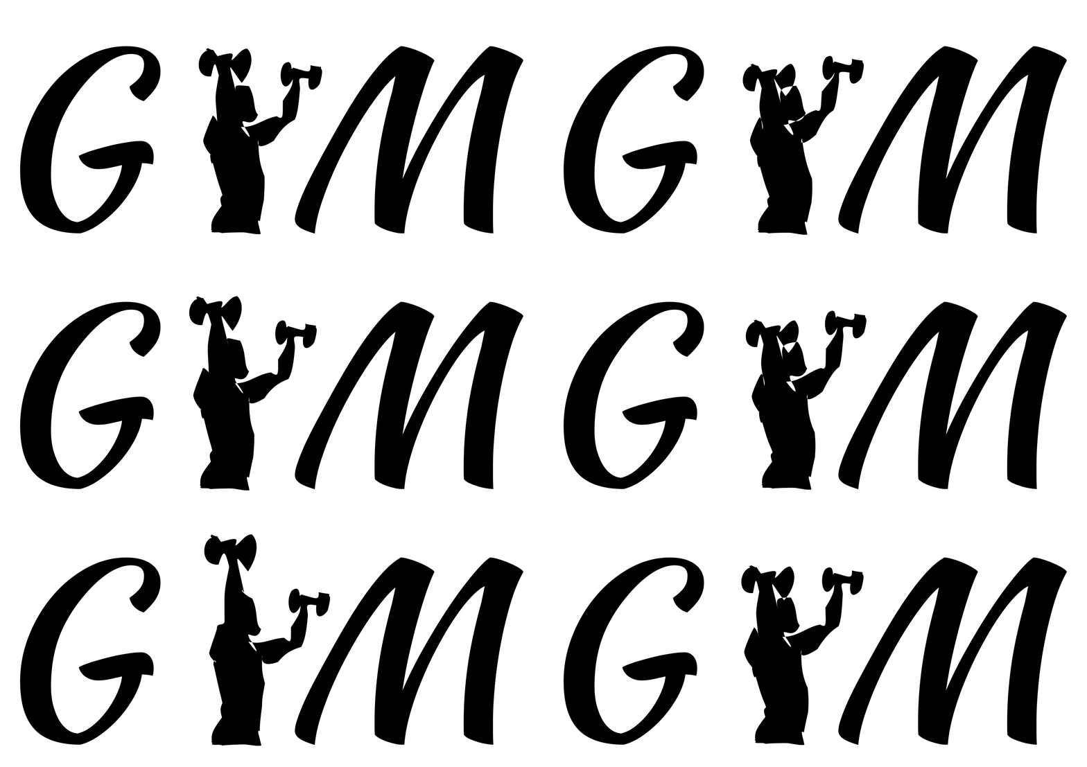
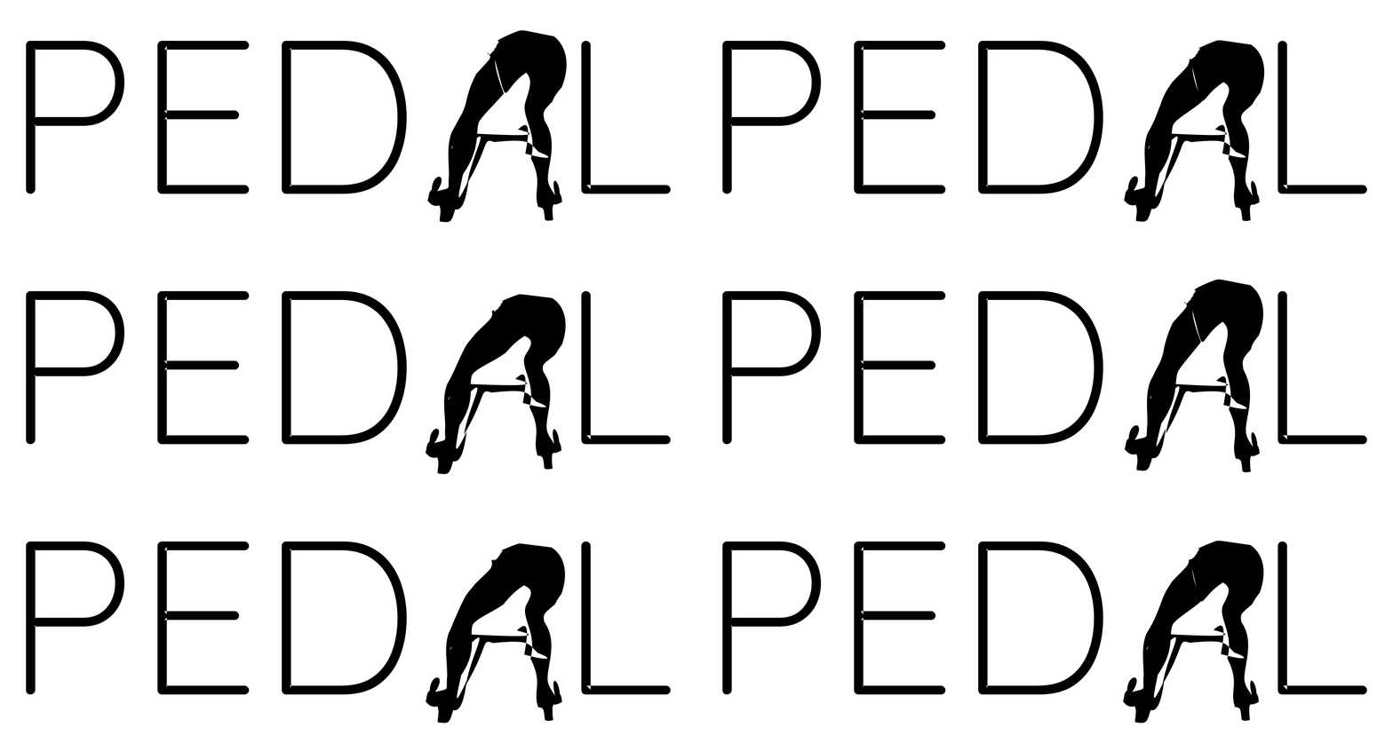
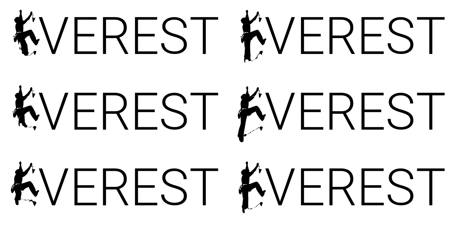
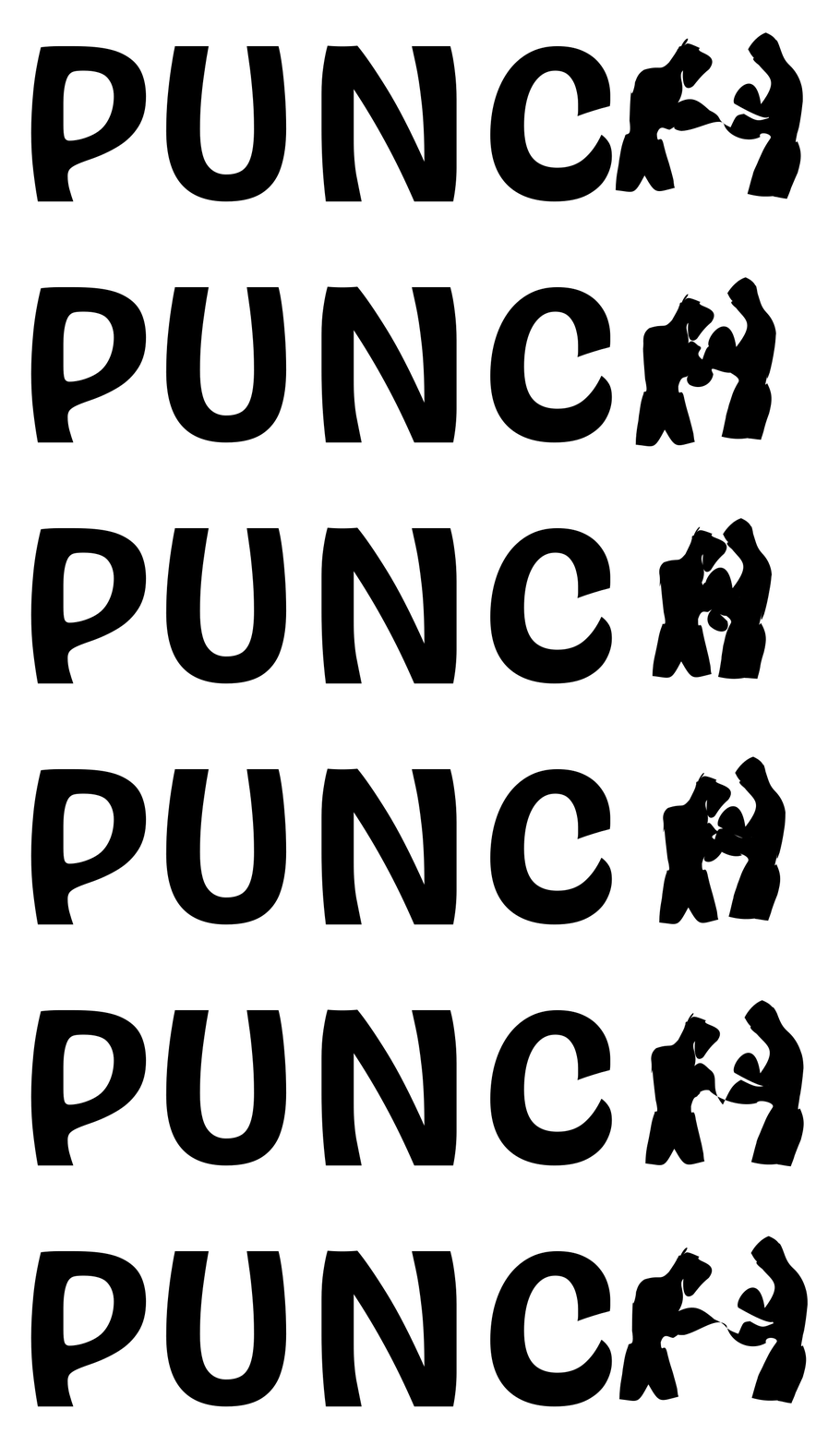
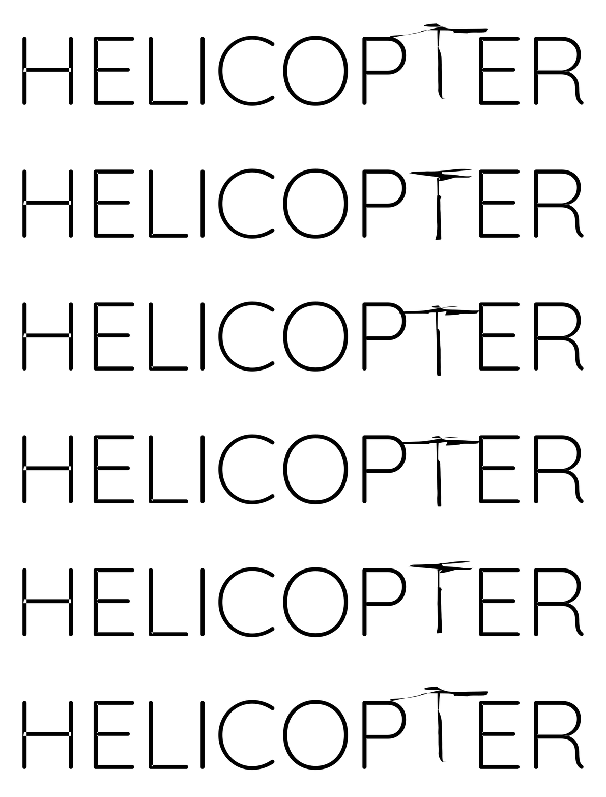
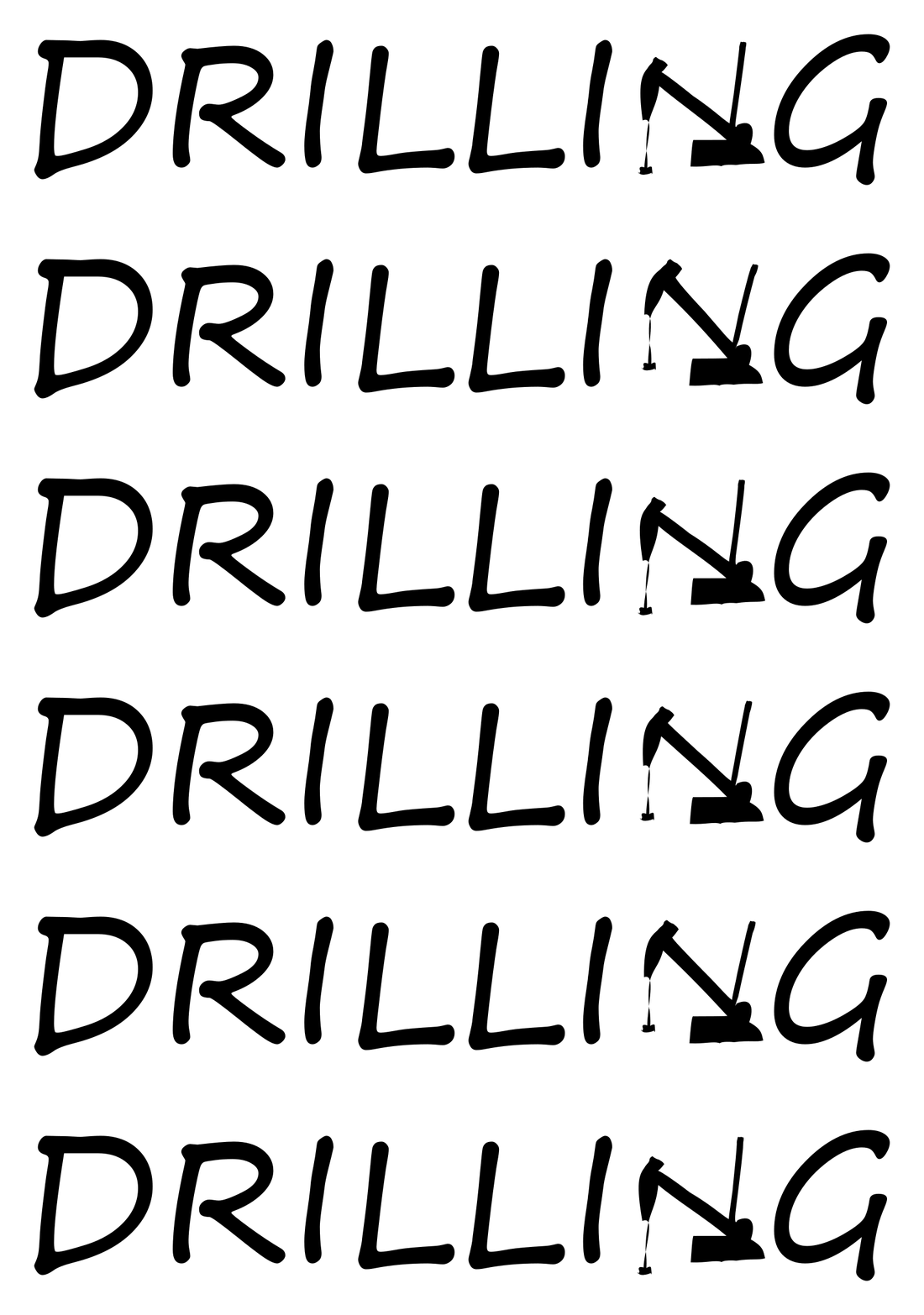
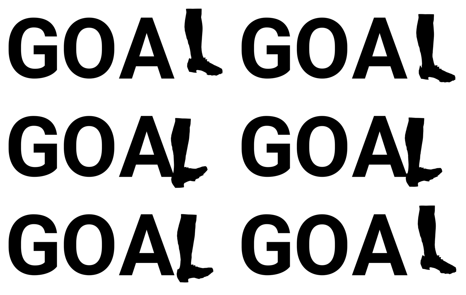
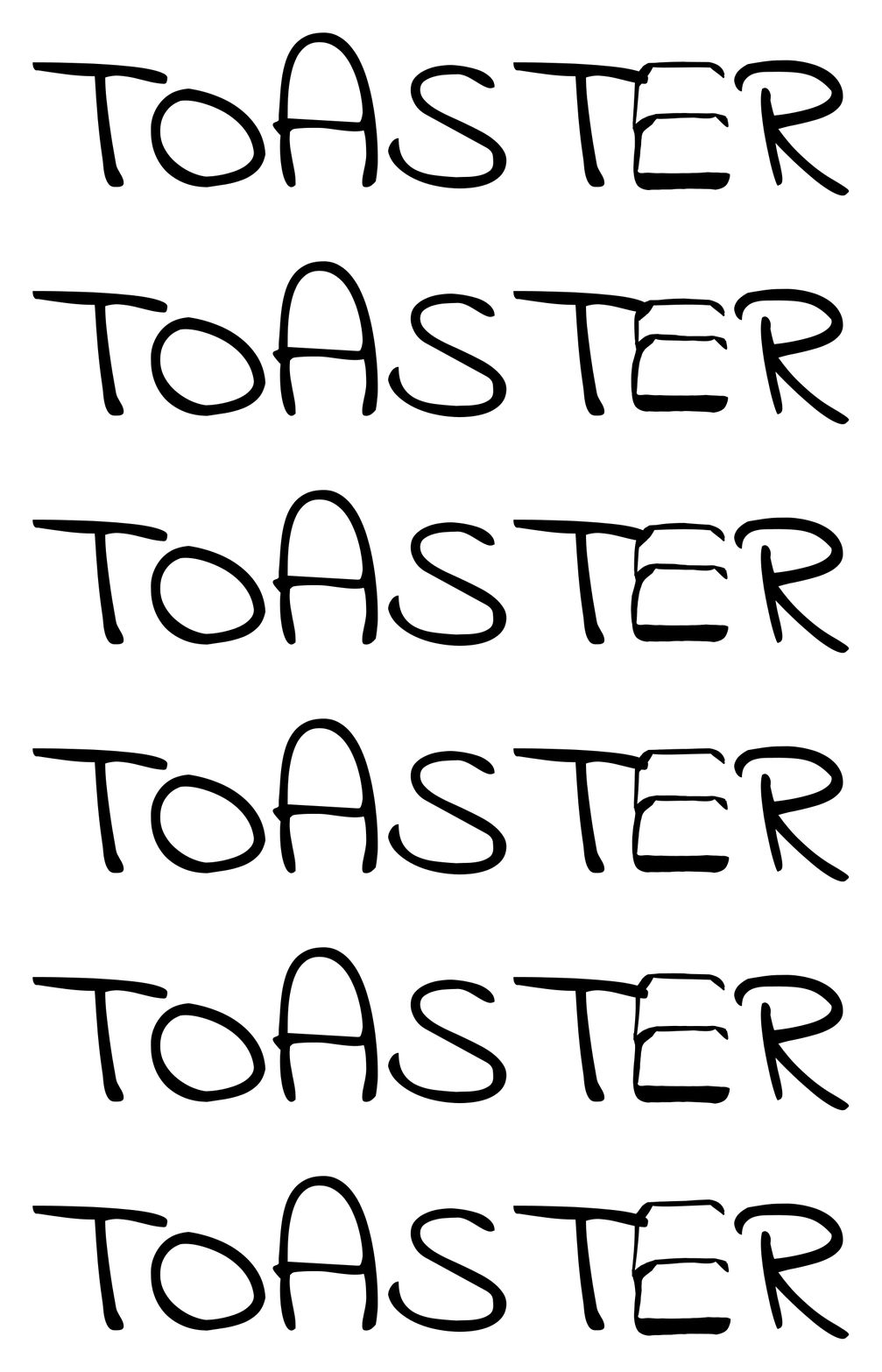
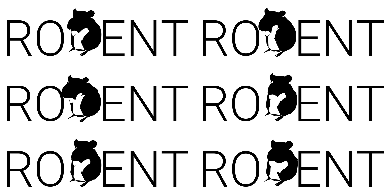
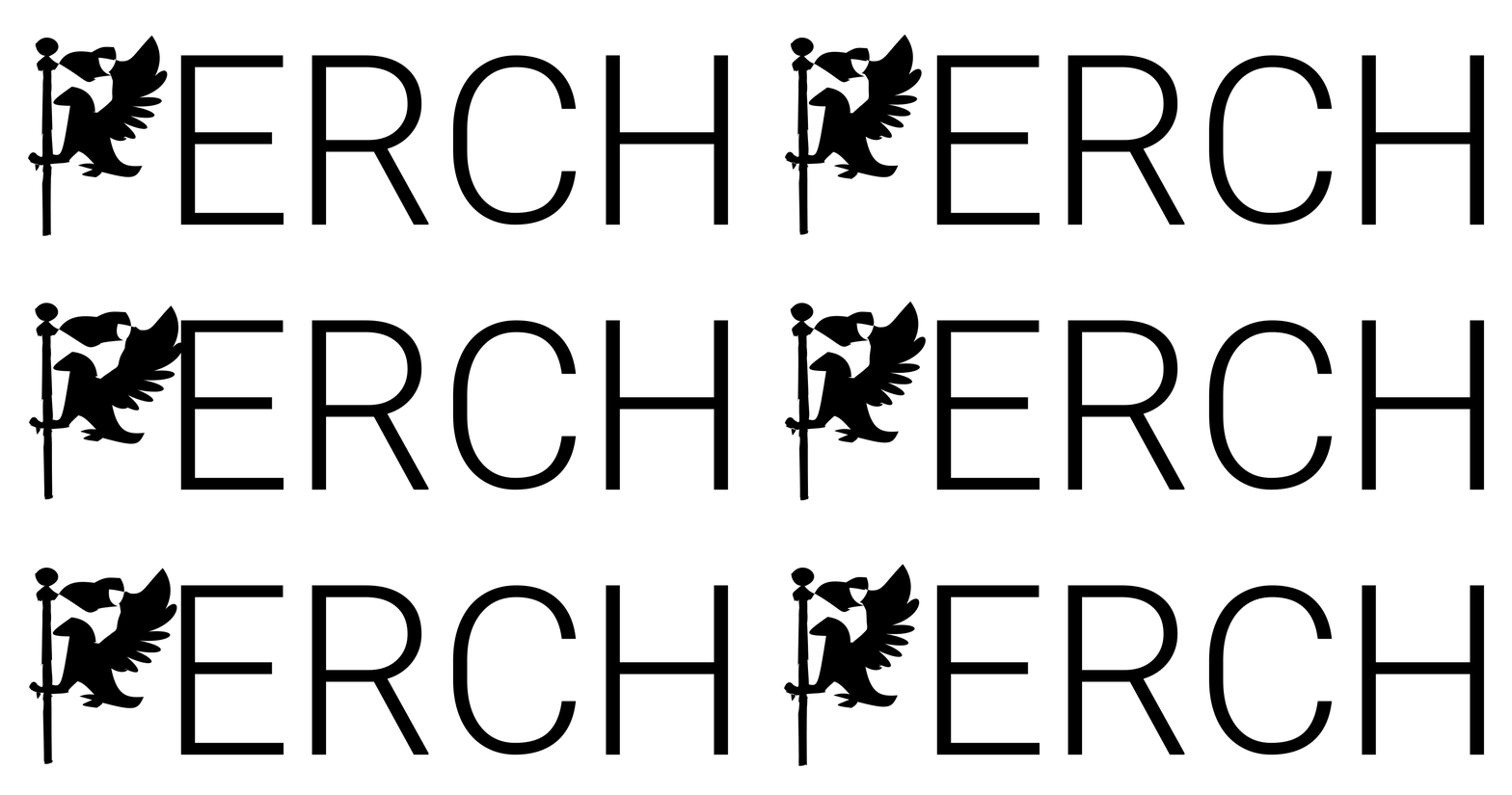
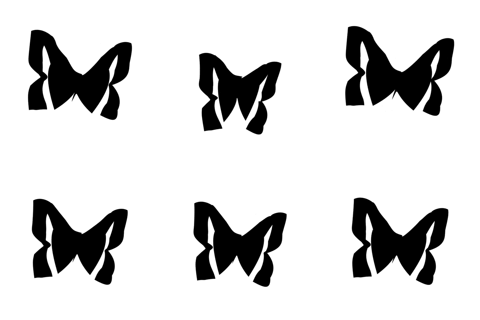
In the results below, the word around each animated letter is there to give the concept a context; it is not necessarily a part of the prompt. Every result animates a single letter, driven by that letter’s caption alone. The remaining letters are ordinary static type, set in the same typeface.
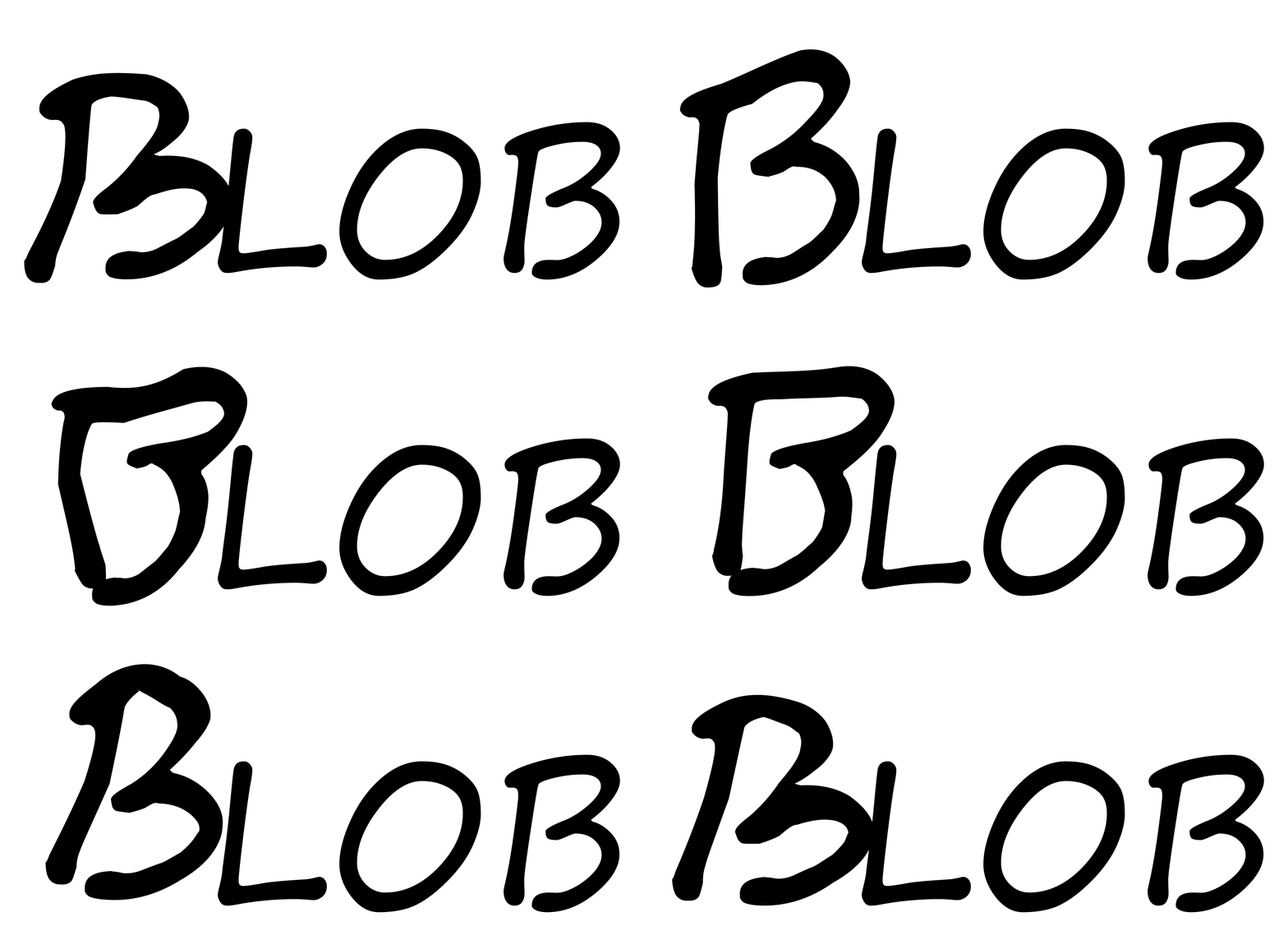
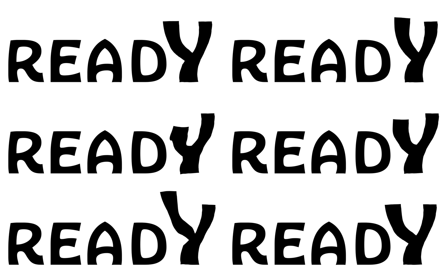
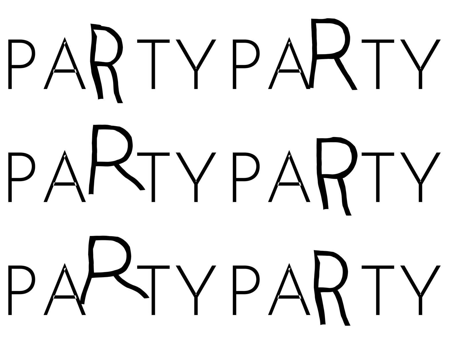
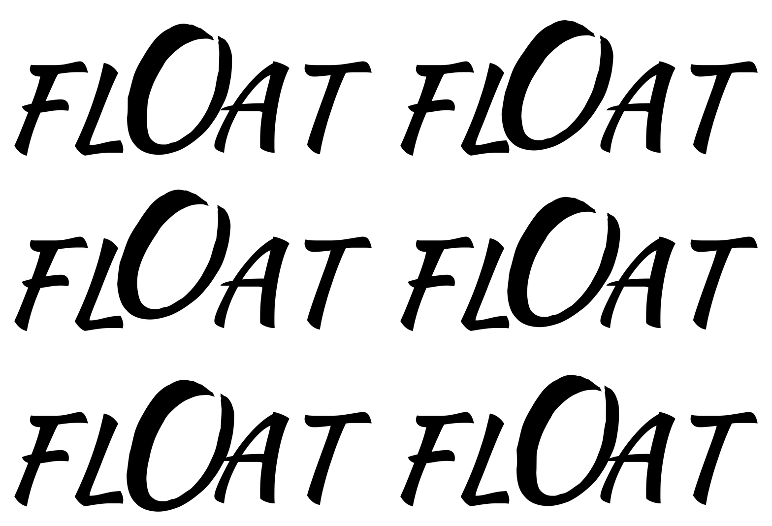
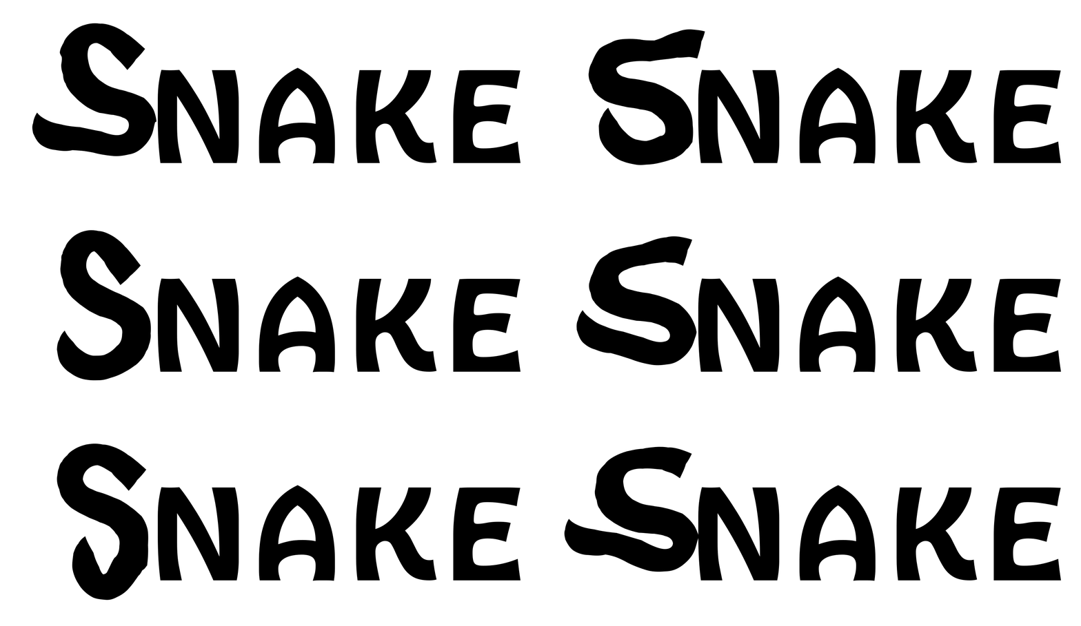
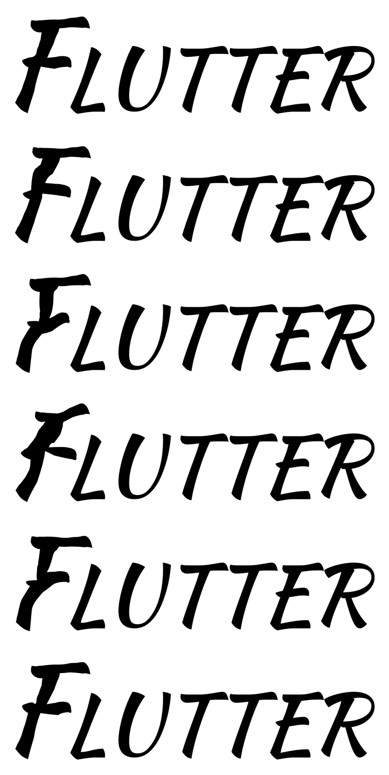
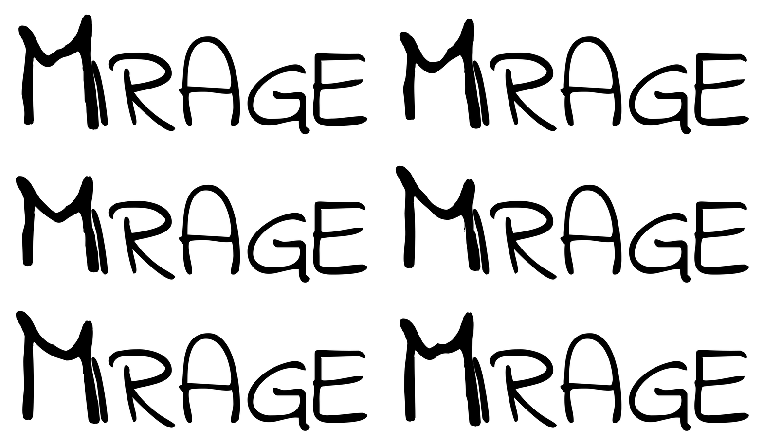
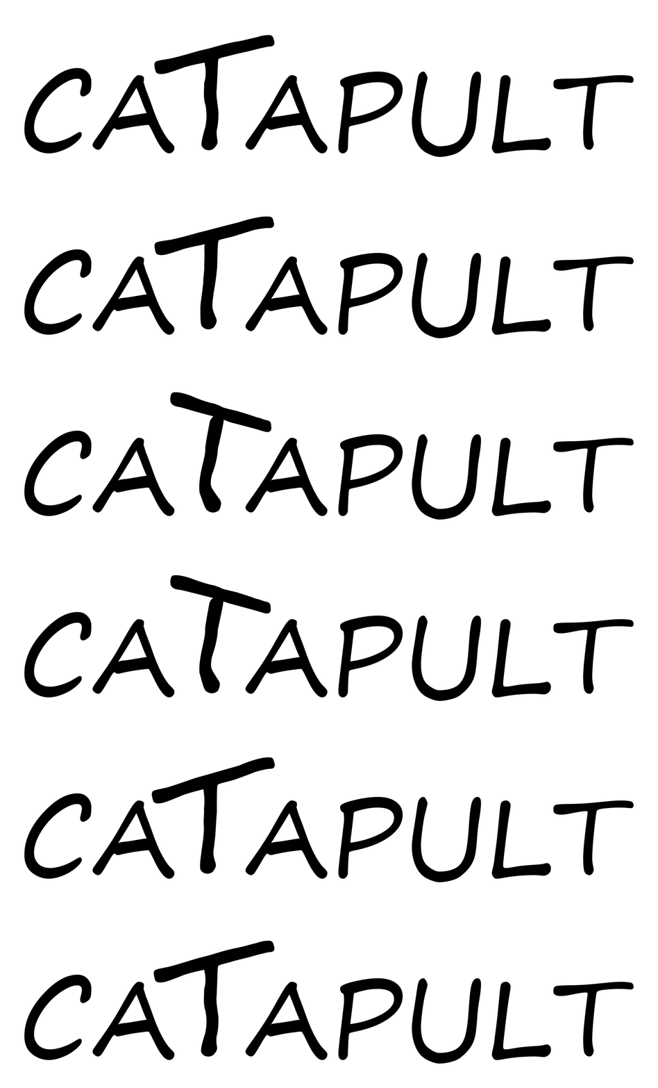
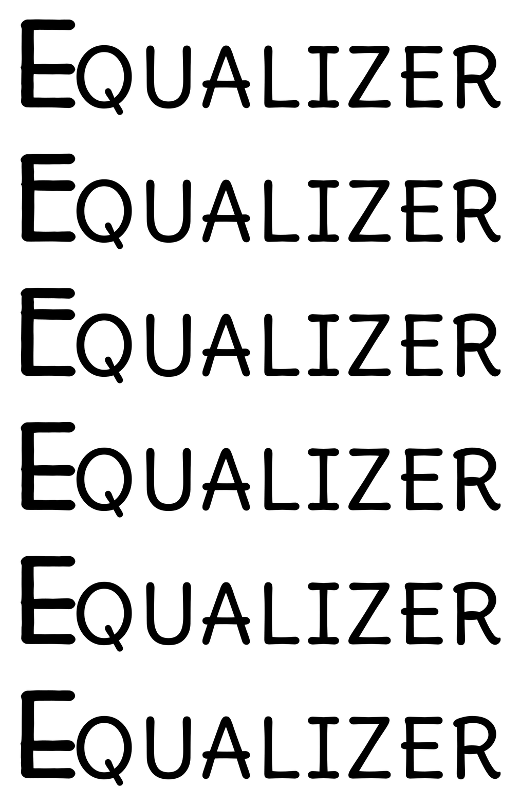
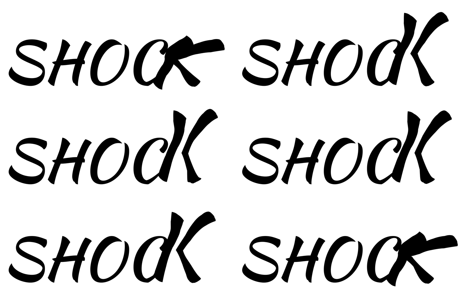
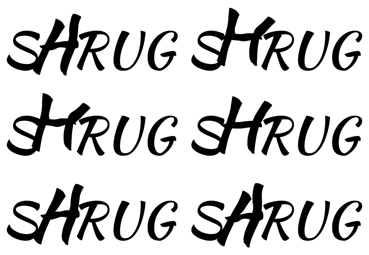
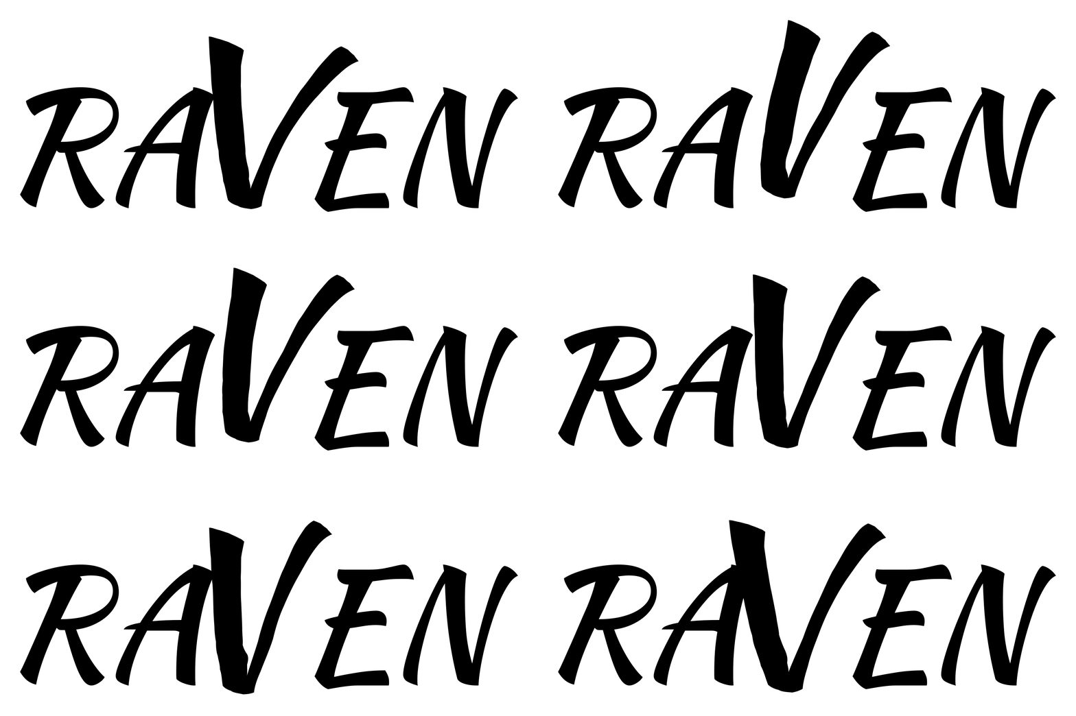
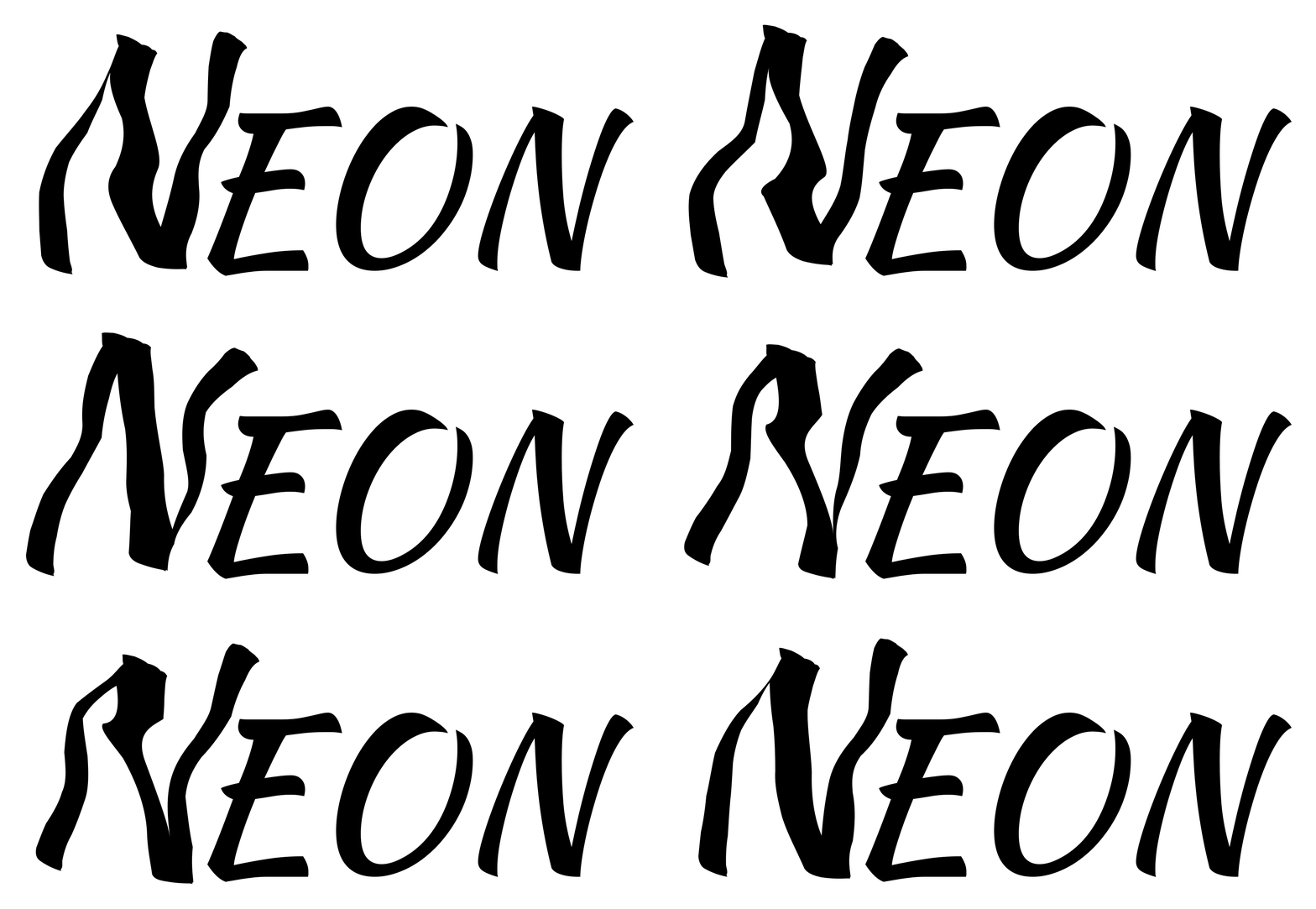
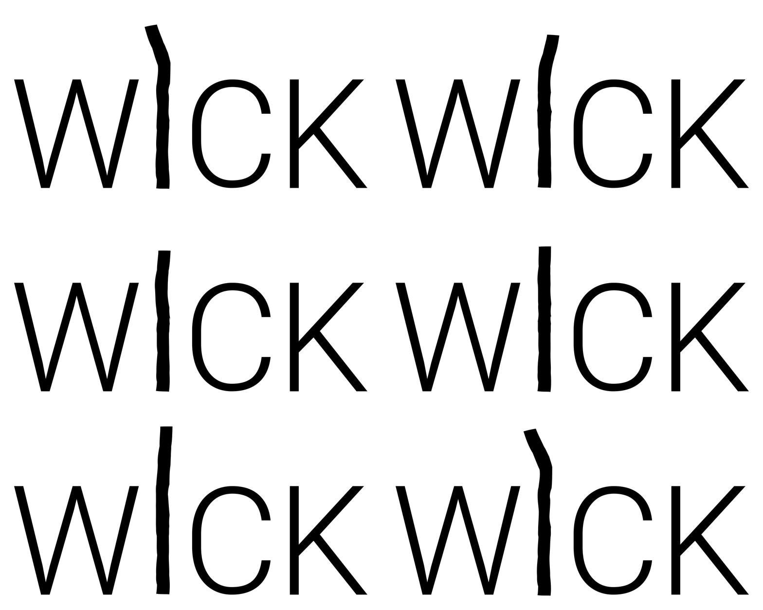
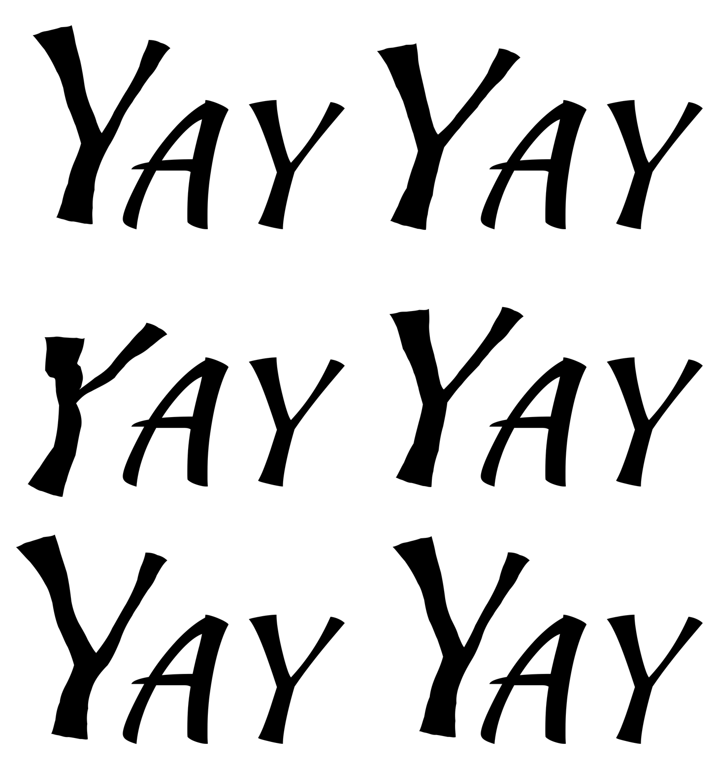
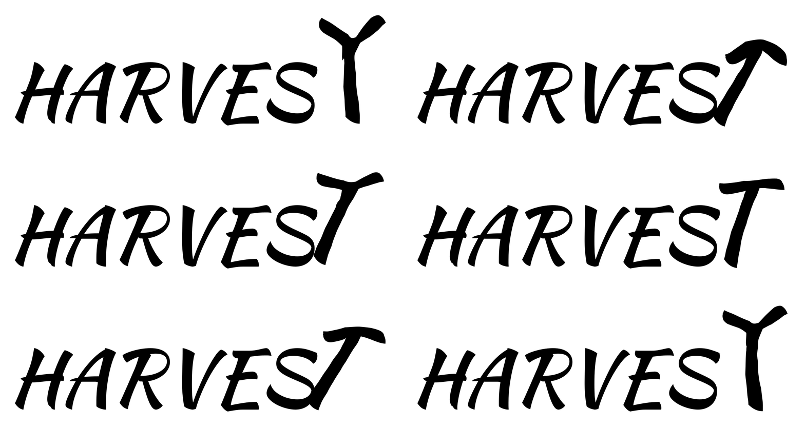
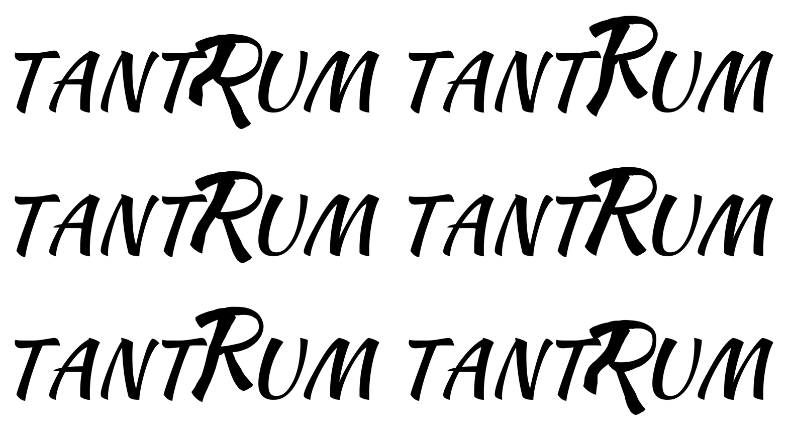
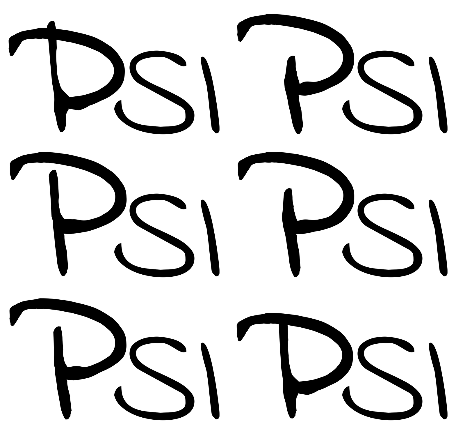
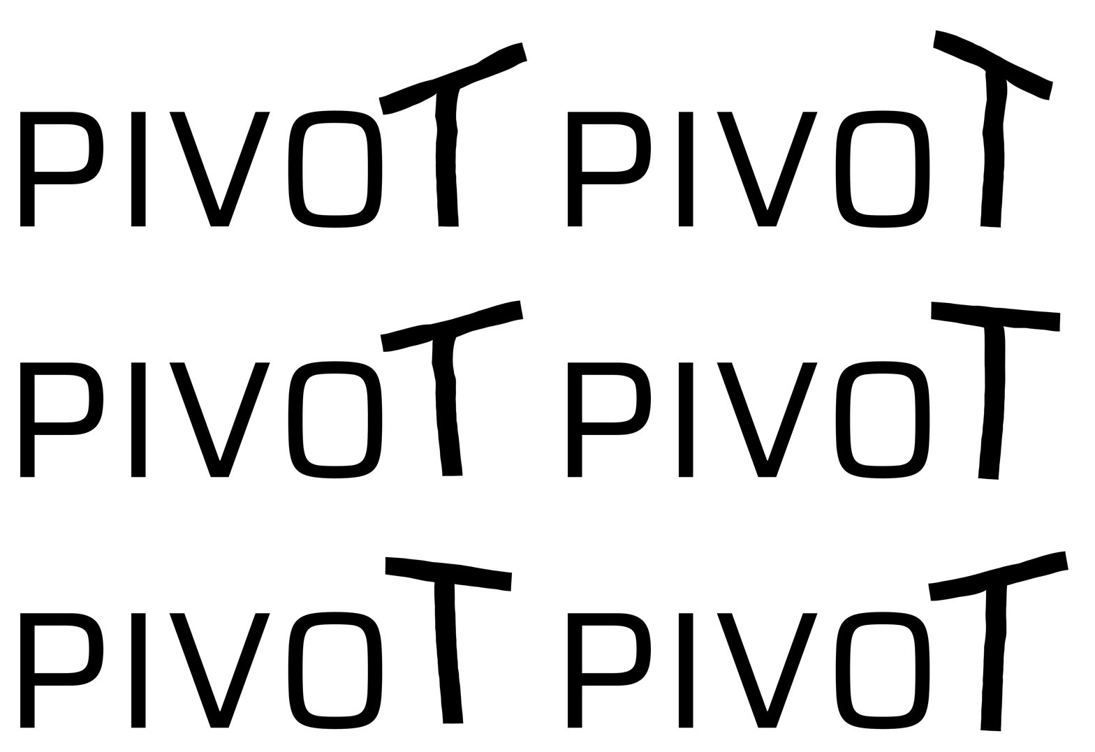
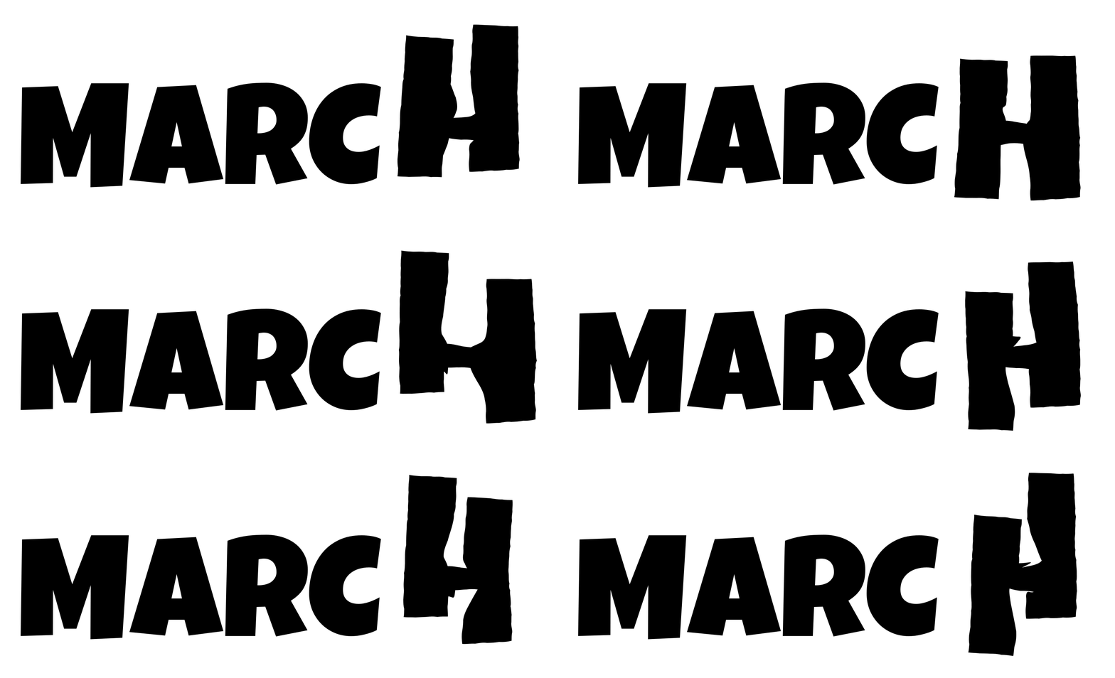
For Astra results we add the target letter and font in the prompt. Not every font is available to Astra, so it uses the closest one it has.
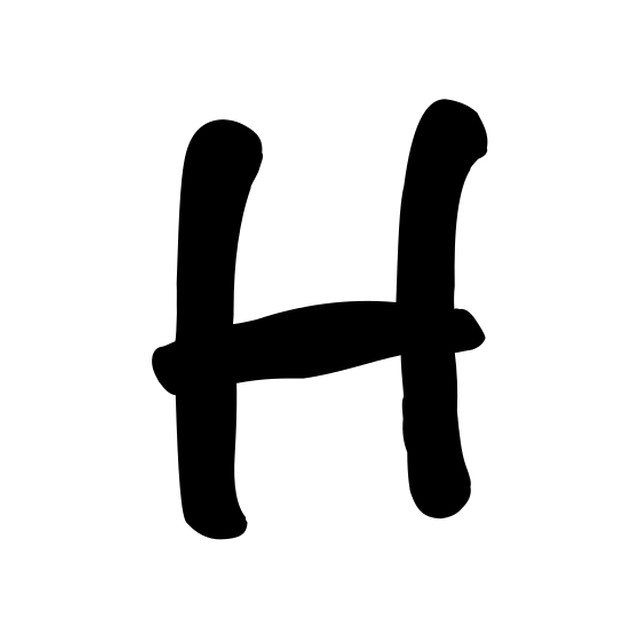
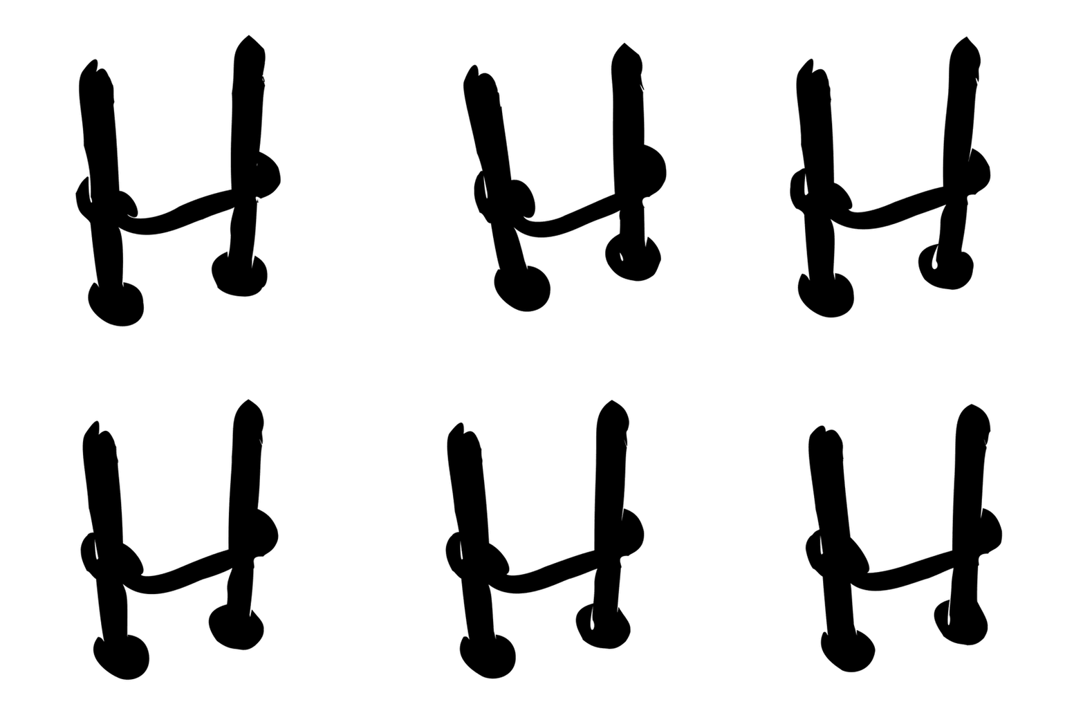
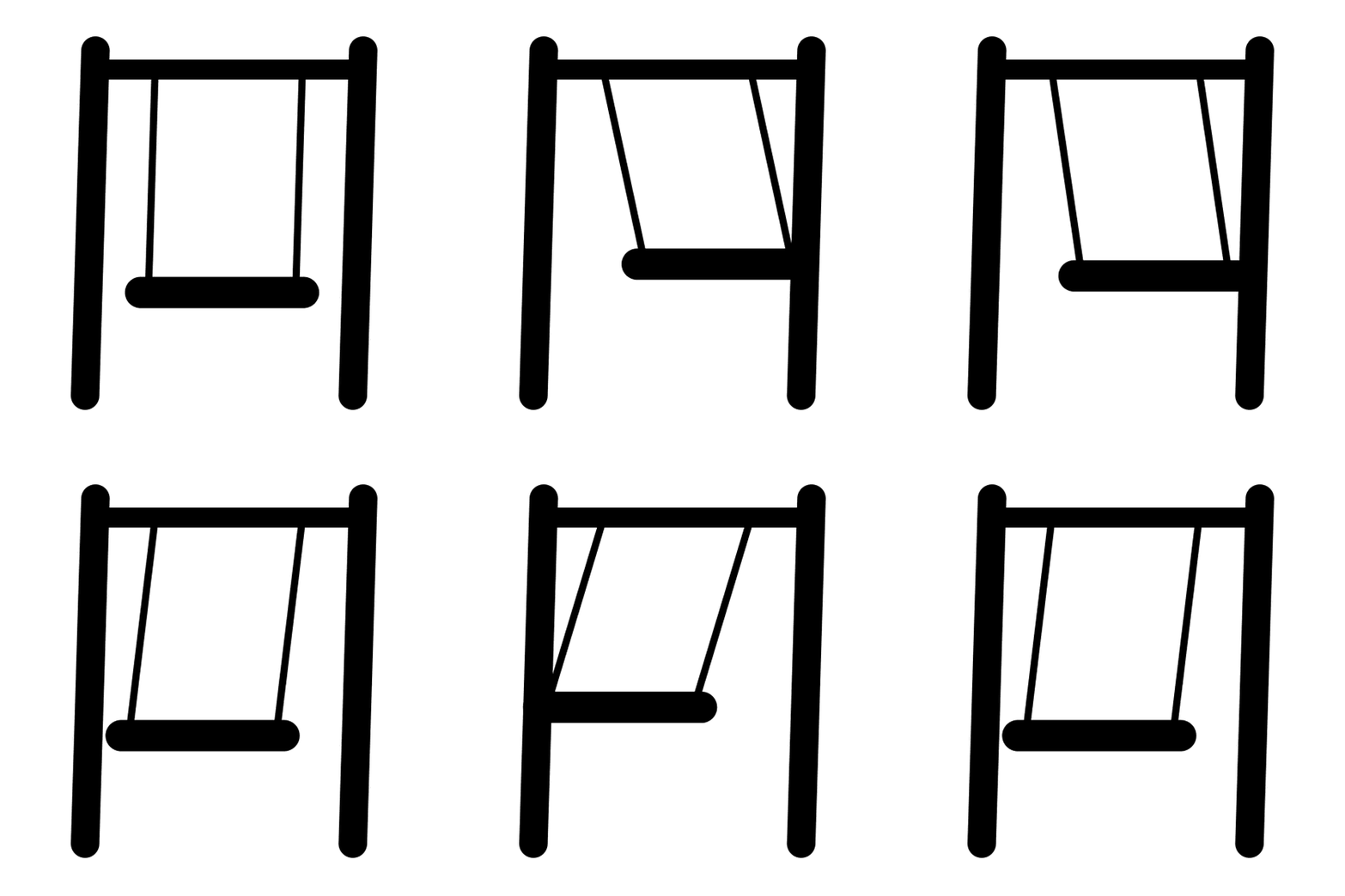
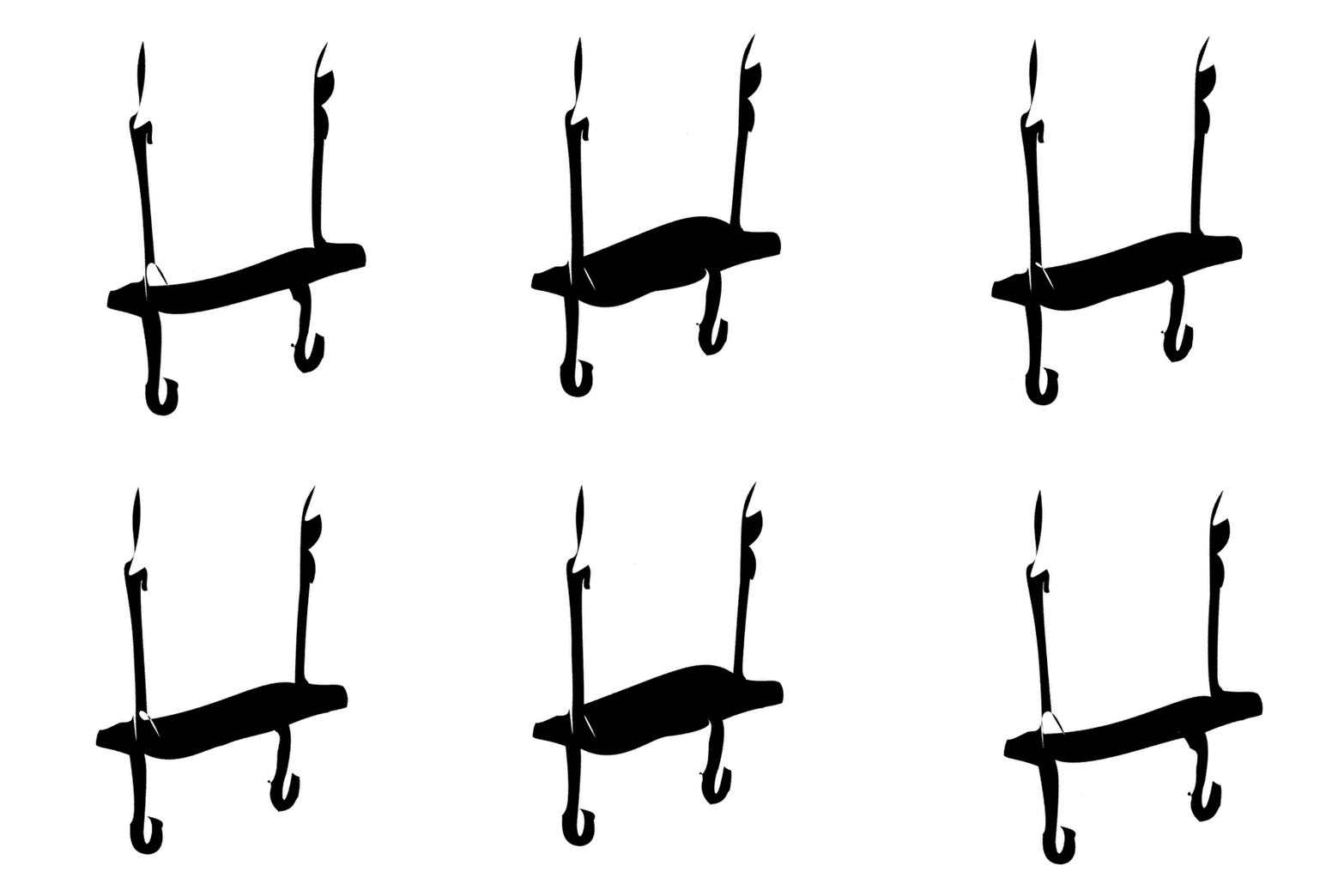
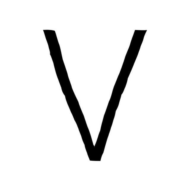
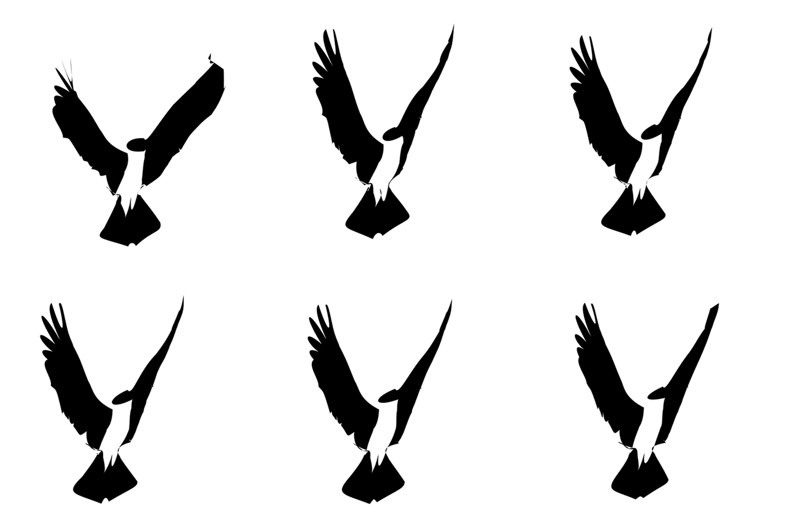
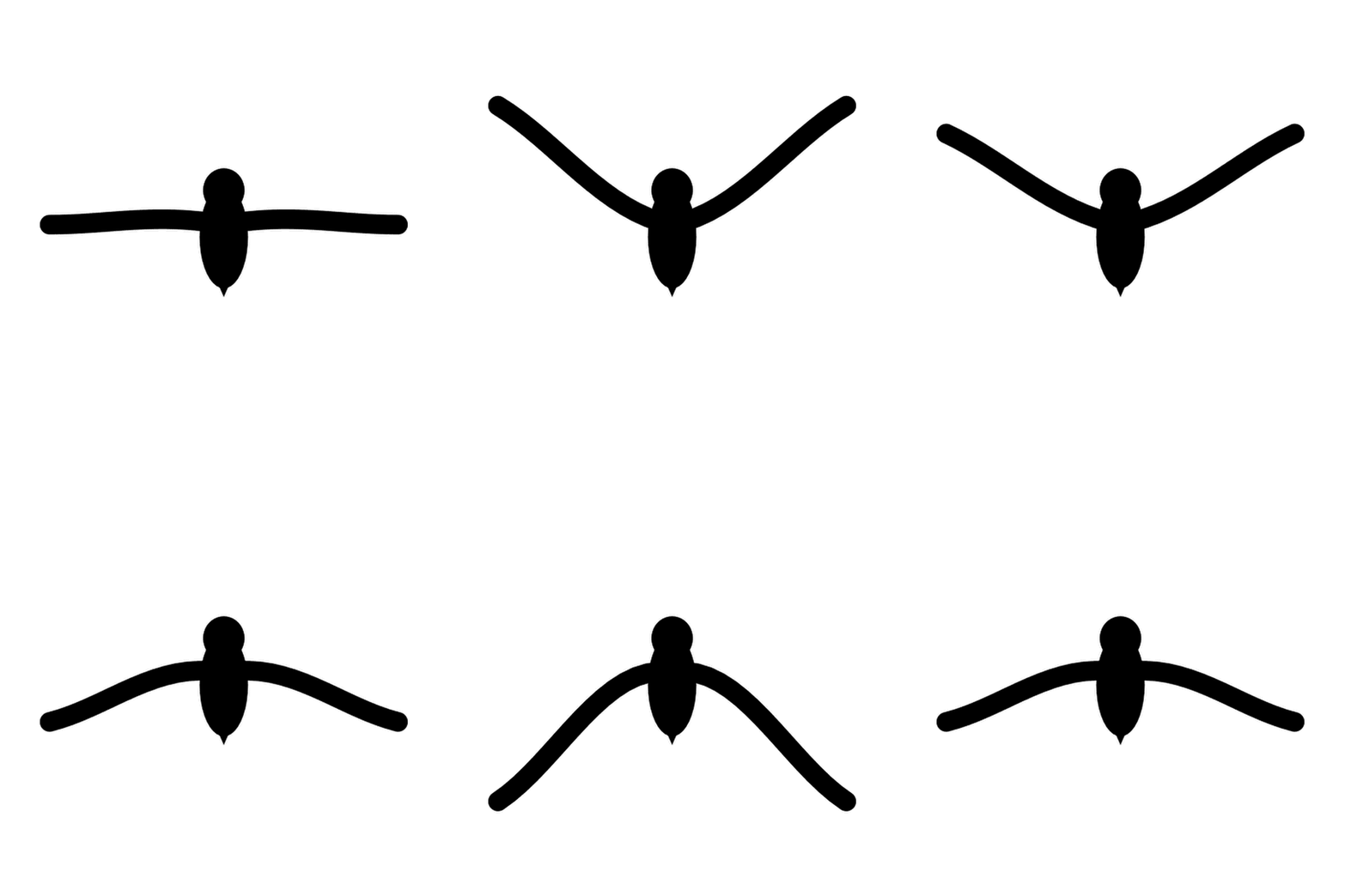
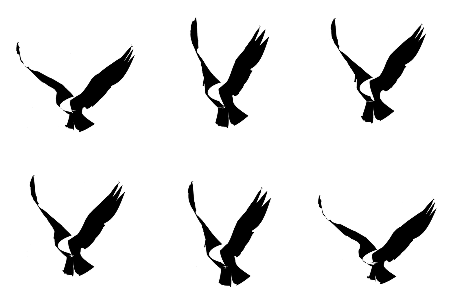
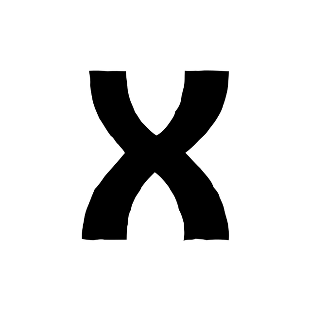
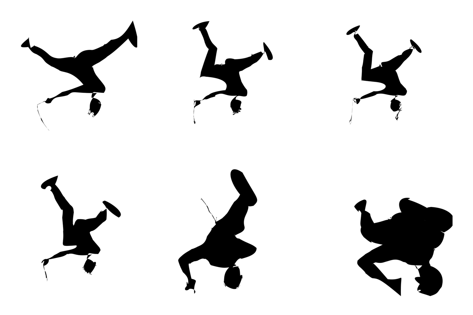
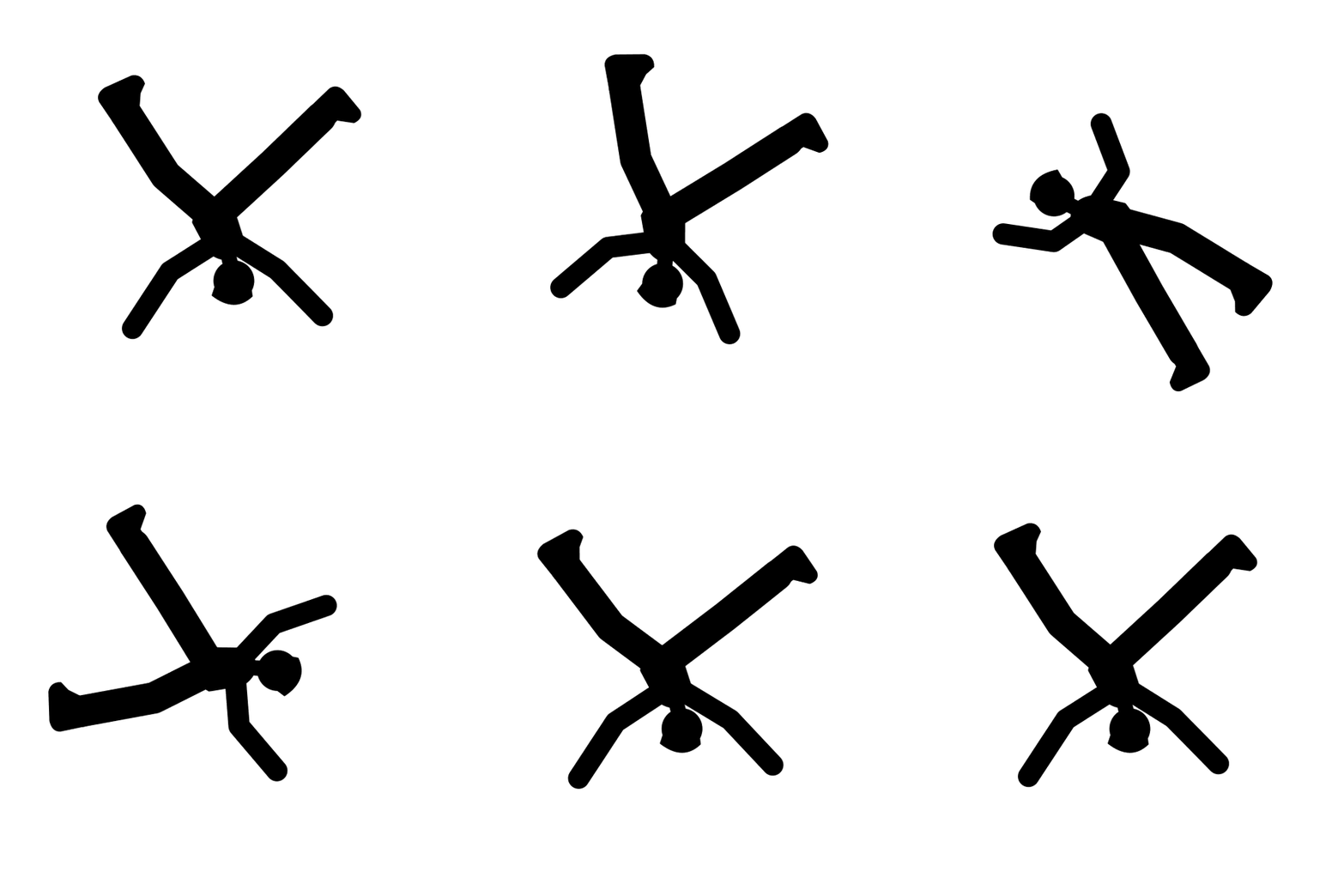
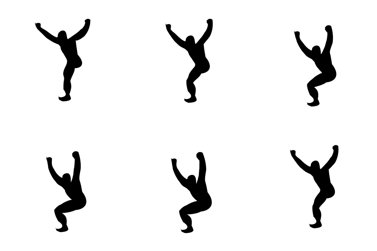
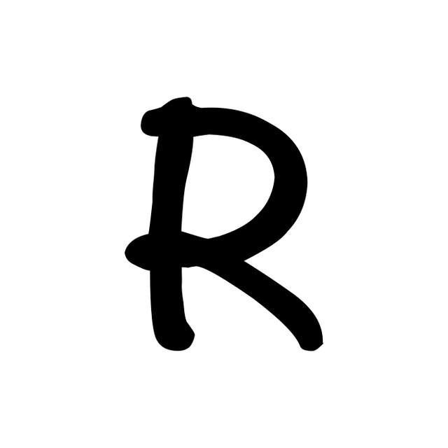
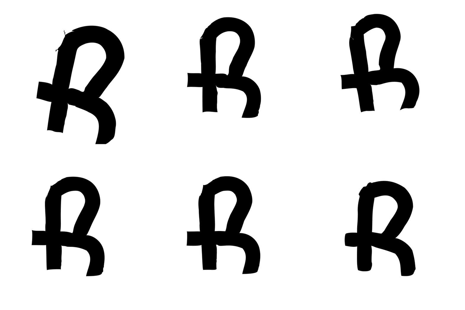
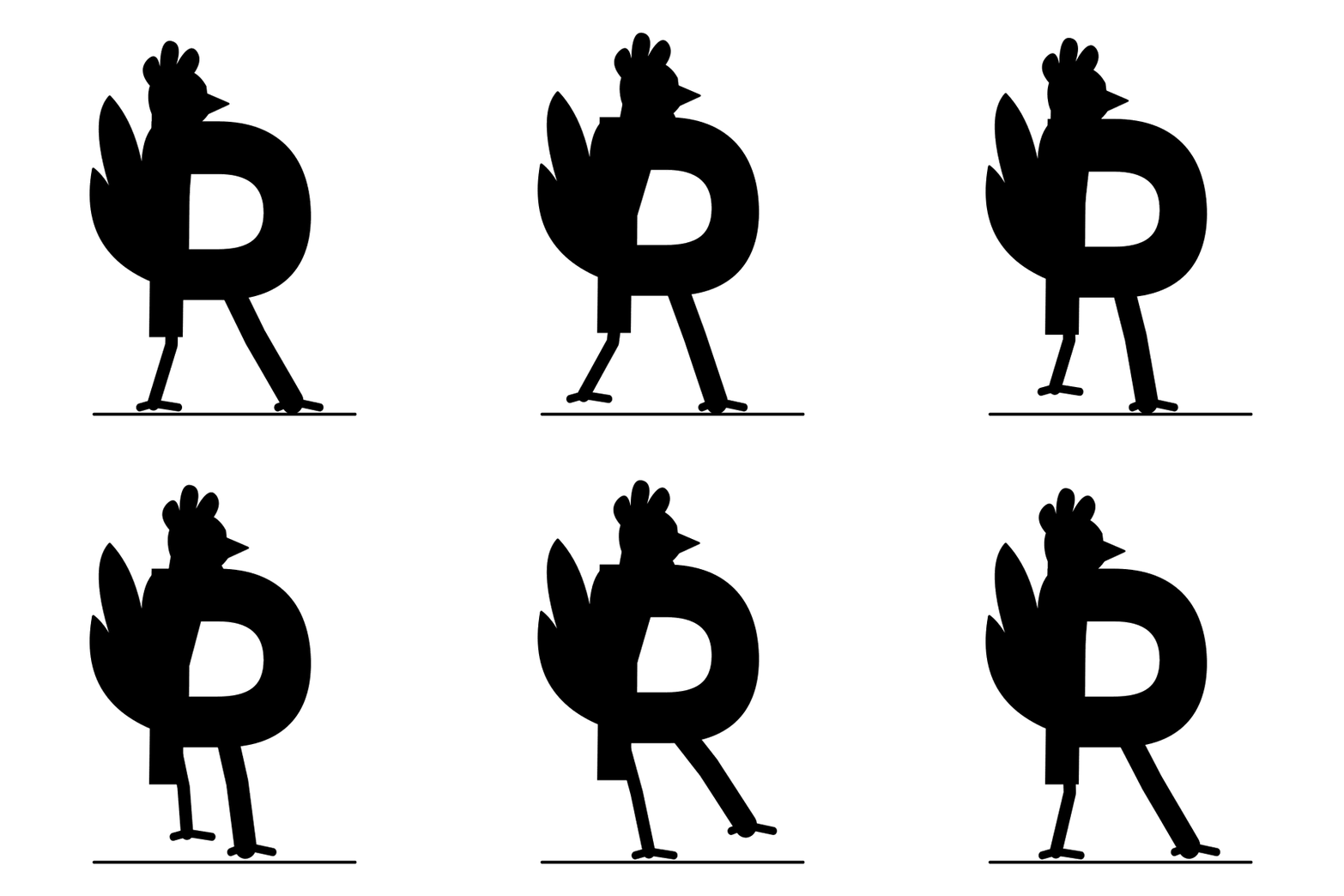
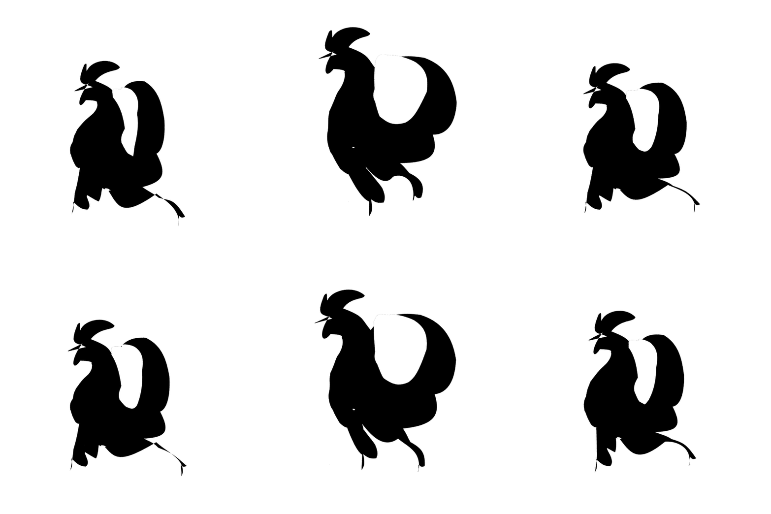
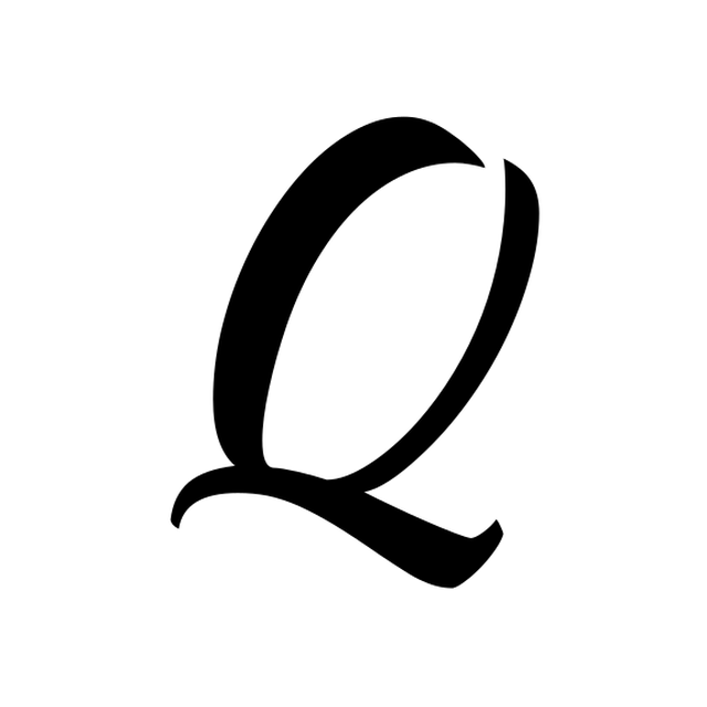
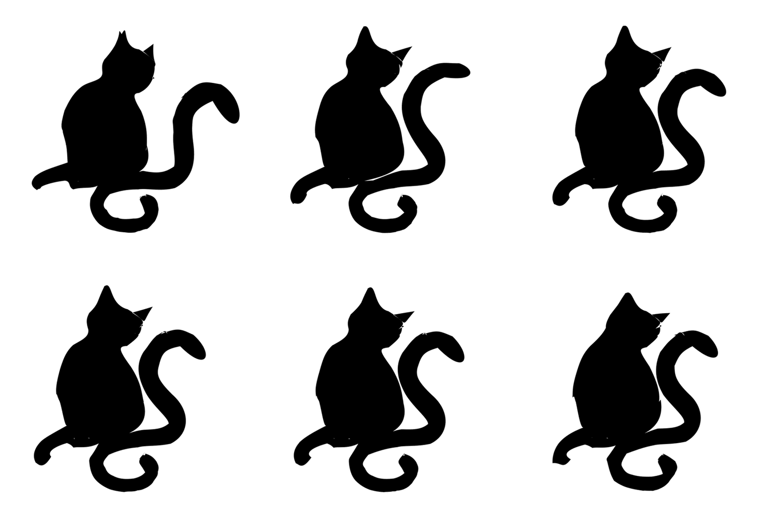
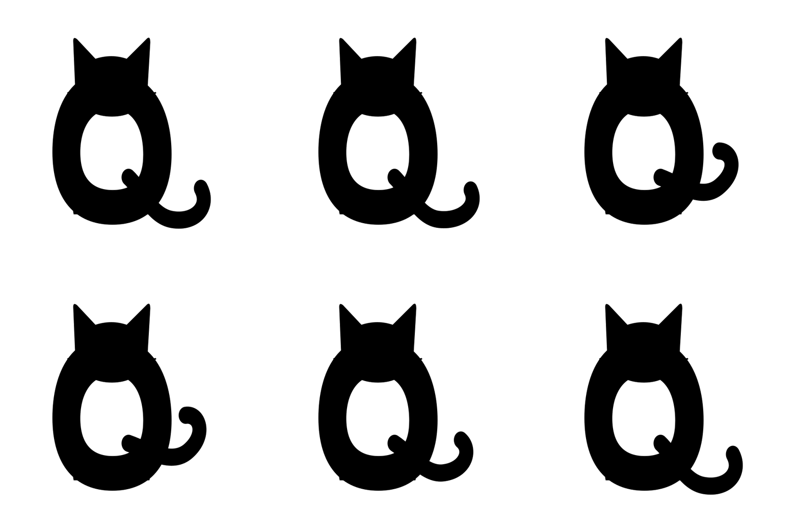
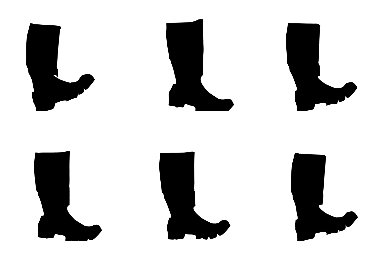
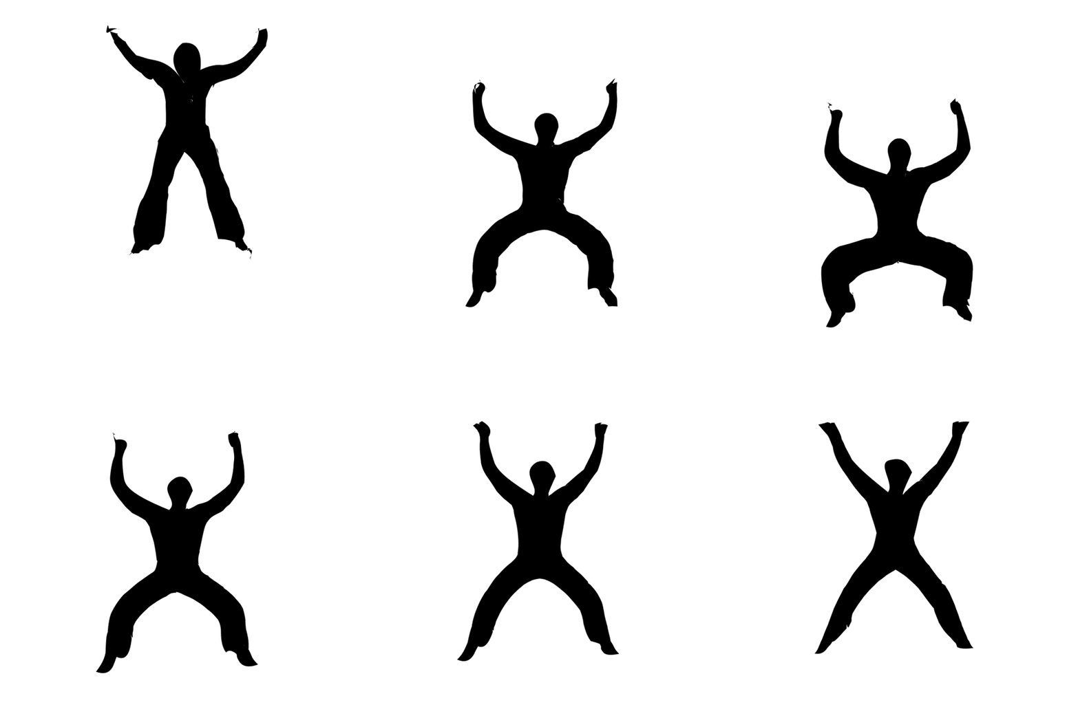
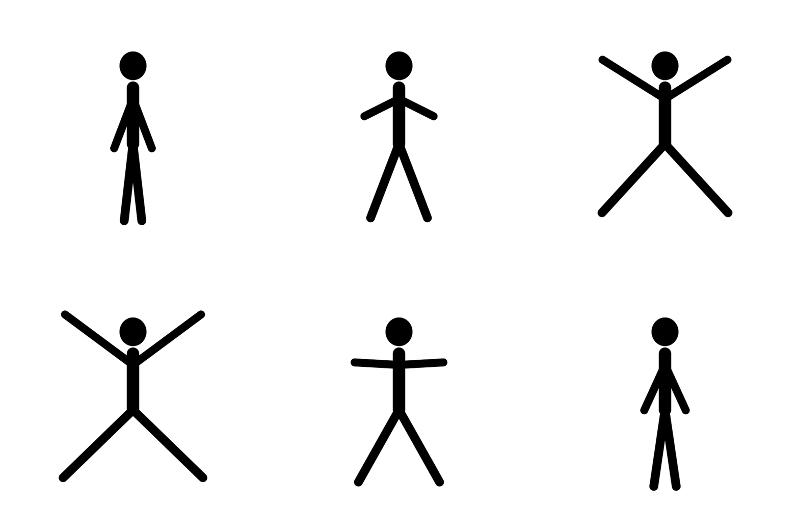
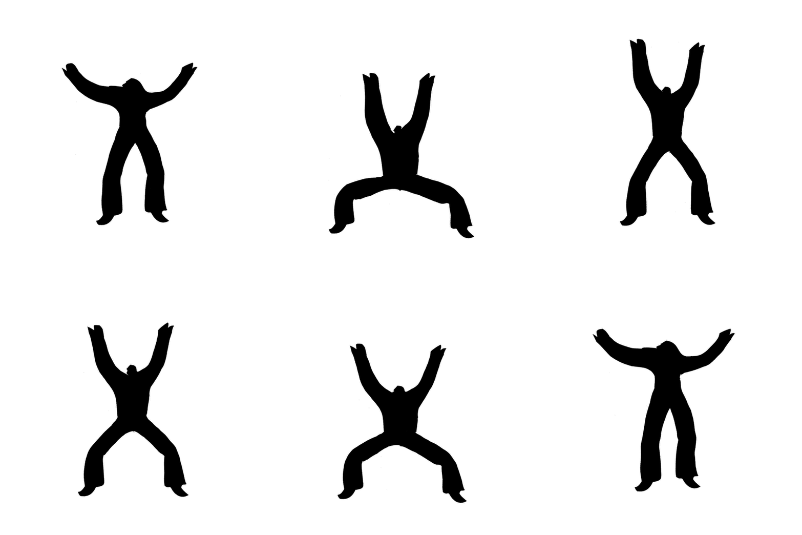
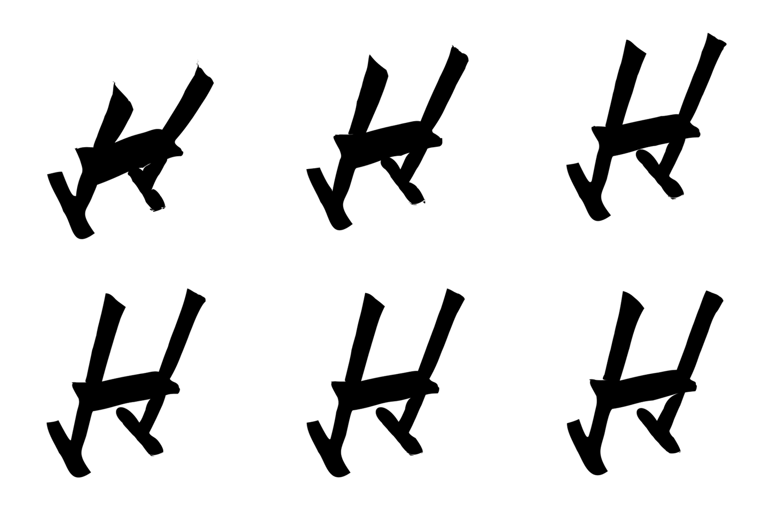
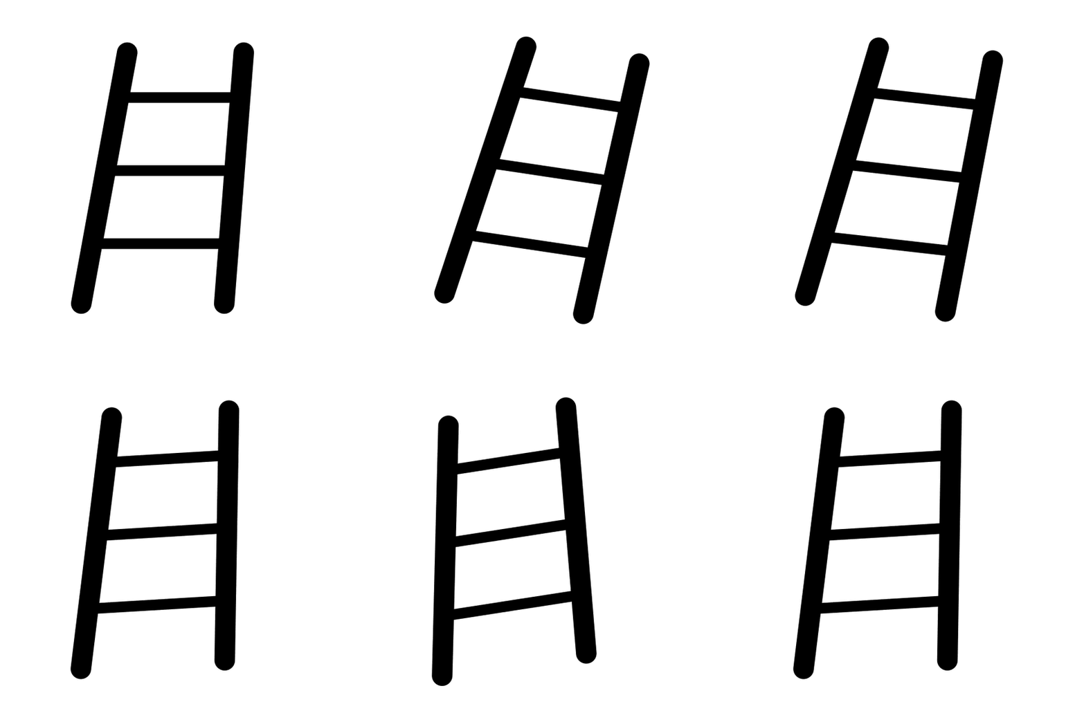
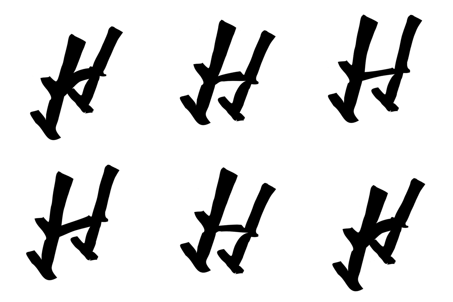
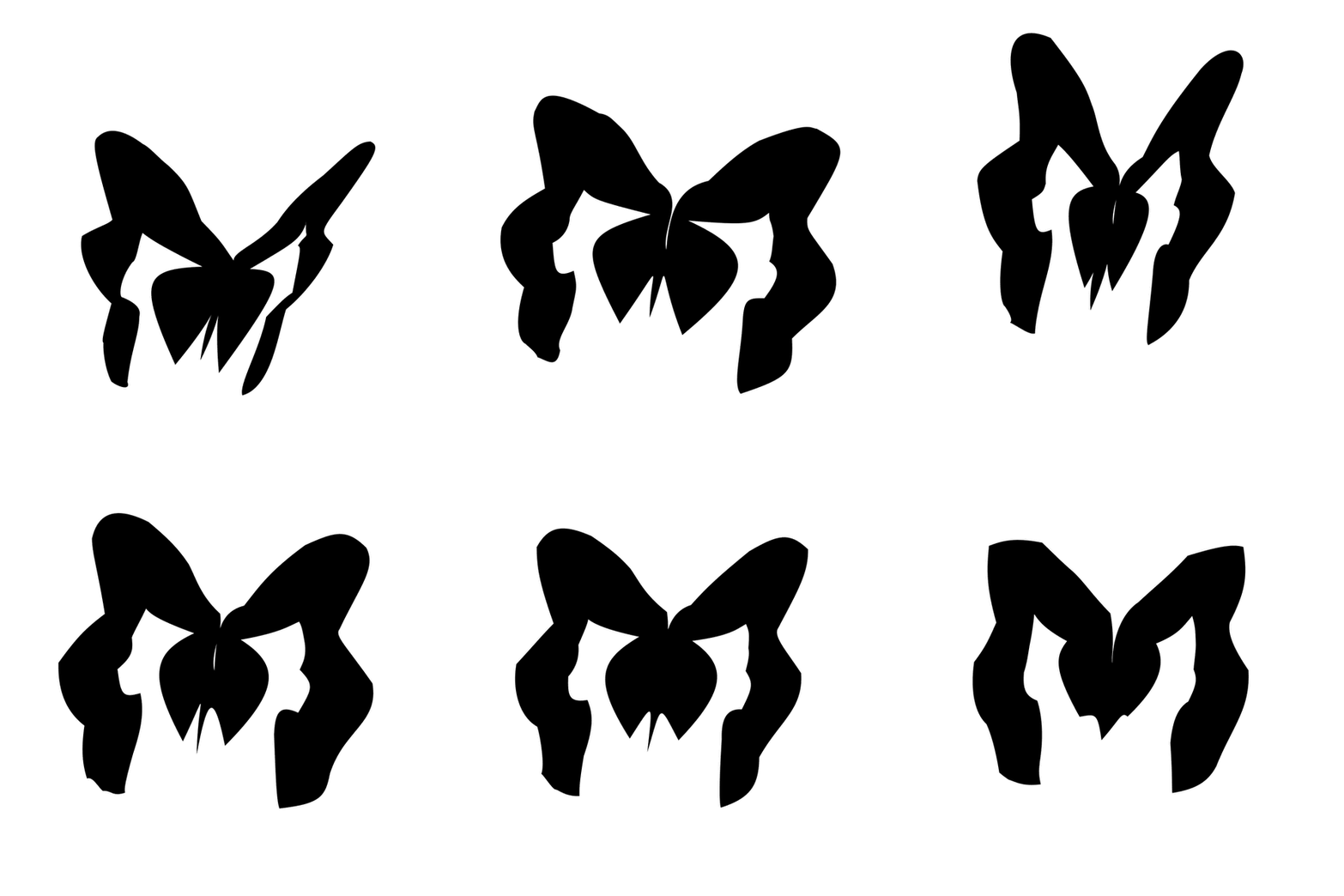
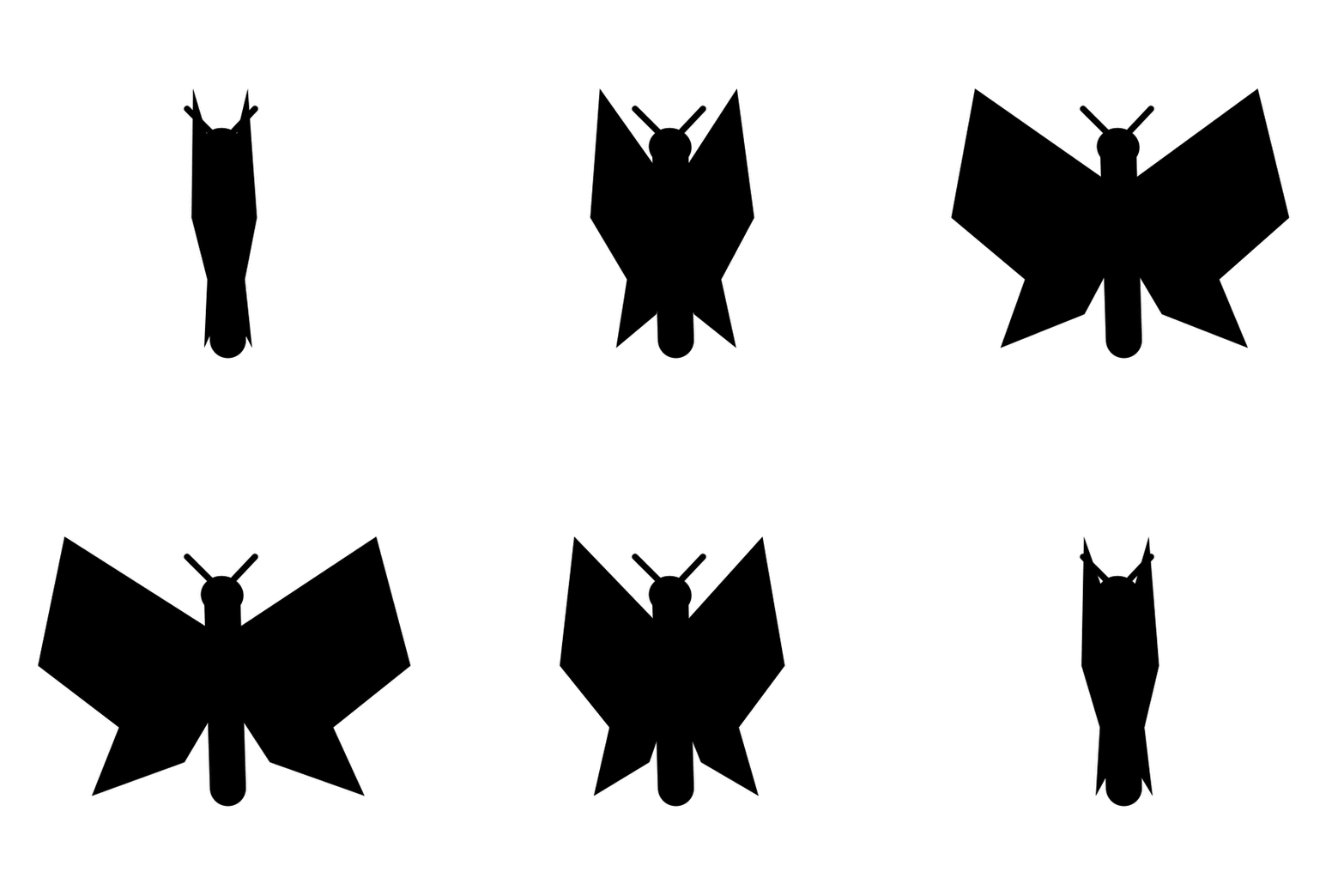
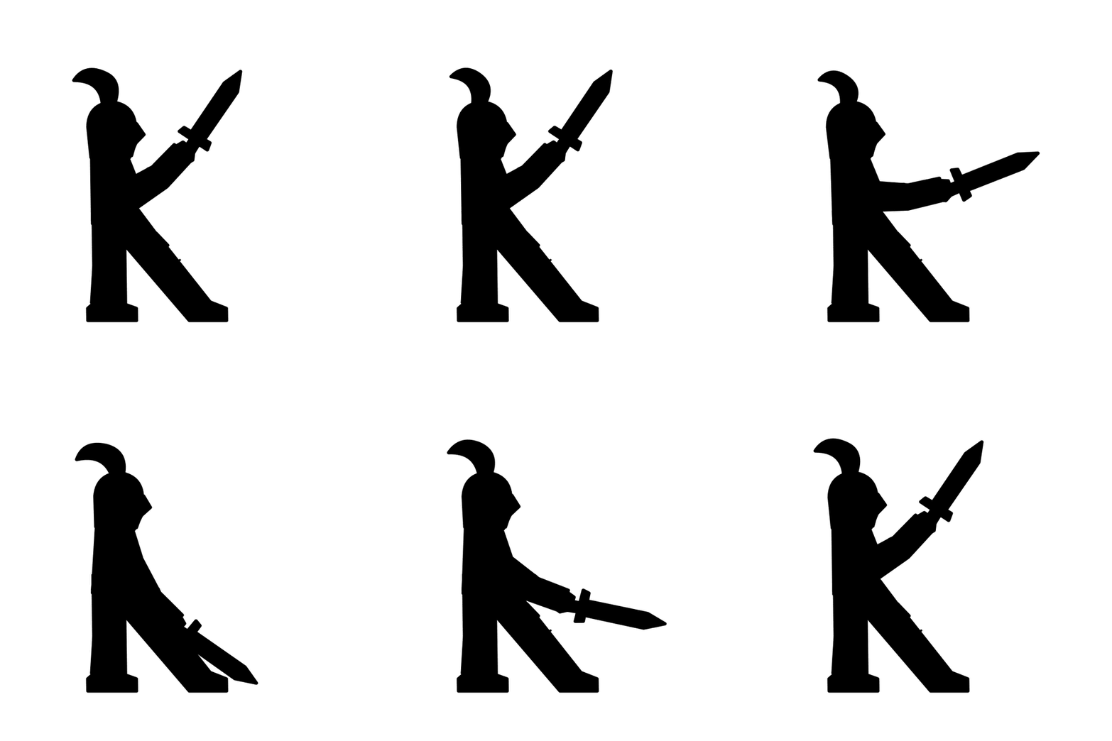
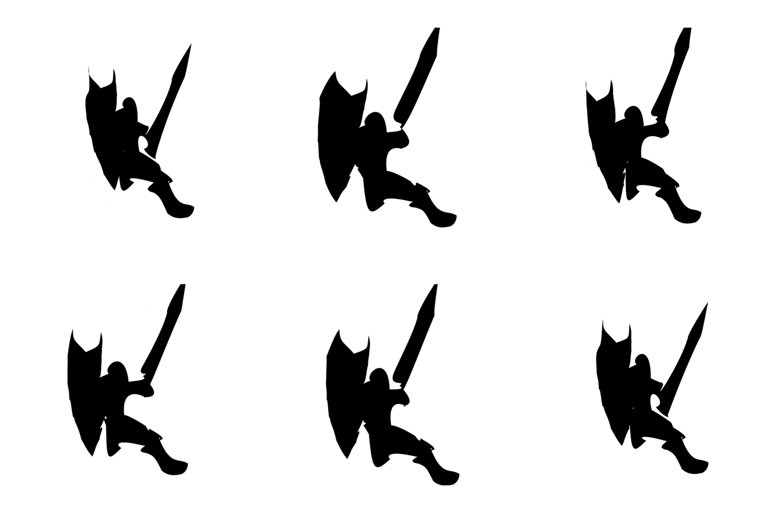
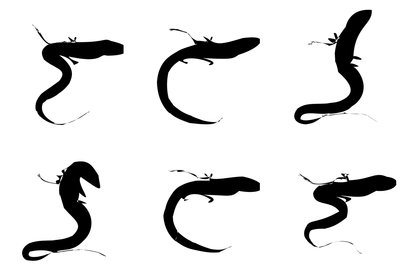
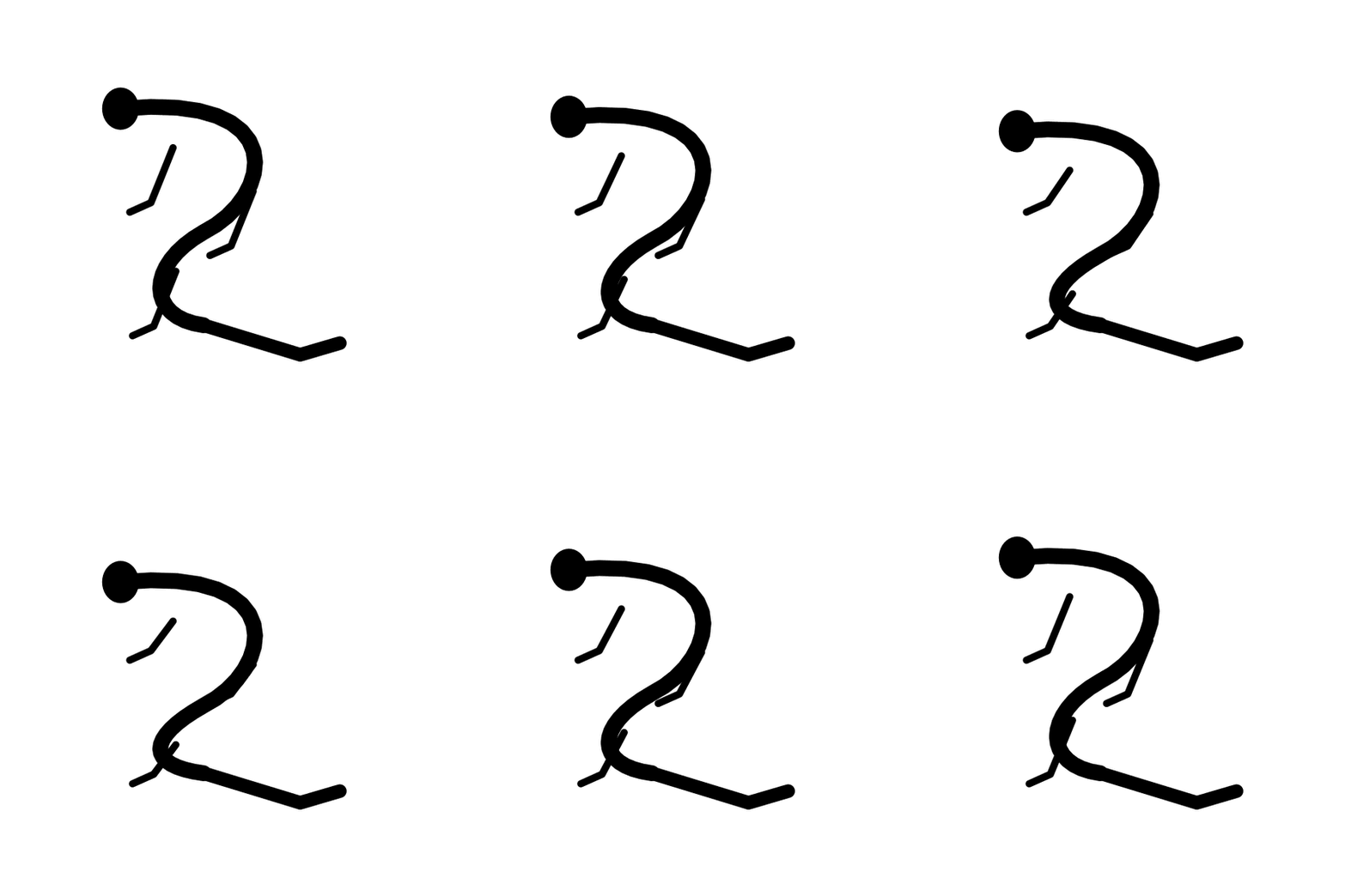
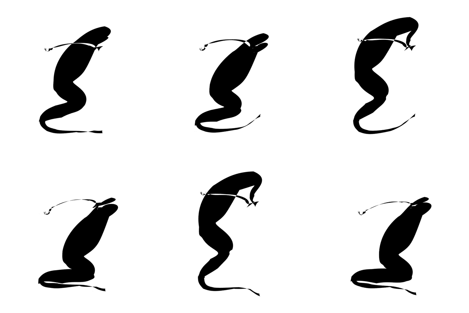
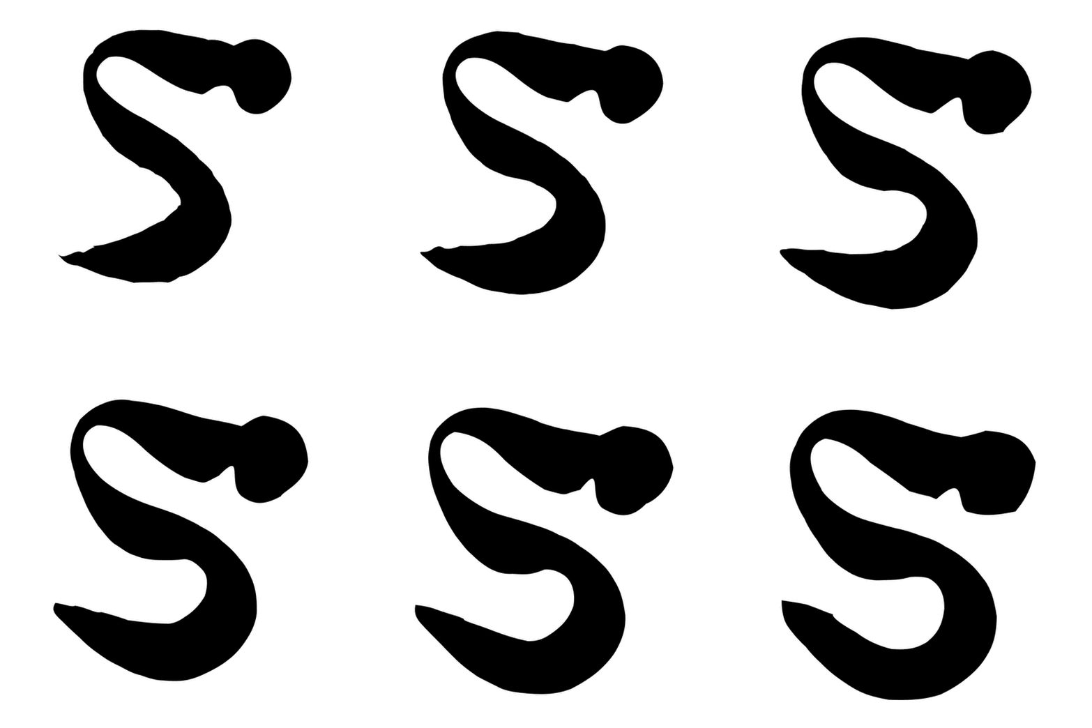
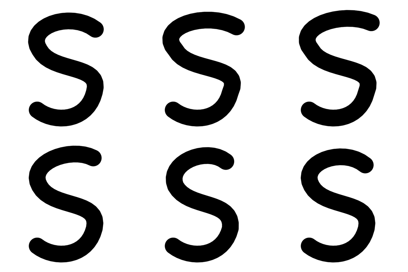
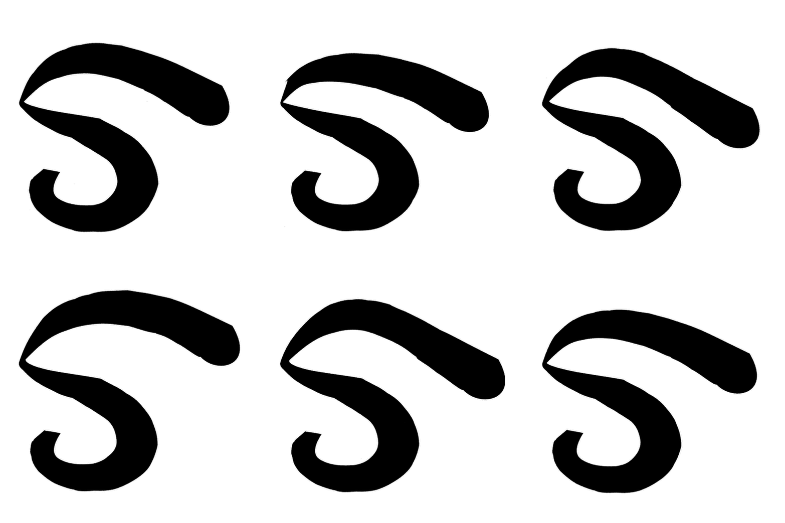
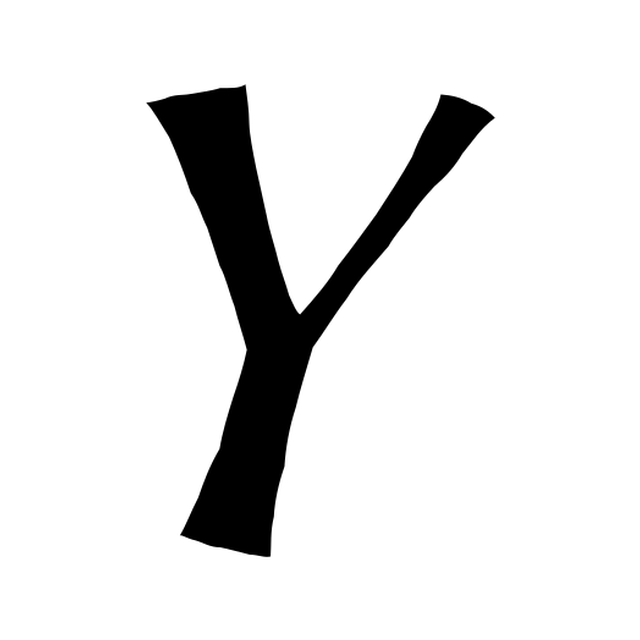
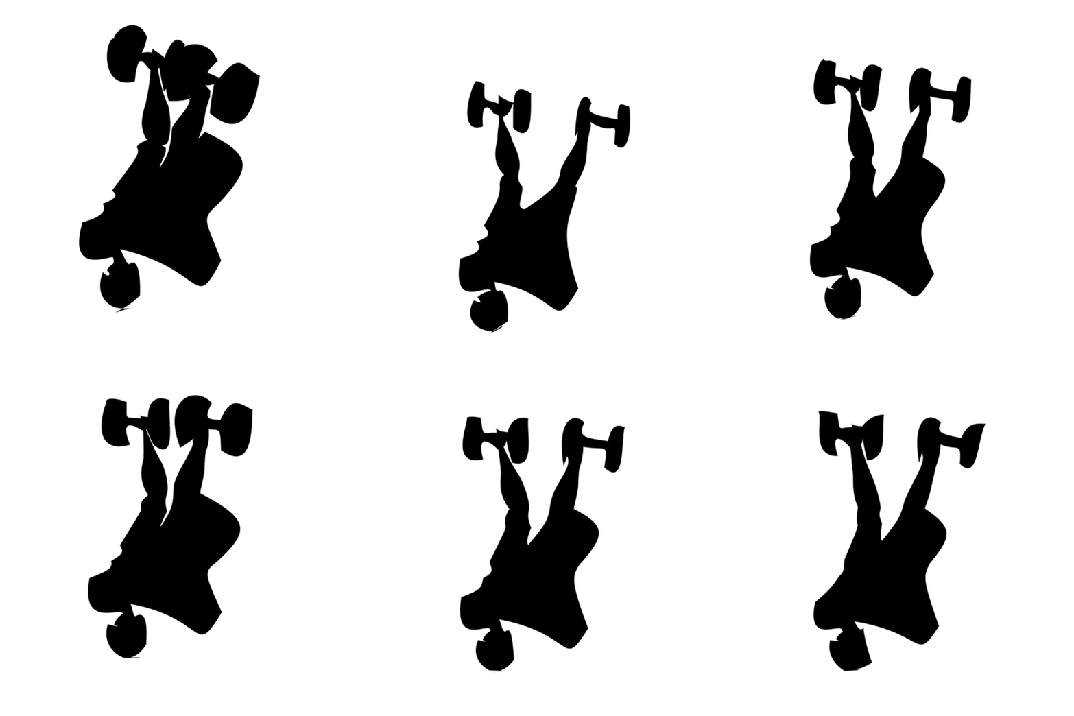

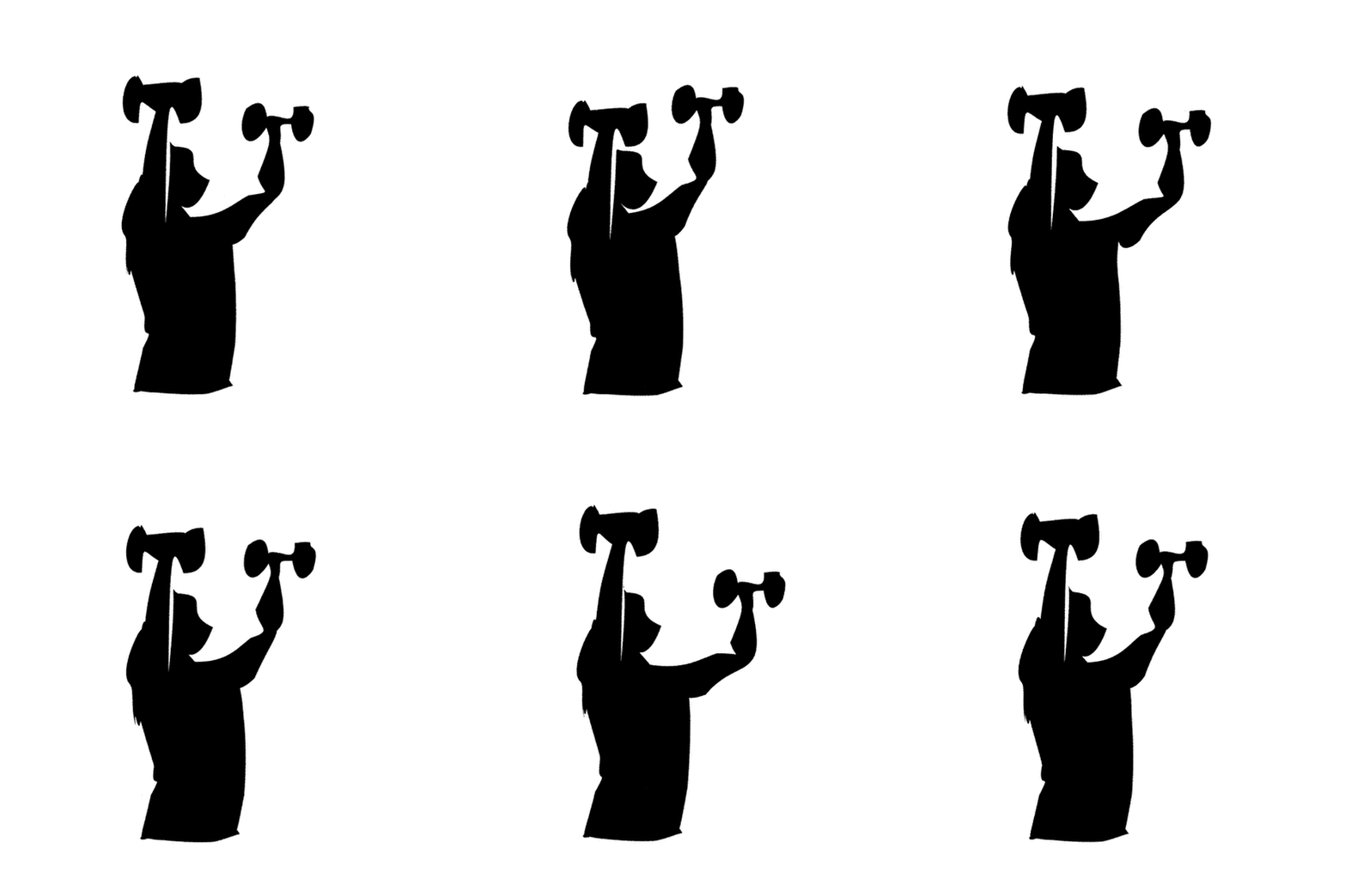
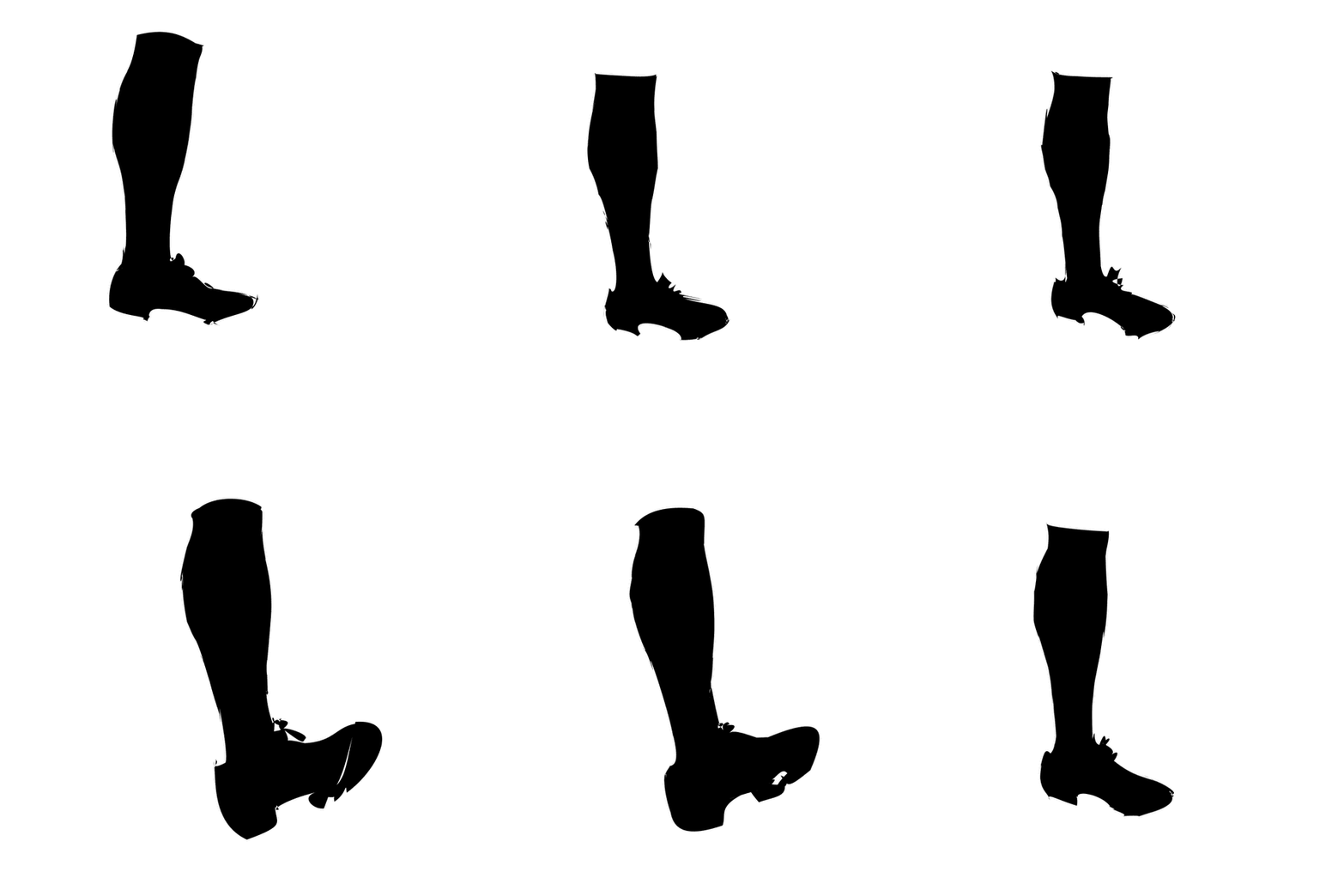
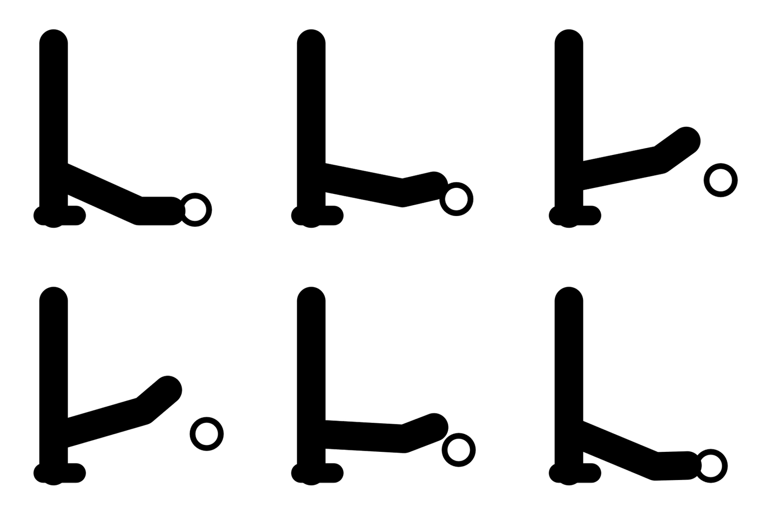
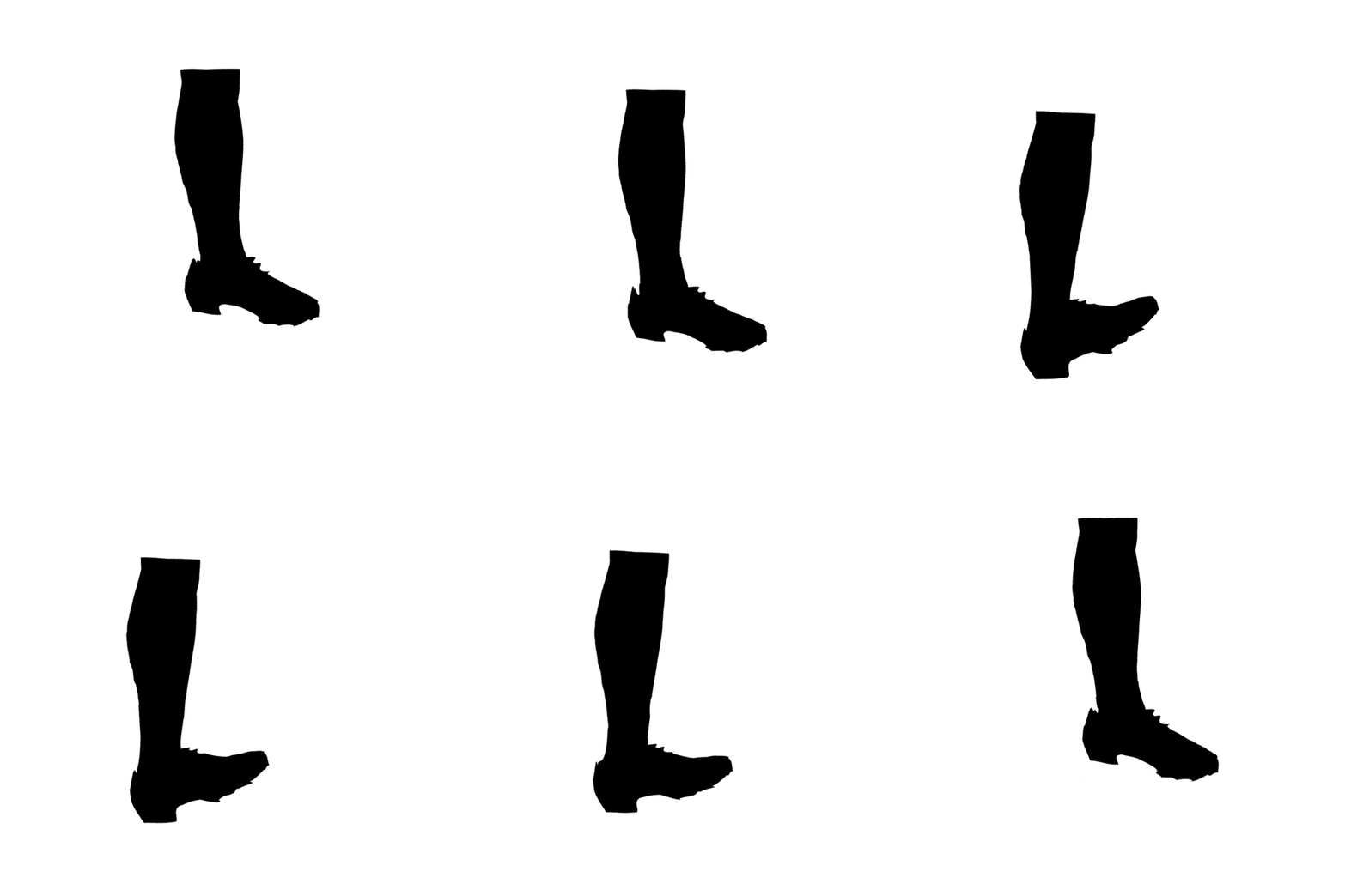
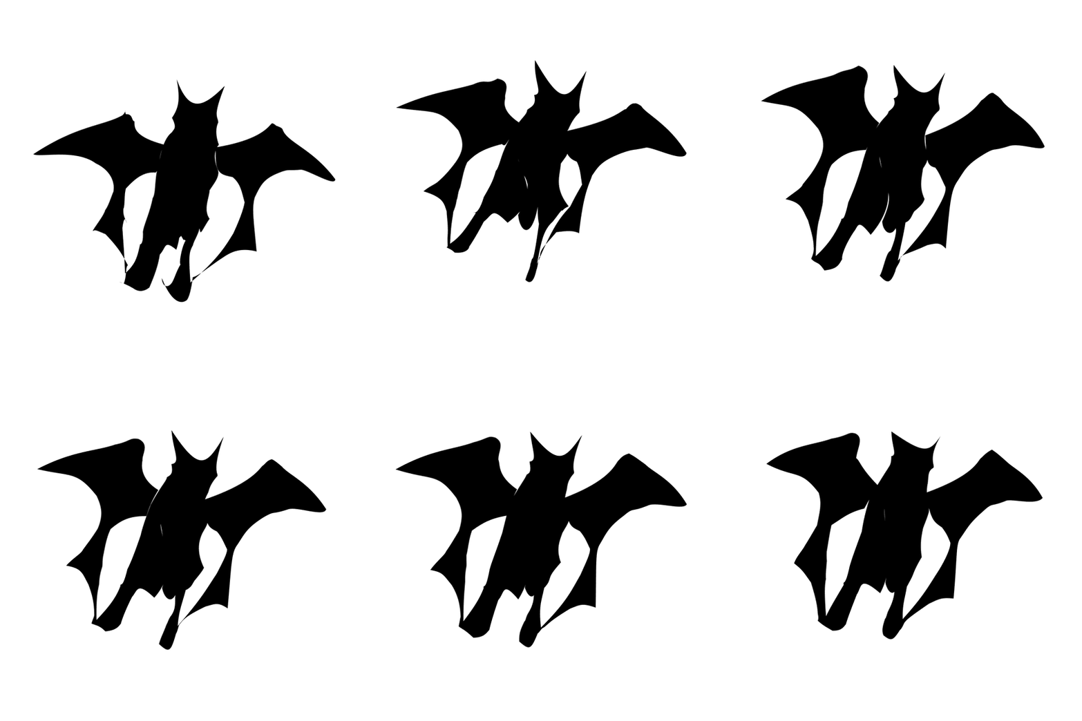
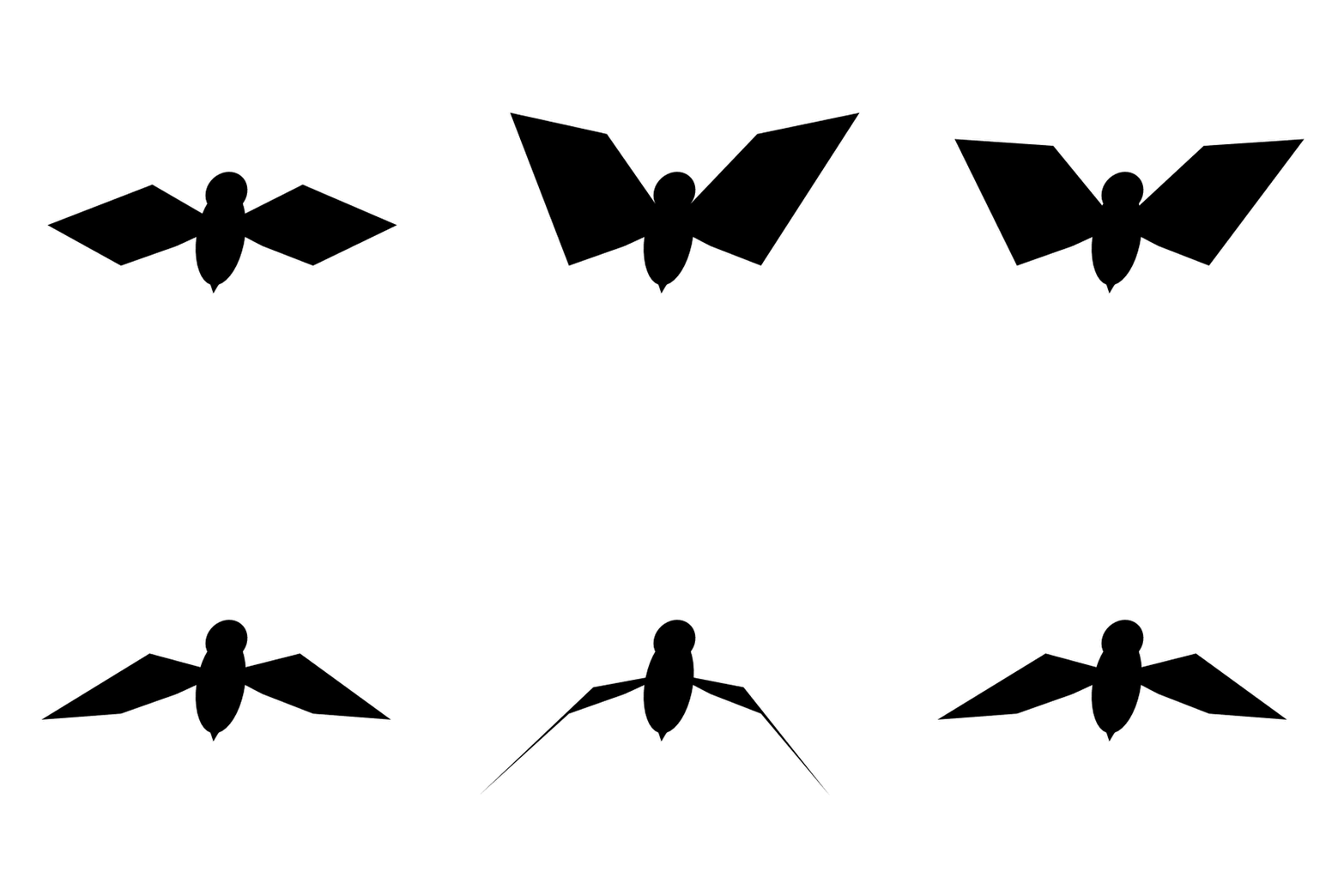
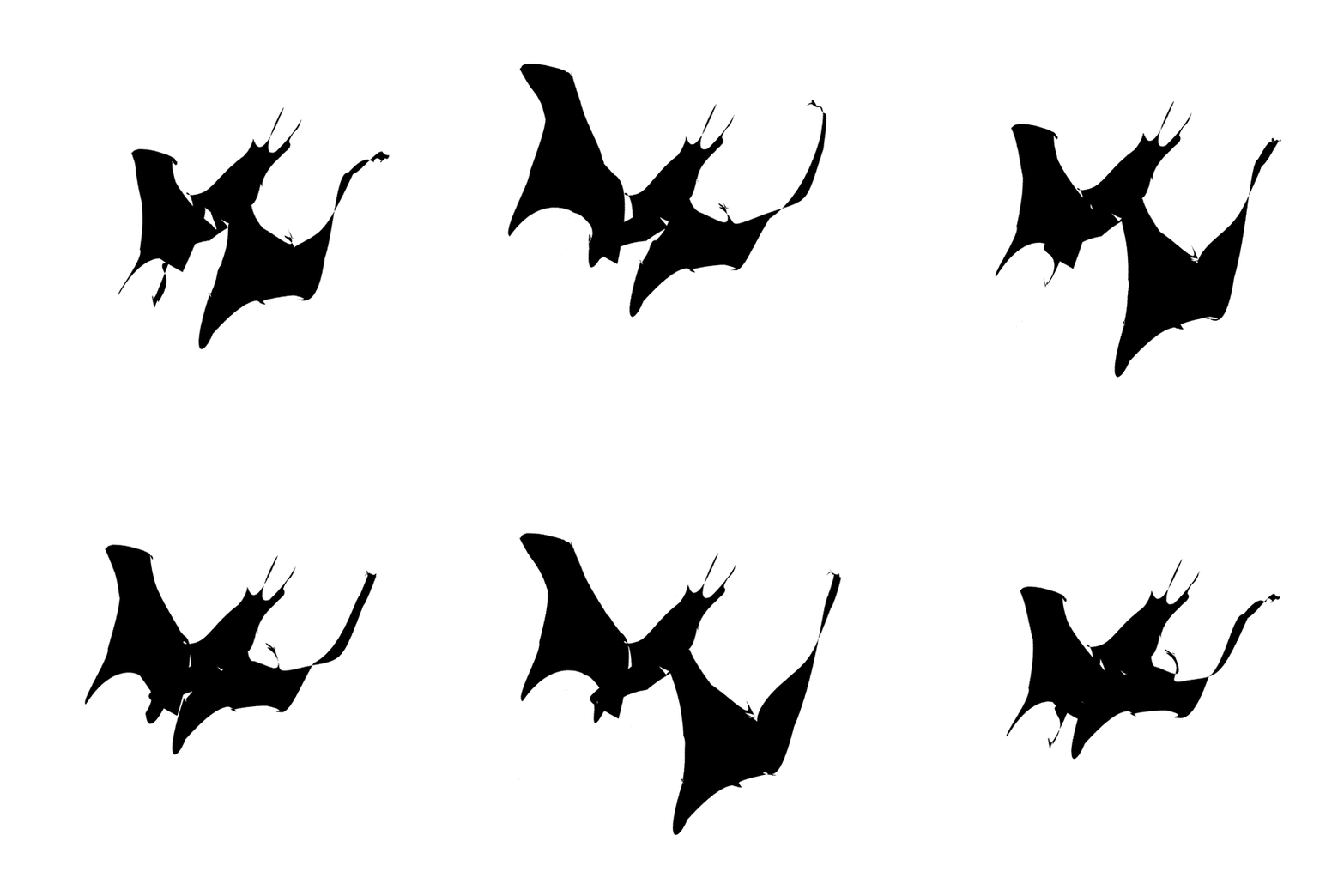
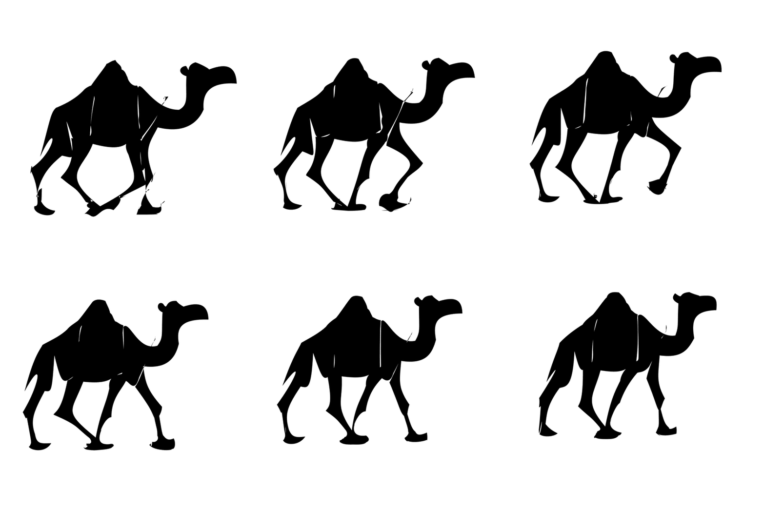
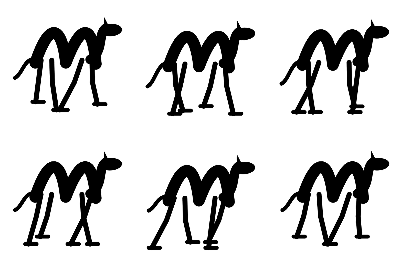
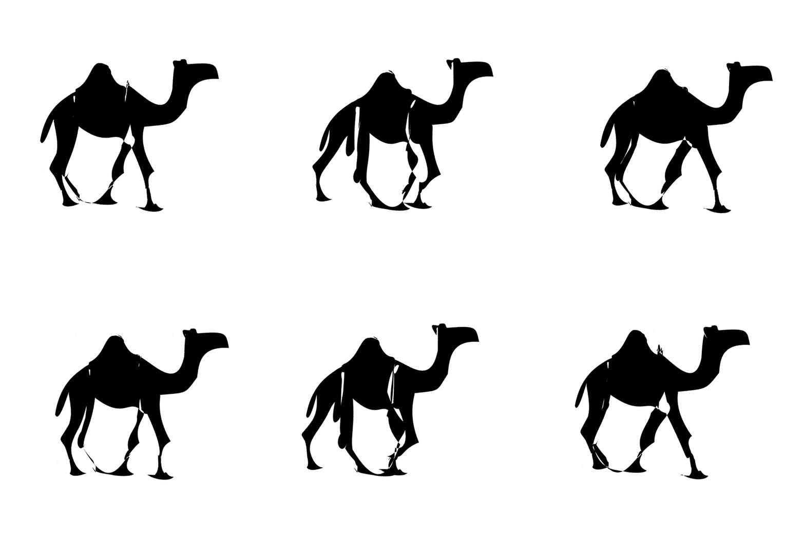

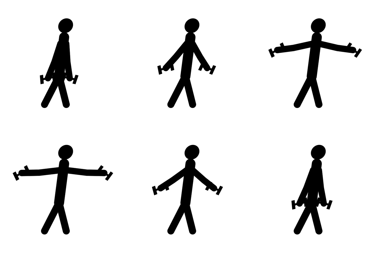

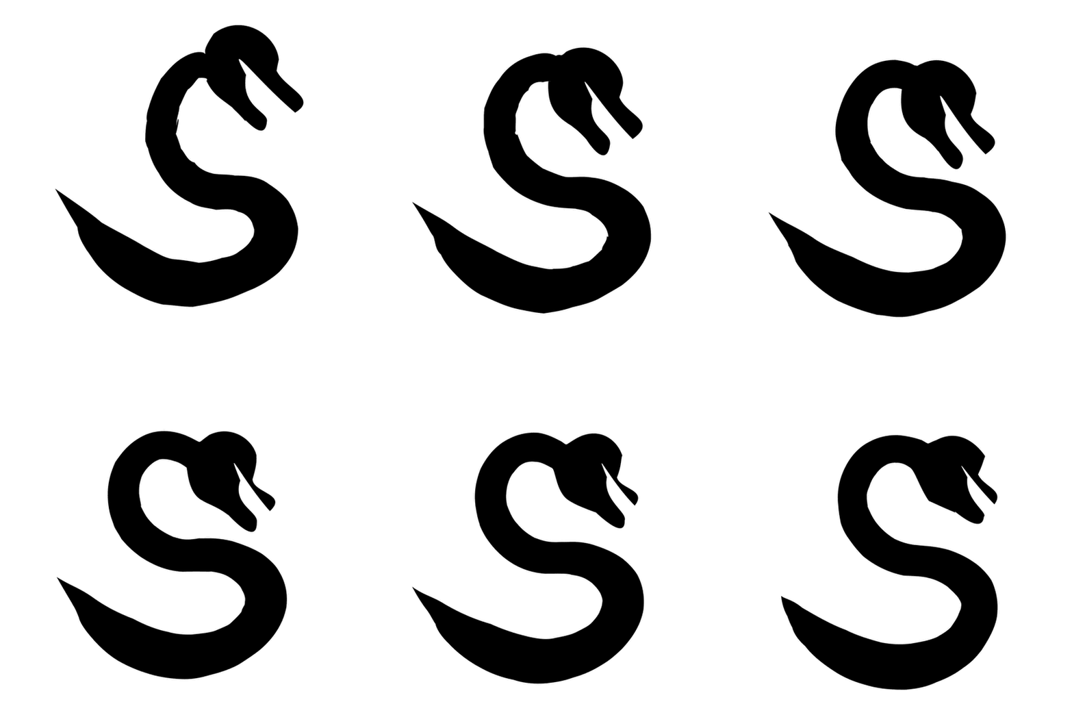
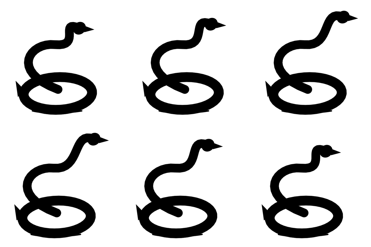
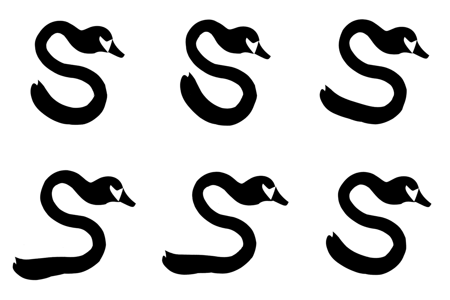
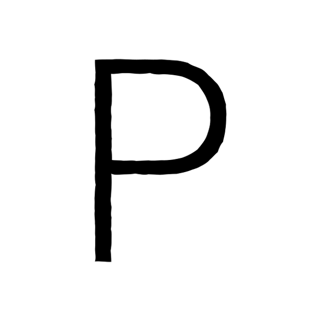
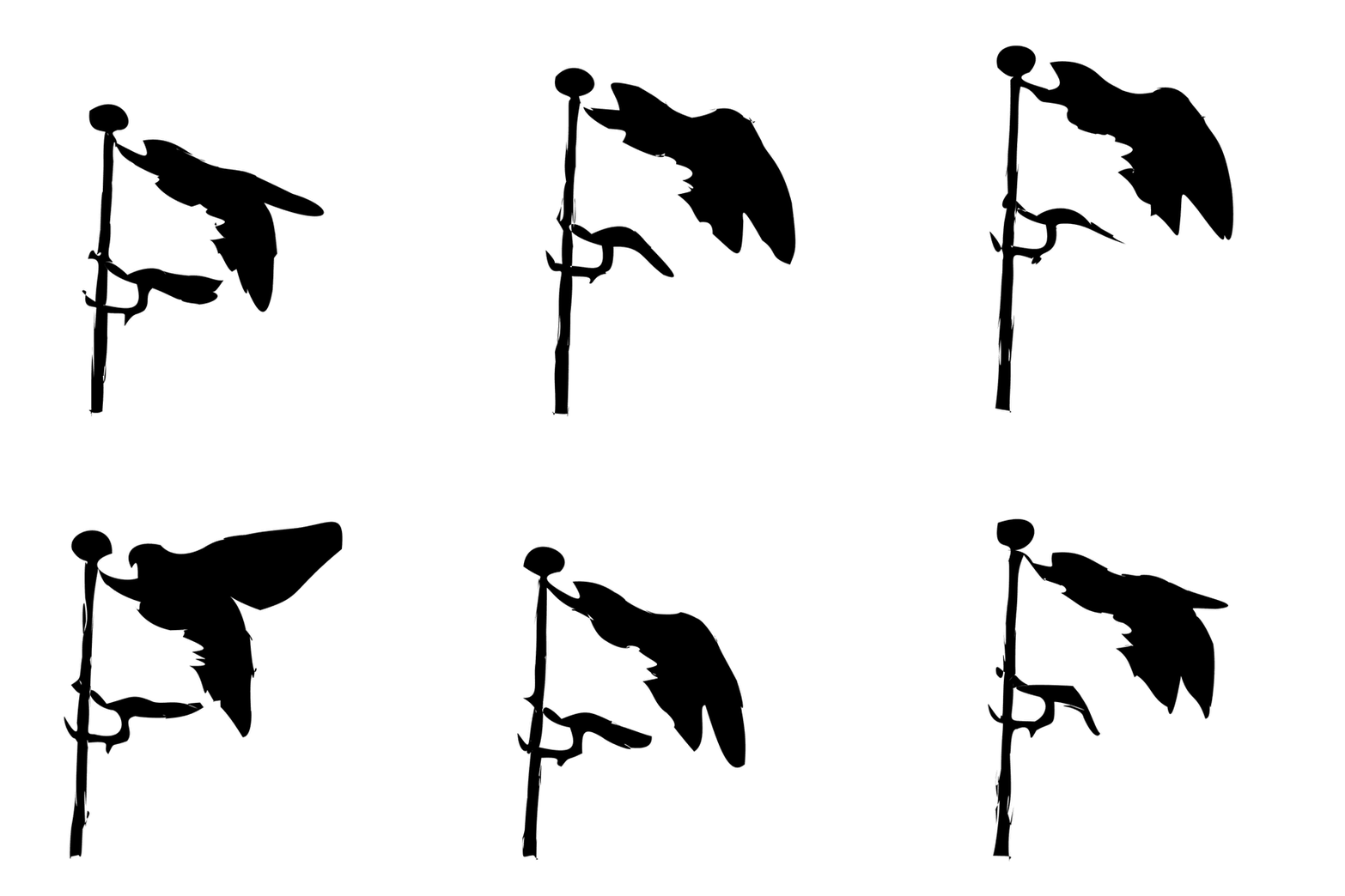
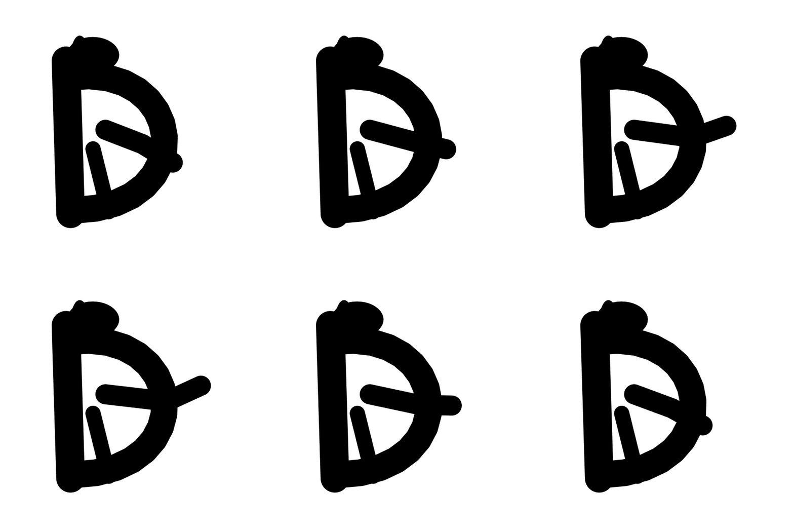
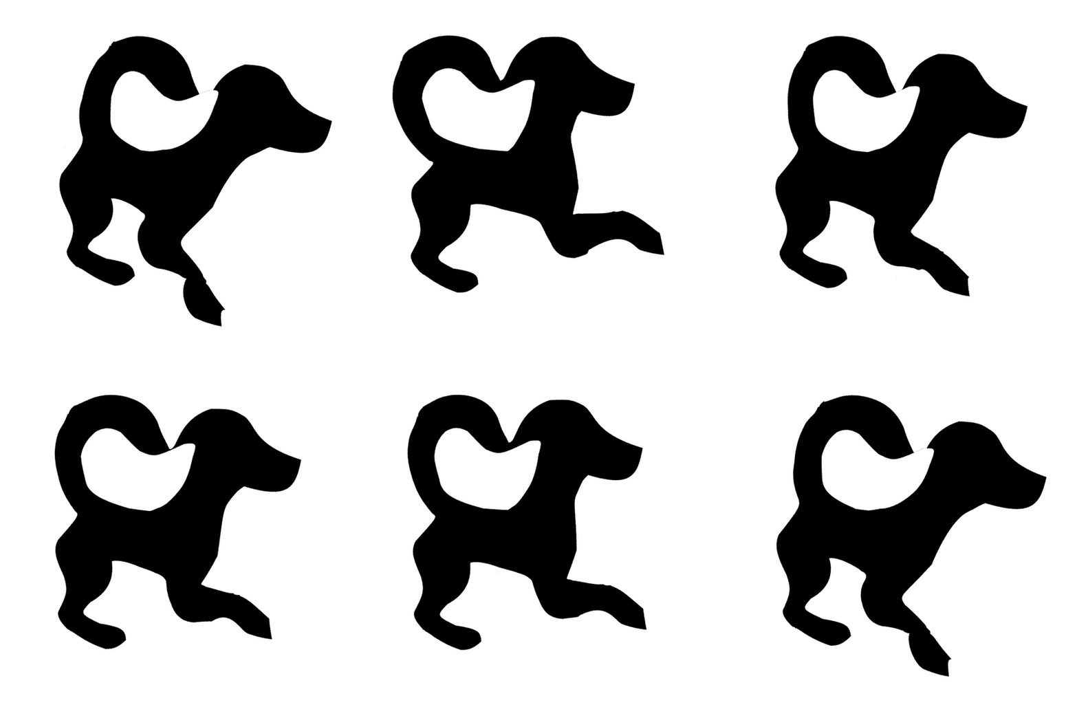
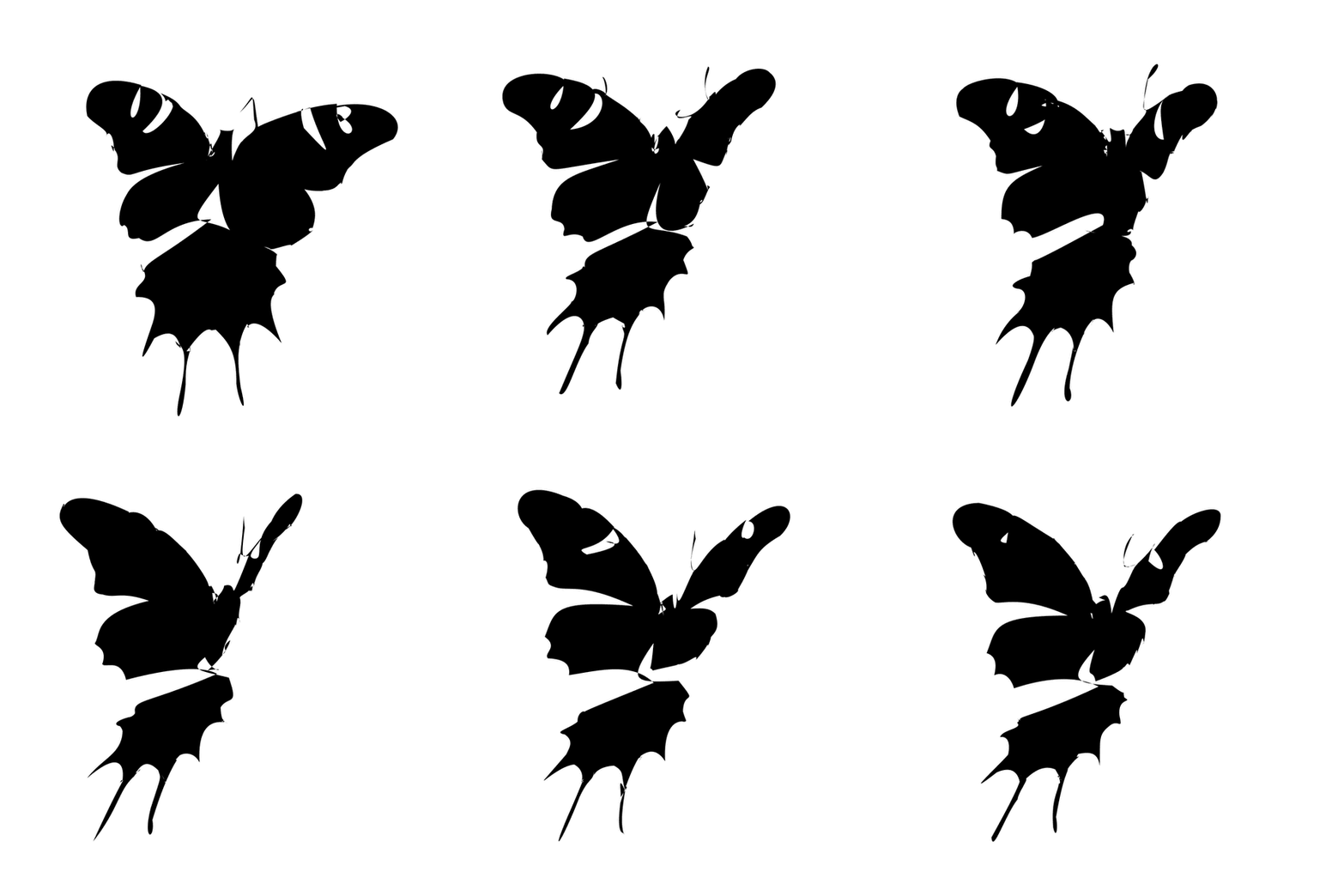
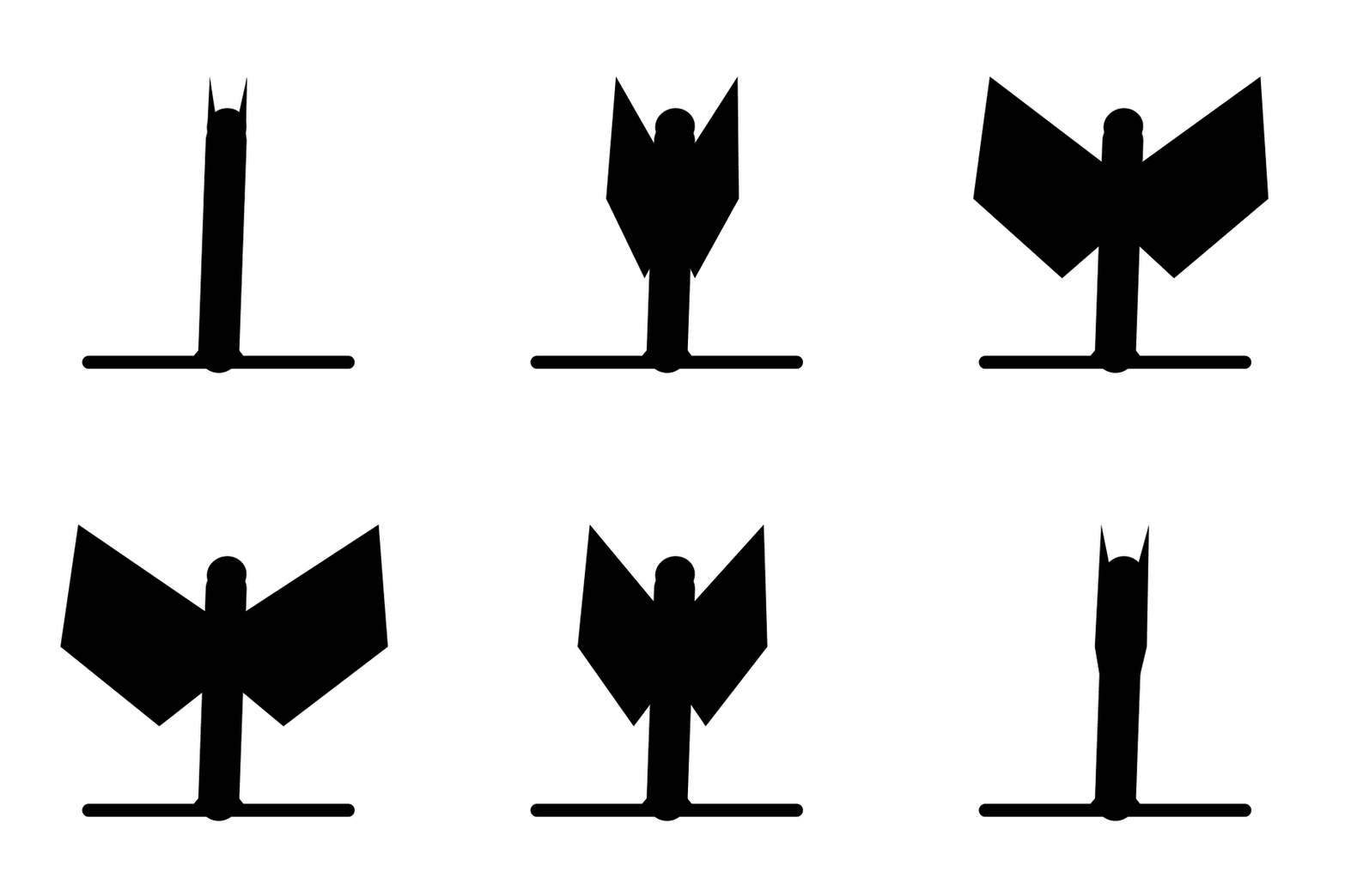
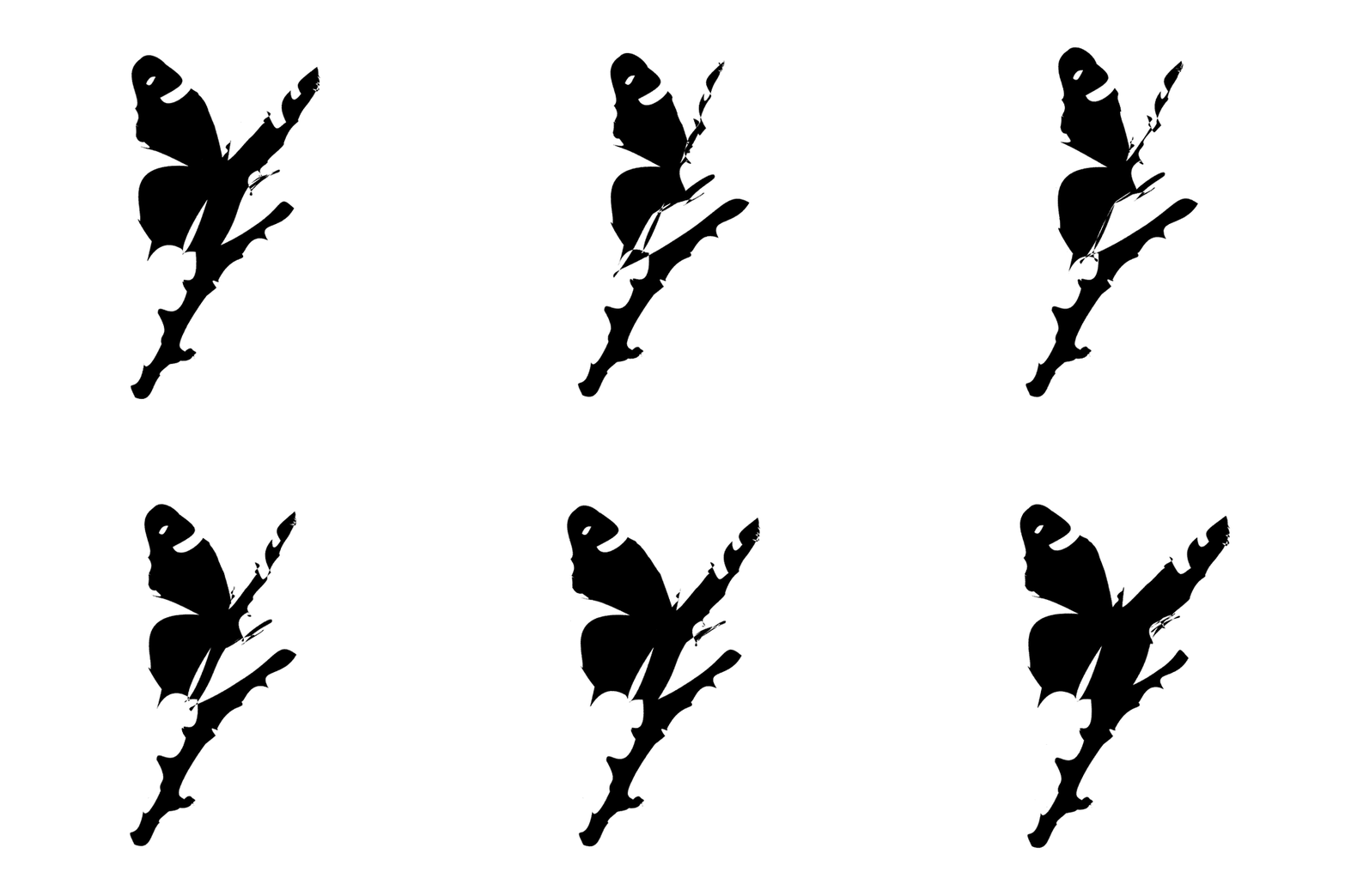


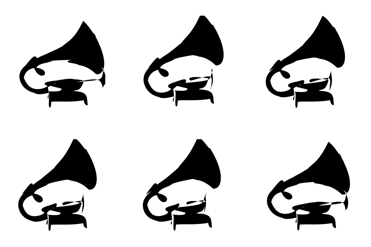
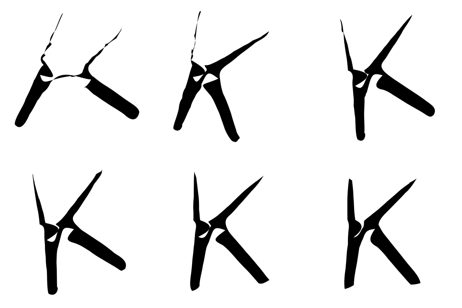
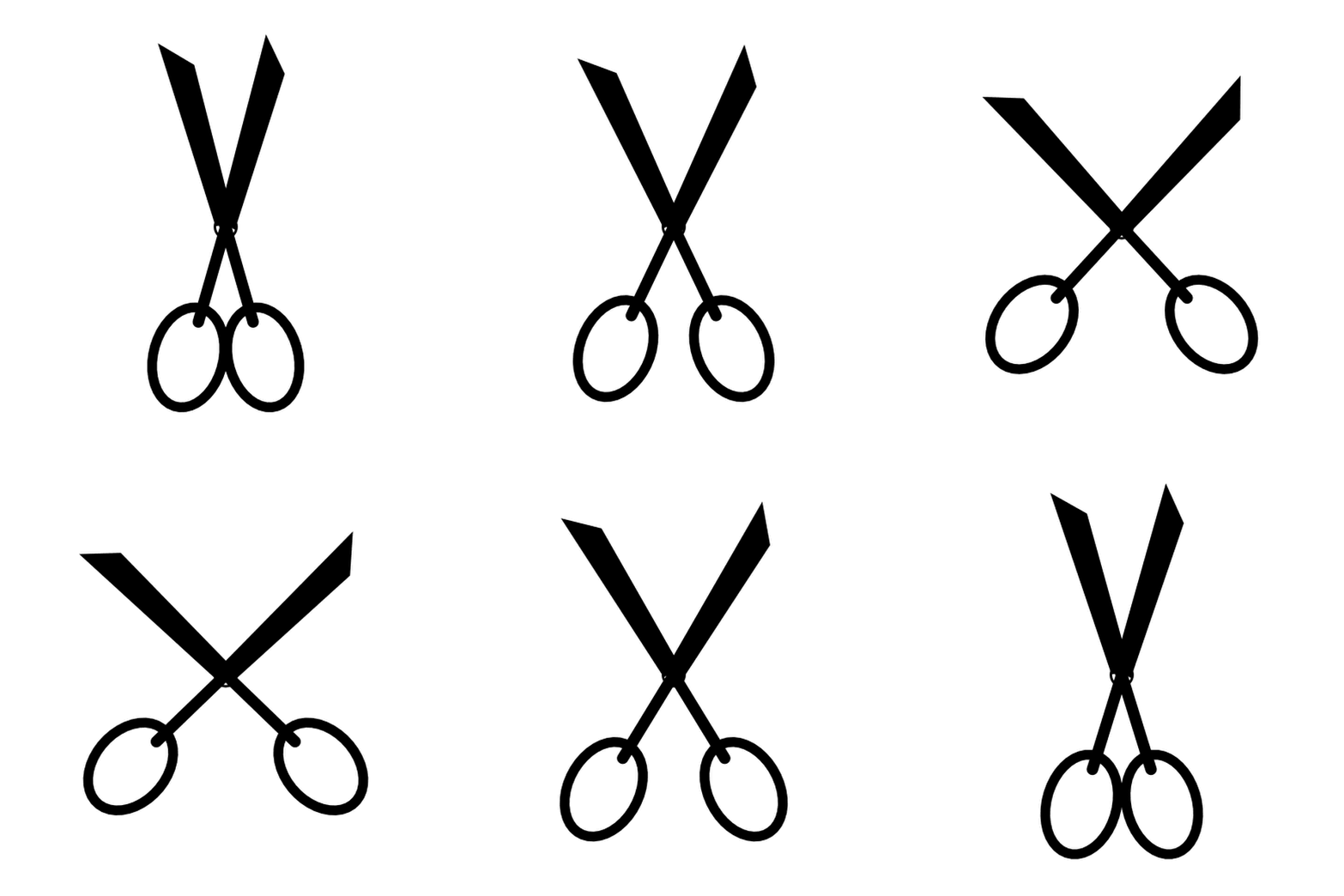
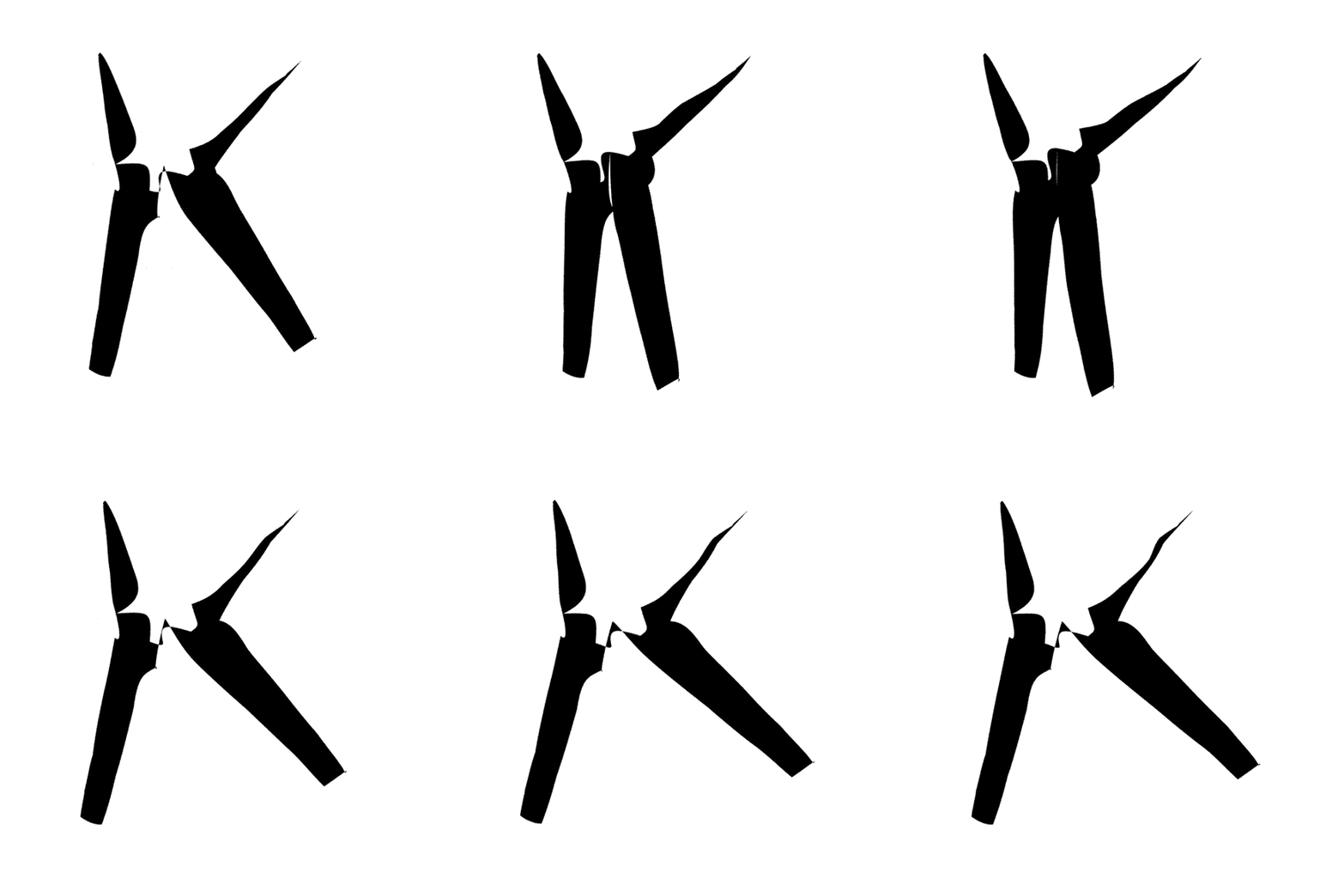
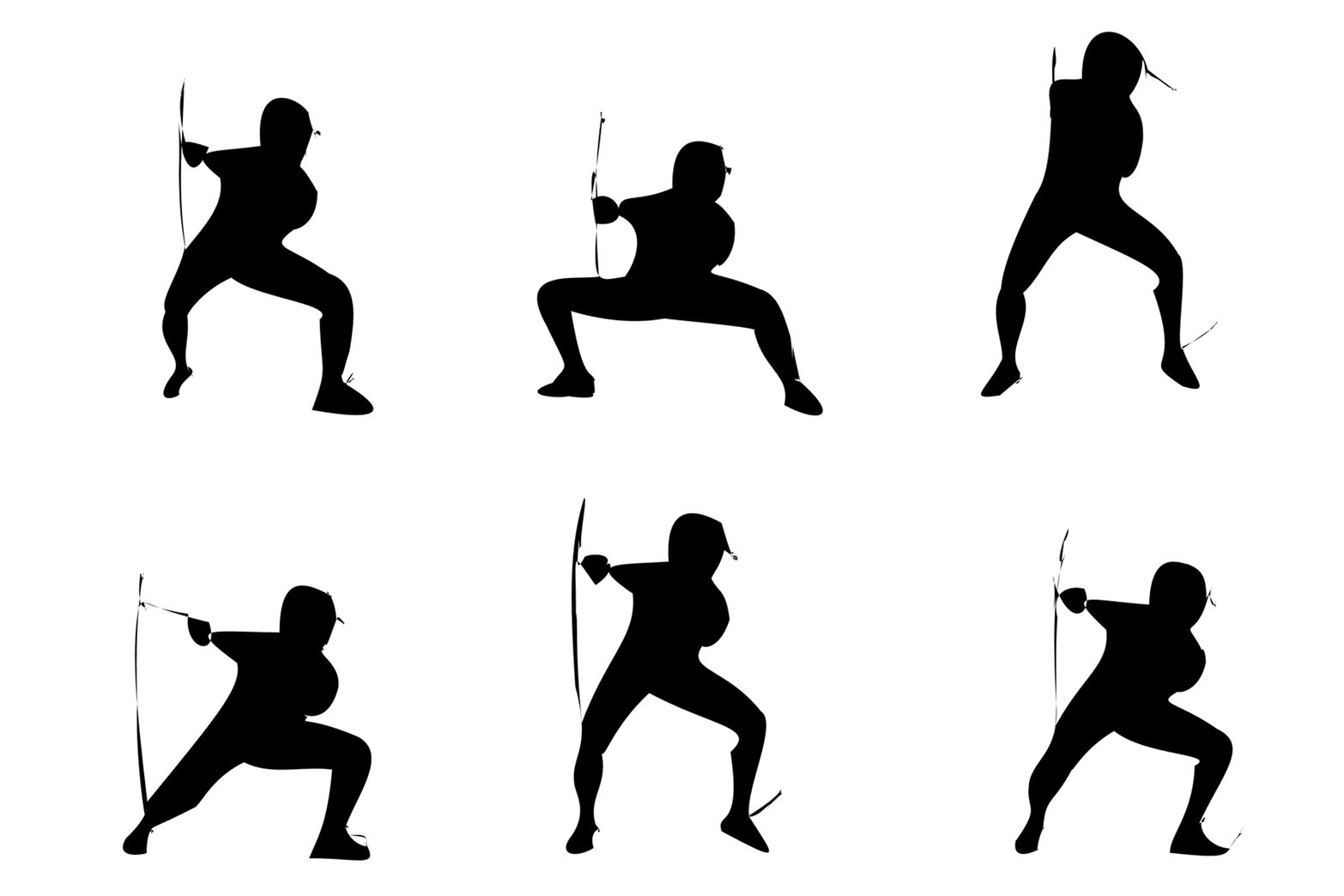
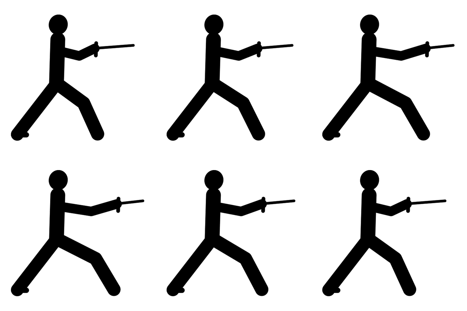
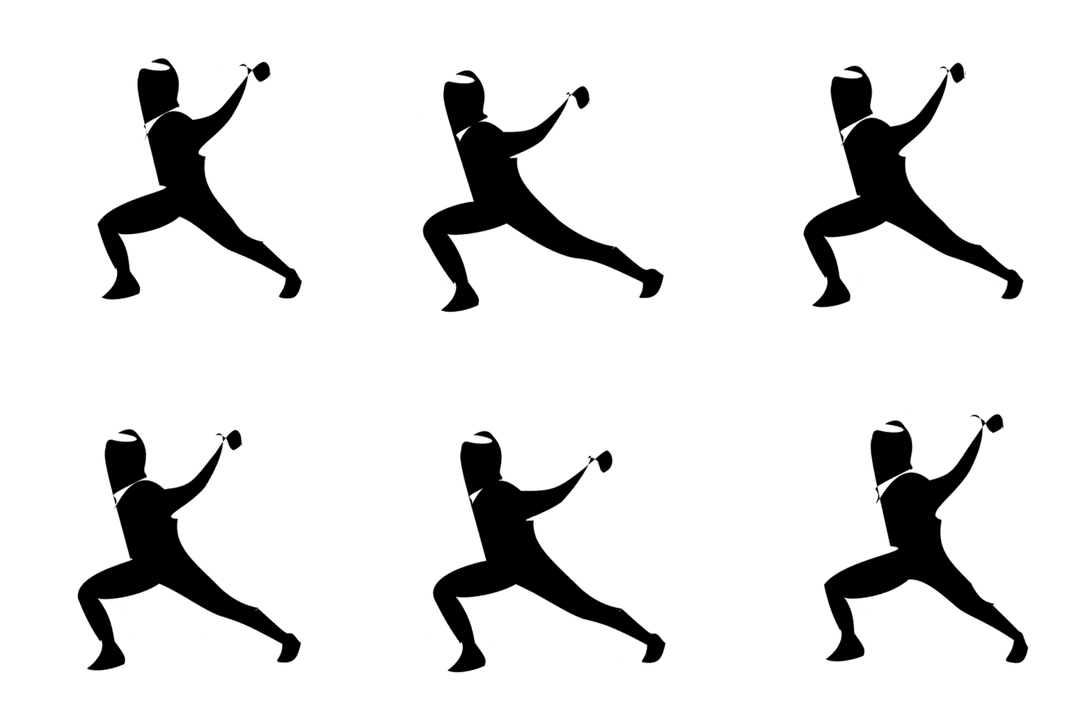
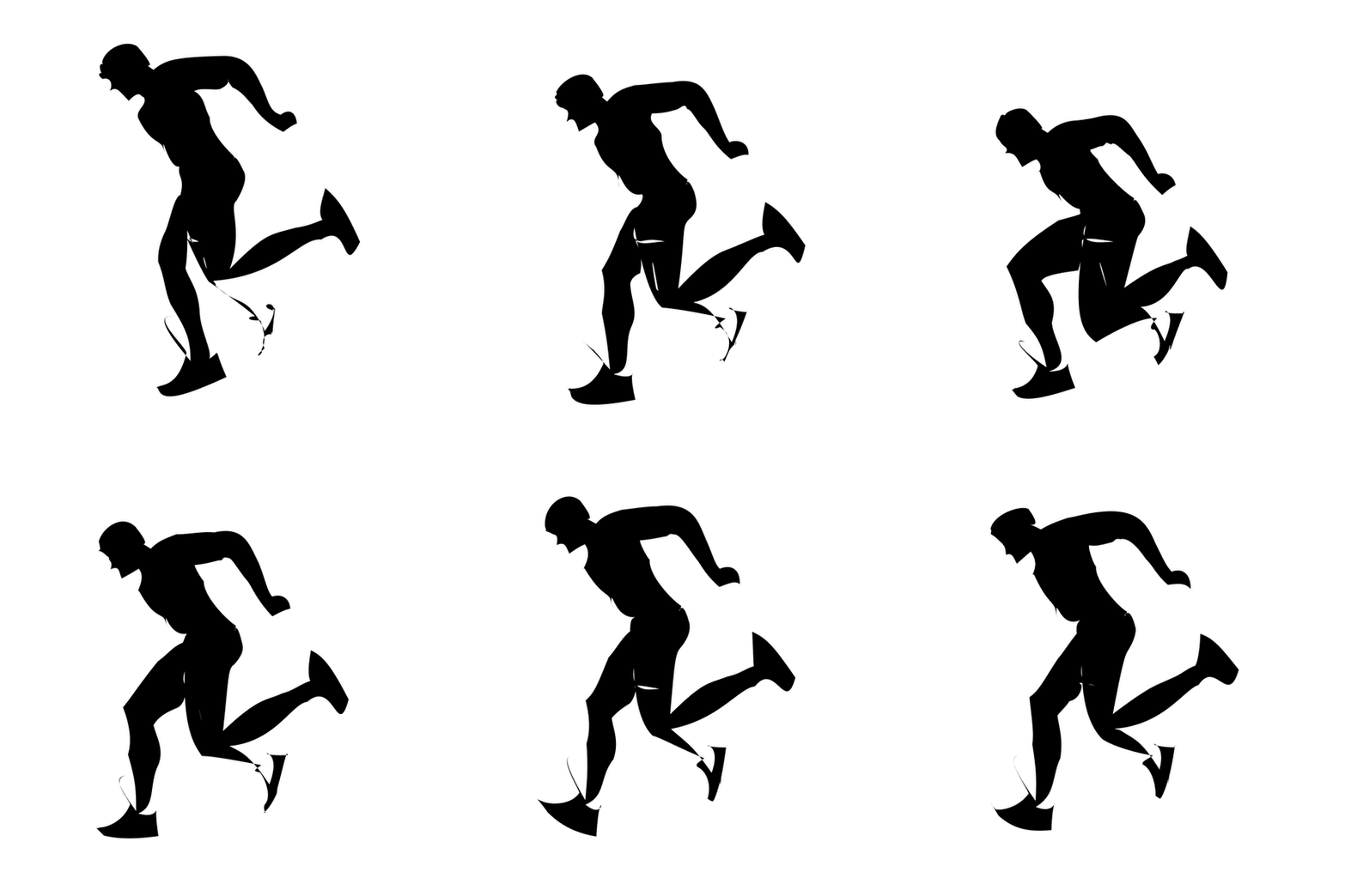
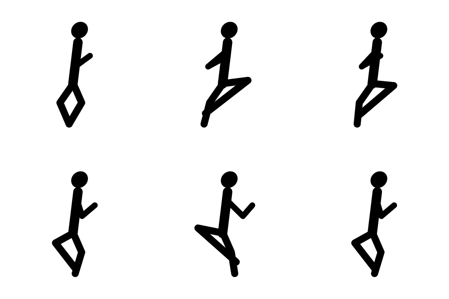
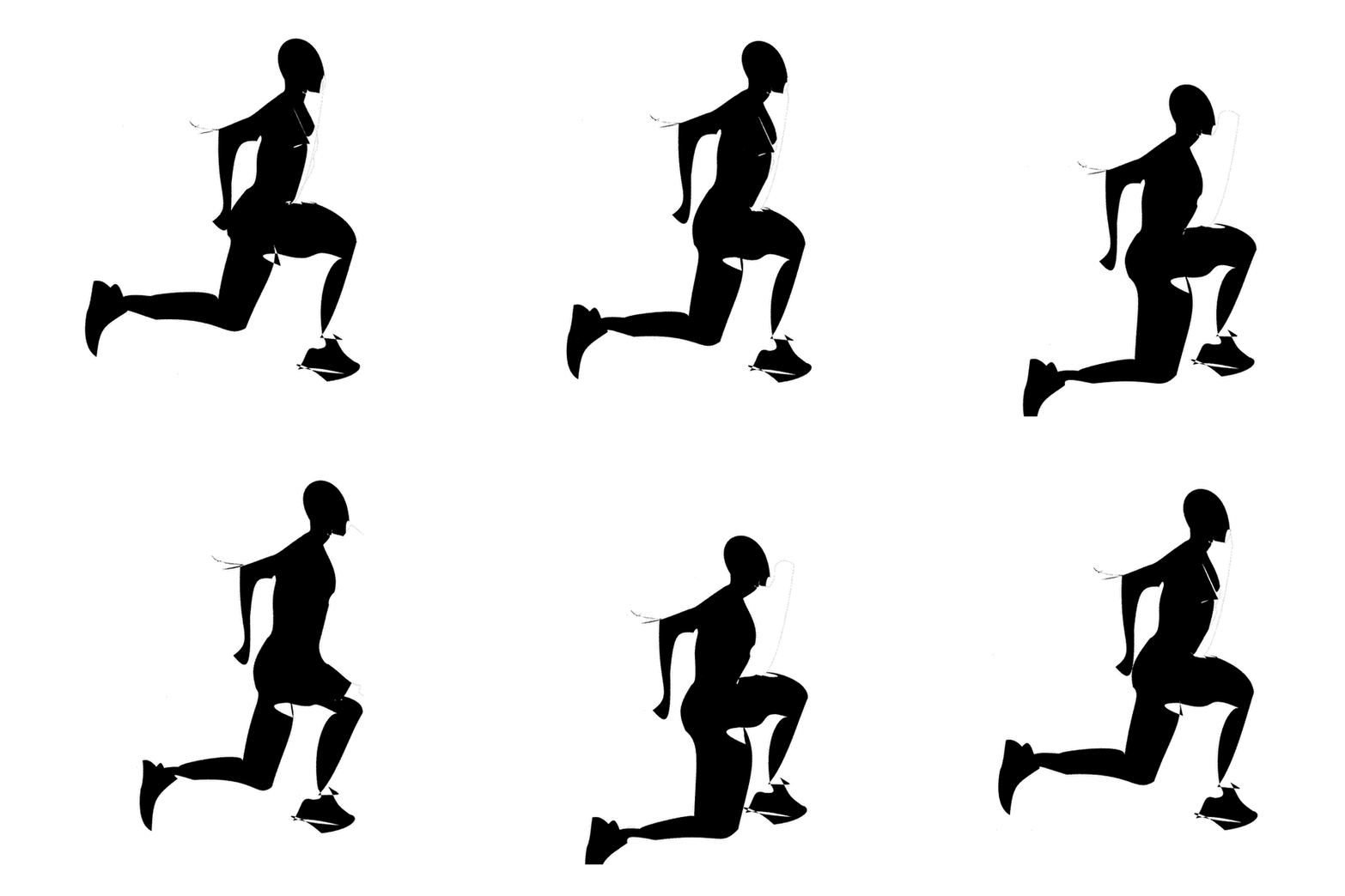
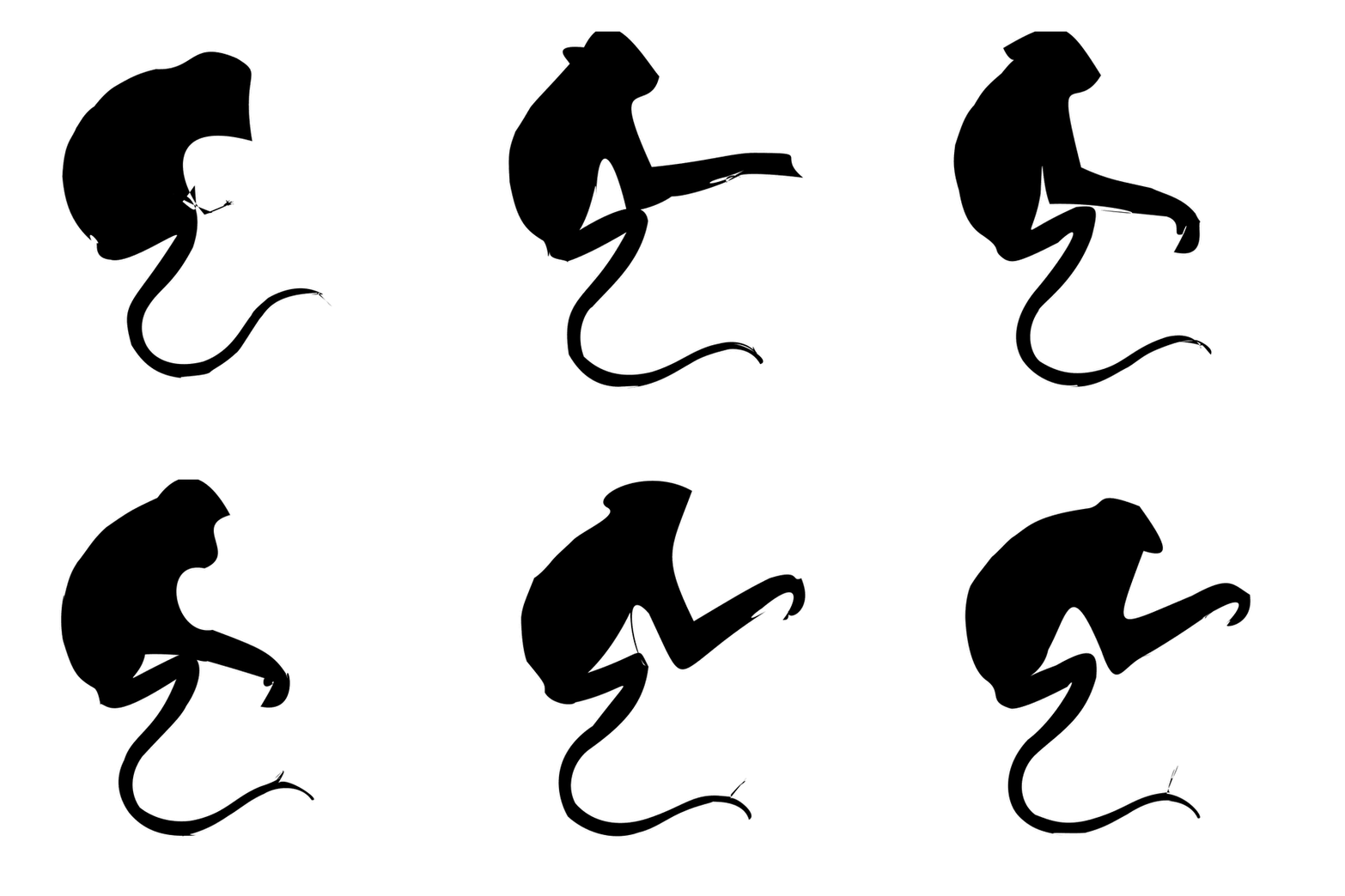
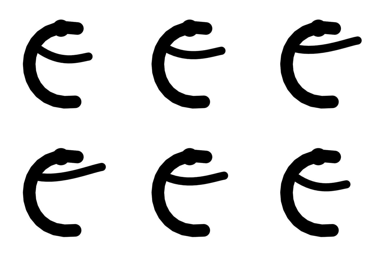
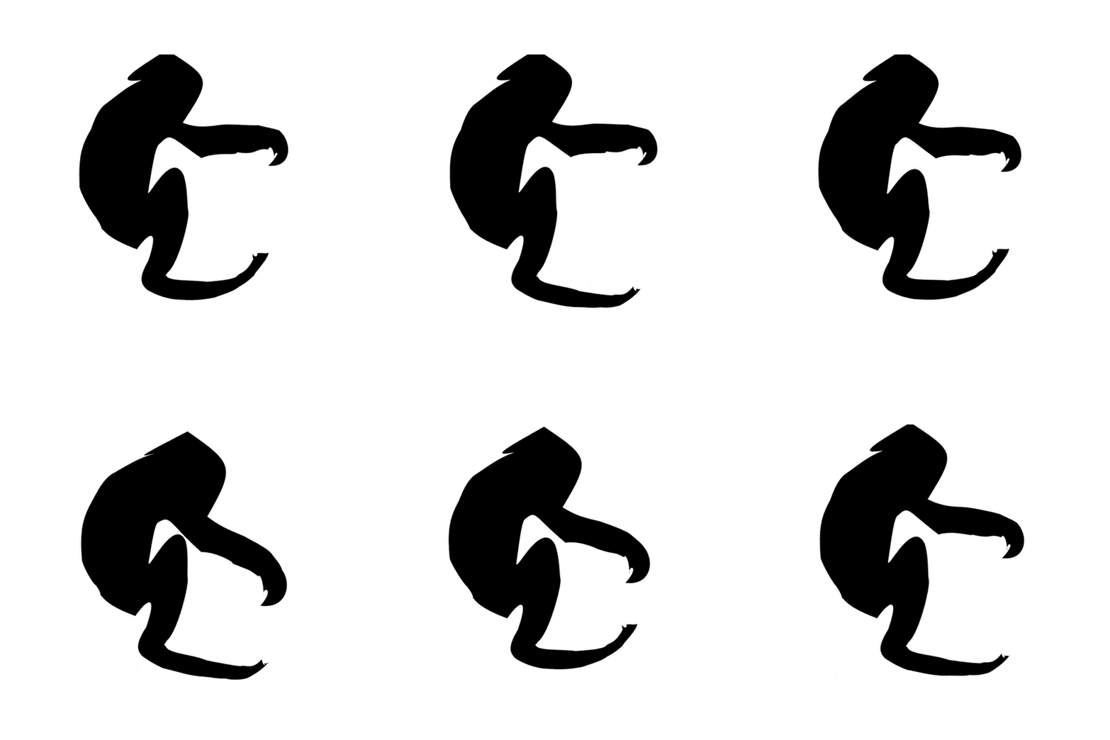

The letter is never reshaped here, so motion alone has to carry the concept. For Astra results we add the target letter and font in the prompt. Not every font is available to Astra, so it uses the closest one it has.
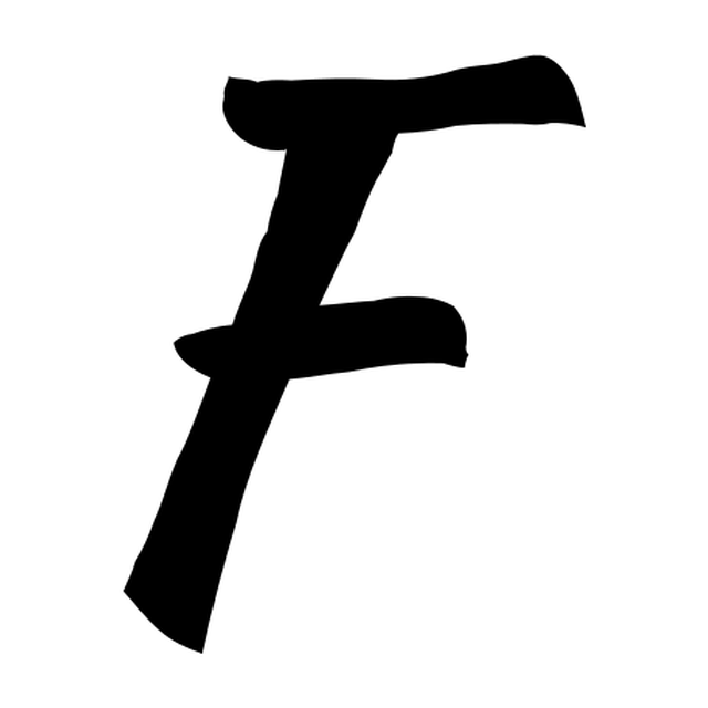
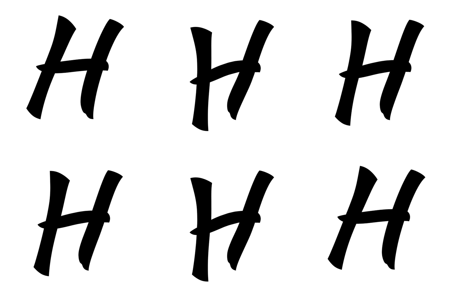
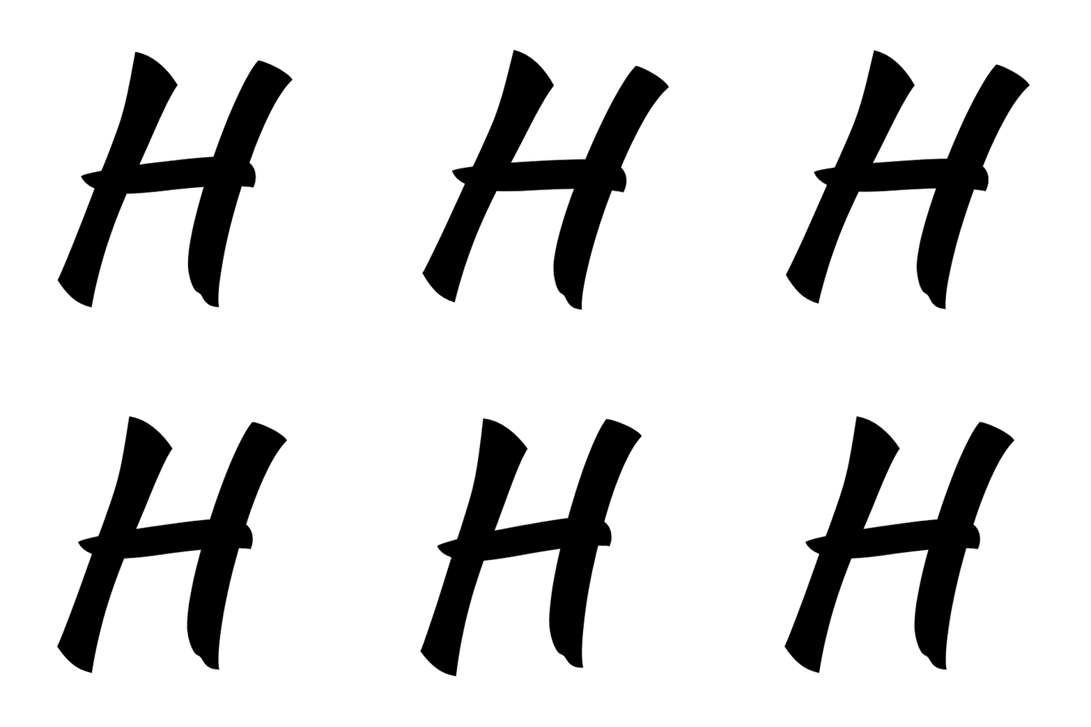
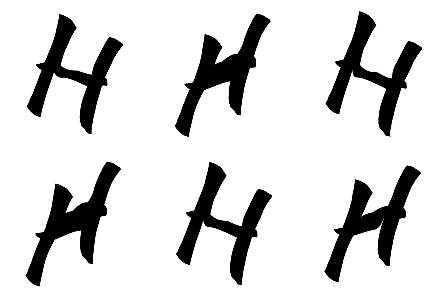
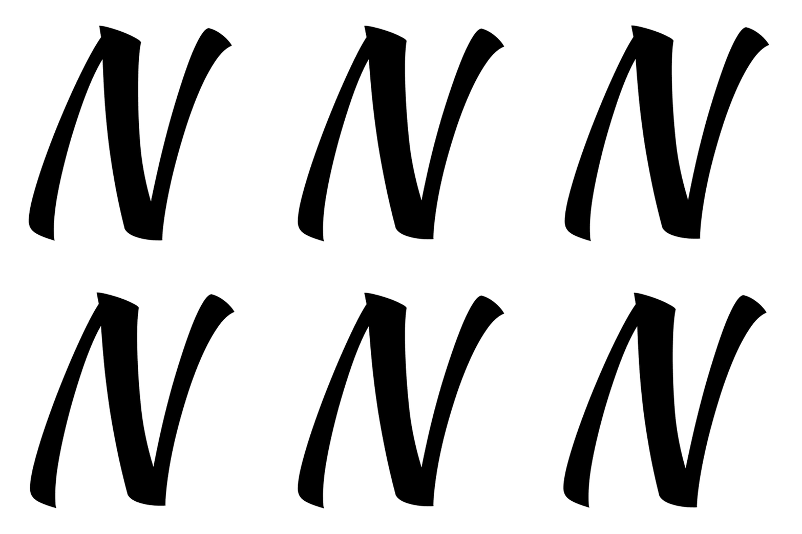
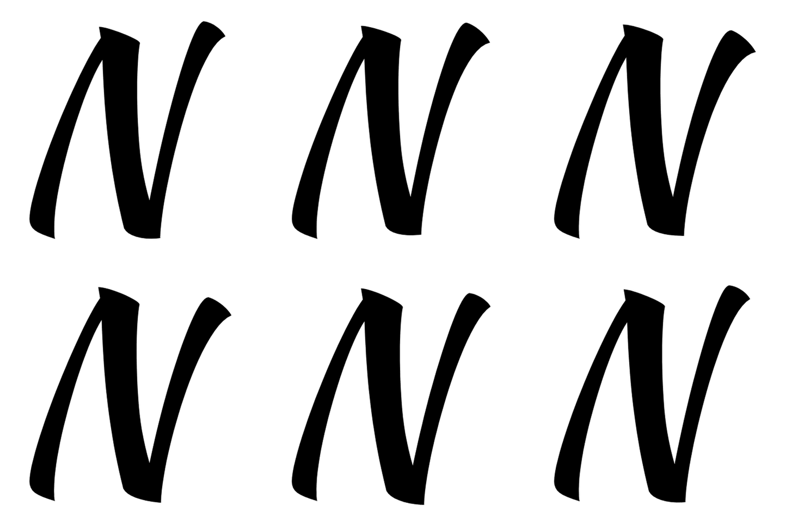
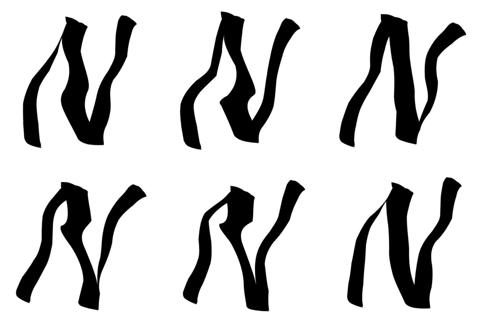
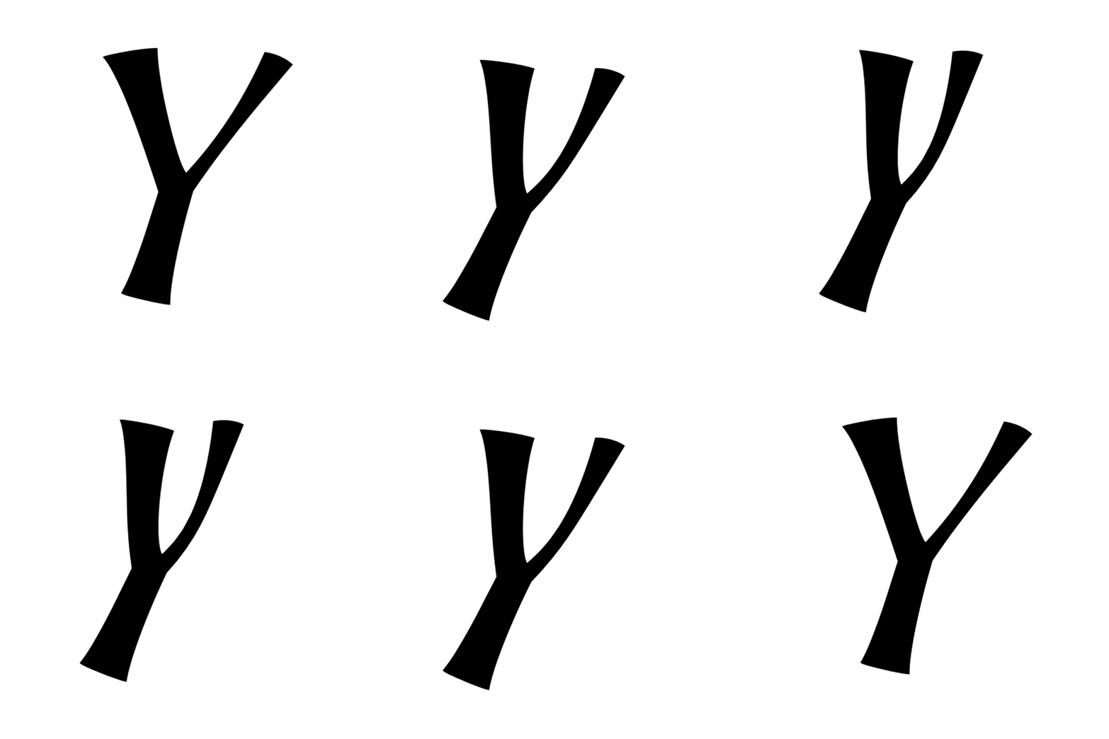
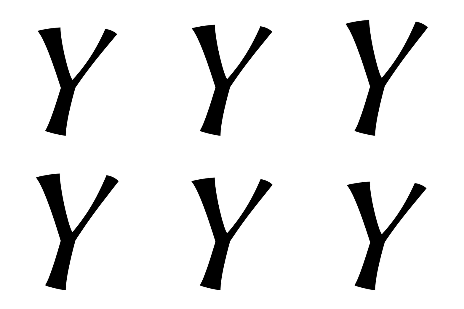
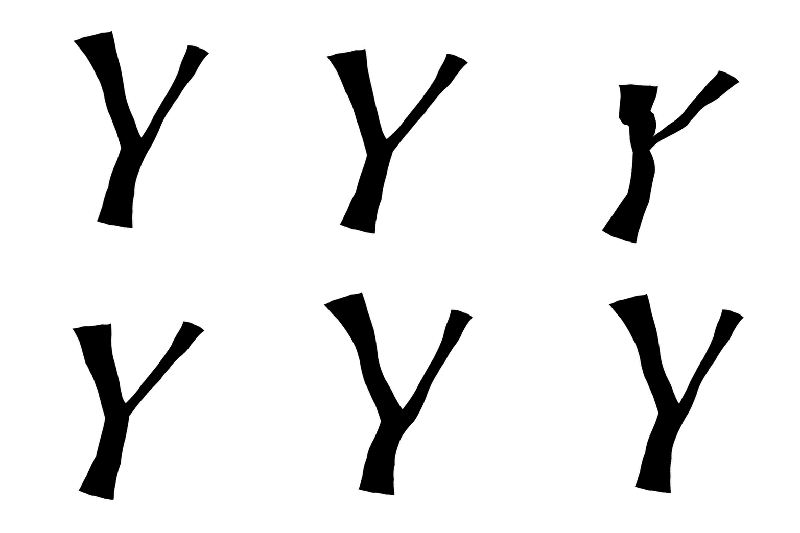

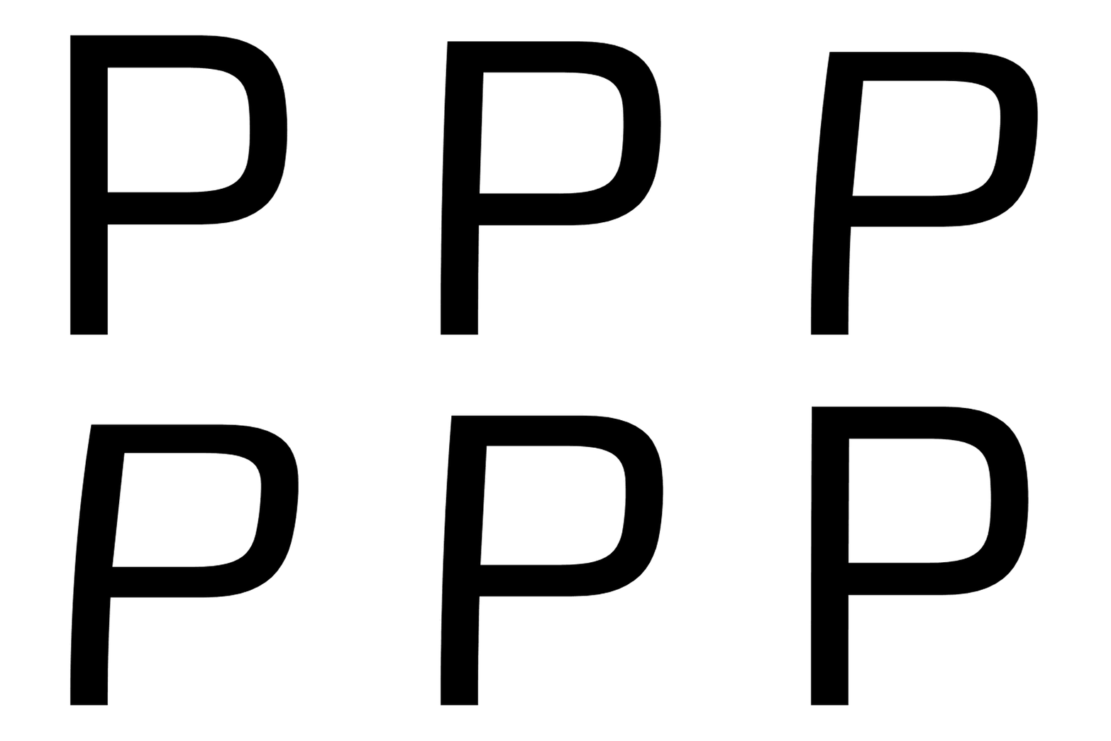
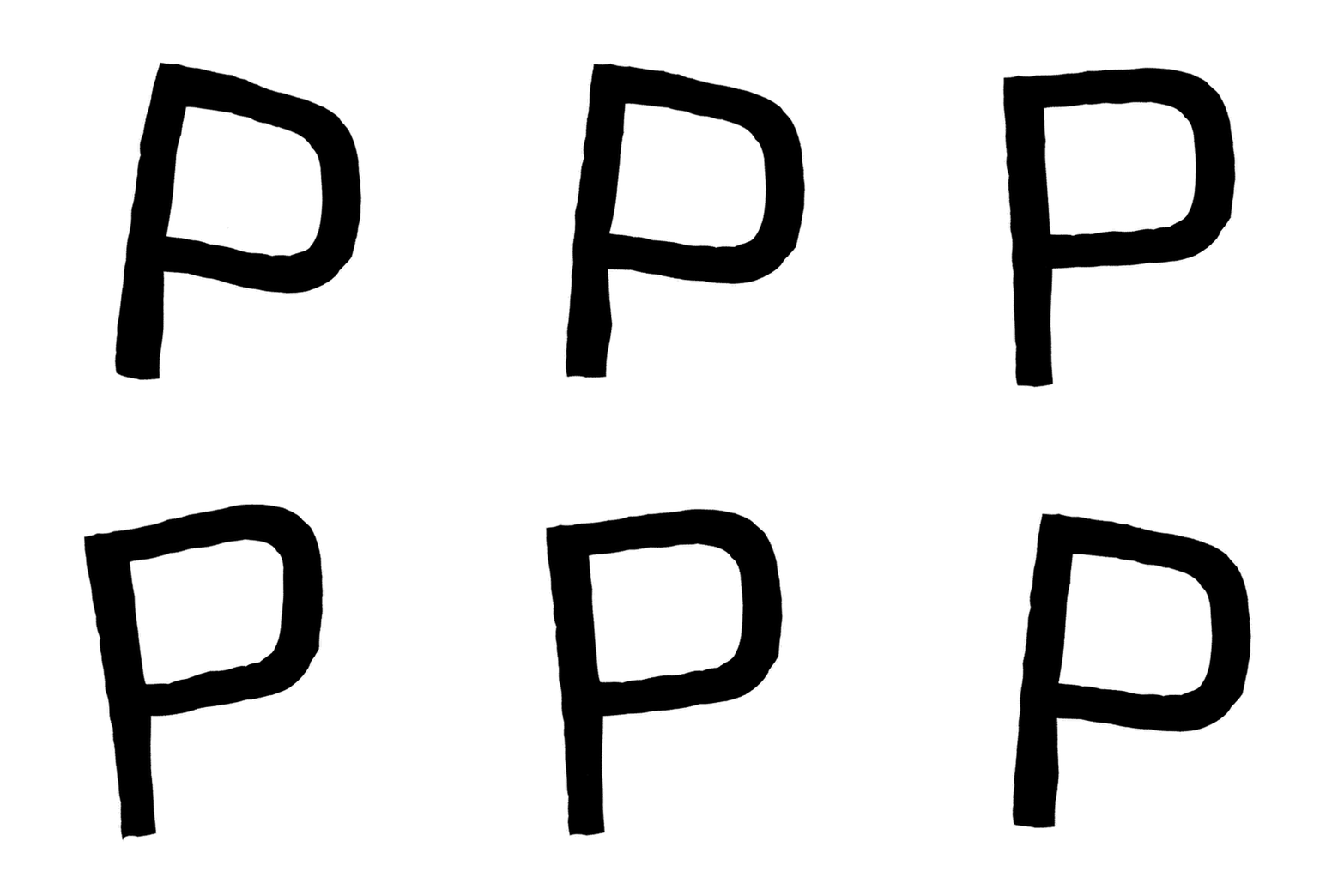
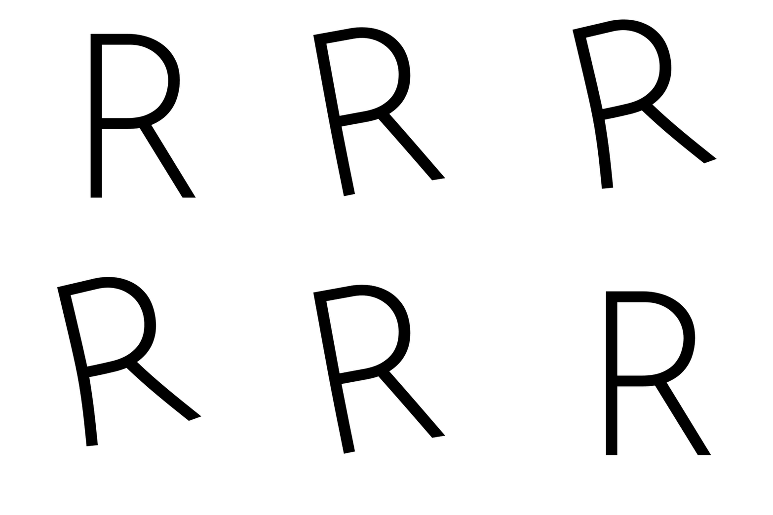
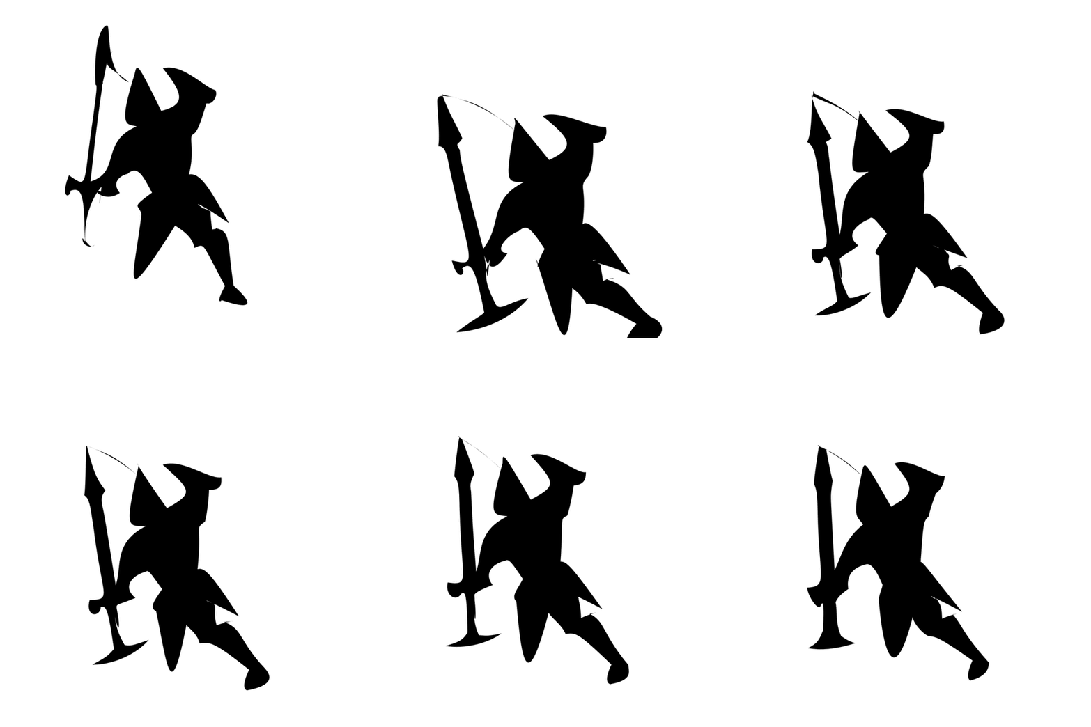
Each arm removes one component and is otherwise identical to the full model, on the same case with the same seed: the drive is left free per frame, only whole-letter modes are kept, the layers are left un-orthogonalized, or the basis is cut to four eigenmodes.